
Your website isn't just an online placeholder—it’s a revenue-generating asset that works for you 24/7. Think of it as your most dedicated salesperson, built to attract the right customers, answer their questions, and guide them toward making a purchase.
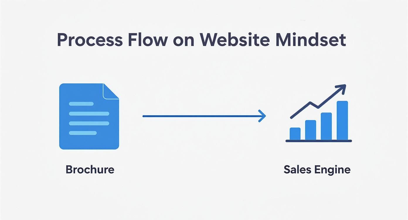
Your Website Is a Sales Engine, Not a Digital Brochure
Many small business owners see their website as a necessary evil. It's a box to check, a digital business card you're told you must have. We see it all the time with contractors, local shops, and service businesses. They get a site up, and then… crickets. They're left wondering why the phone isn't ringing.
The problem starts with that "check-the-box" mindset. A website shouldn't be a static placeholder. It's an active, powerful tool for growth. It should be the central hub for every marketing effort you make. Whether someone finds you on Google, sees a social media post, or gets a referral, their next stop is almost always your website. That’s where they decide if you’re the right choice.
Shift Your Perspective From Cost to Investment
Once you view your website as a sales engine, every decision about its design, layout, and content becomes strategic. Instead of just listing services, you start thinking about how to build trust and automate parts of your sales process.
Here’s what a strategic website actually does for your business:
- It Qualifies Your Leads: A well-built website answers common questions upfront, essentially pre-selling potential customers. This means the leads that do contact you are more informed and ready to move forward.
- It Builds Instant Credibility: Your website is often the first impression someone has of your business. A clean, professional, and helpful site immediately signals that you're a trustworthy expert.
- It Works While You're Sleeping: Unlike your team, your website is always on. It captures leads, provides information, and generates business around the clock.
This mindset shift is everything. Without it, you're just paying for an online listing. With it, you're investing in a machine designed to grow your bottom line. The data doesn't lie—as of 2025, 73% of U.S. small businesses now have a website because they know it’s essential. In fact, nearly one in three shoppers have admitted to not buying from a small business specifically because it didn’t have a website.
A great website makes the sales process easier. It answers questions, overcomes objections, and builds a relationship with your prospect so that by the time they pick up the phone, they’re already convinced you’re the solution.
This approach is about creating a smooth, intuitive path for your visitors. Every element, from the navigation menu to the call-to-action buttons, is intentionally designed to make it effortless for customers to take that next step. Our guide on user experience design best practices dives deeper into how these small design choices can have a huge impact on your business.
Create Your Blueprint for a High-Performing Website
Would you build a house without a blueprint? Of course not. You’d waste time and money on a wobbly structure that doesn't meet your needs. The same logic applies to your website. Before you think about colors or fonts, you need a plan that answers two critical questions: who are you trying to reach, and what do you want them to do?
This foundational work is what separates an online placeholder from a genuine tool for growth. It prevents costly, frustrating revisions down the line. It's all about moving away from thinking of your site as a passive digital brochure and toward seeing it as an active sales engine.
The real goal isn't just to be online; it's to build a system that consistently brings in business.
Pinpoint Your Ideal Customer
Your business doesn’t serve everyone, so your website shouldn't try to. The most effective sites speak directly to one specific person with a specific problem. Get granular. Don't settle for "homeowners." Zero in on "busy families in Murrieta who need a reliable landscaper because they don't have time for yard work." See the difference?
To find that clarity, ask yourself these questions:
- What’s their biggest pain point? For an auto shop, the real pain isn’t just a broken-down car; it’s the stress of an unexpected bill and finding a mechanic they can trust.
- What truly motivates them? A dental patient isn't just buying a cleaning; they're buying the confidence that comes with a healthy, bright smile.
- What questions are they asking? Before they commit, what do they need to know about your process or pricing? A great website answers these questions before they even have to ask.
Understanding this person—their worries, goals, and questions—informs every word you write and every design choice you make, creating an experience that feels like it was built just for them.
Define Your Website’s Primary Job
Once you know who you're talking to, decide on the single most important action you want them to take. A website that tries to do everything at once ends up doing nothing well. Your main goal must be measurable and directly tied to your bottom line.
A website's success isn't measured by how pretty it looks. It's measured in qualified leads, scheduled appointments, and new sales. Your design has to serve a clear business purpose.
This means getting past vague goals like "increasing brand awareness" and focusing on tangible results. For most local service businesses, your website’s main job will likely be one of these:
- Generate Quote Requests: If you're a contractor, your entire site should guide a potential client toward filling out a detailed form so you can give them an accurate estimate.
- Drive Phone Calls: For an emergency plumber, that phone number needs to be front and center. When someone's basement is flooding, you must make it incredibly easy for them to call.
- Book Appointments: A dental office or consultant needs to get appointments on the calendar. The goal is to funnel visitors to a scheduling tool to lock in that time slot.
This one core objective becomes your website's north star. Every page, button, and headline should work together to push your ideal customer toward completing that critical action. That clarity of purpose transforms a simple site into a high-performing sales machine.
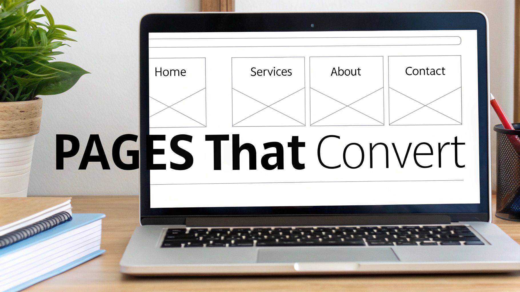
Essential Pages and Features That Convert Visitors
With a solid plan in hand, we can now map out the actual website. This isn't about picking colors; it's about building a strategic journey that guides a visitor from simple curiosity to becoming a paying customer. A high-performing website isn't a random collection of pages. It’s a carefully constructed pathway.
Each page has a specific job, and every feature should nudge your ideal customer to take that next logical step. Let's break down the non-negotiable pages and features that turn your website traffic into tangible business results.
The Core Four Pages Every Business Needs
Beyond the homepage, four key pages form the backbone of any website designed to build trust and drive action. Together, they answer a visitor's most pressing questions: What exactly do you do? Why should I trust you? Have you done this before? And how do I get started?
-
A Compelling Services or Products Page: This is your chance to make your offer crystal clear. Ditch the jargon and focus on the outcomes you deliver. A roofer doesn't just "install shingles"; they provide "a leak-free roof that protects your family and increases your home's value."
-
A Trust-Building About Page: People buy from people they know, like, and trust—not faceless corporations. Your About page is where you tell your story, share your mission, and introduce the real humans behind the logo. It’s one of the most powerful tools for forging a genuine connection.
-
A Social Proof Page (Case Studies or Portfolio): This is where you prove you can walk the talk. Showcasing past work, client testimonials, and measurable results takes the risk out of the equation for a new customer. For a cabinet maker, this means high-quality photos of finished kitchens. For a consultant, it could be a case study detailing how they helped a client double their revenue.
-
An Effortless Contact Page: The goal here is simple: zero friction. Provide multiple ways to get in touch—a phone number, an email address, and a simple contact form. And please, only ask for the essentials on that form. A 10-field questionnaire is a surefire way to lose a hot lead.
The words you choose for these pages are every bit as important as the design itself. Great content is what ultimately persuades and converts. If you're looking for pointers, we've put together a full guide on how to write website content that speaks directly to your ideal customer.
Features That Drive Action and Automation
Fantastic pages need smart features to steer users toward your main business goal. These are the tools that turn passive browsing into active engagement. Without them, even the most beautifully designed site will struggle to generate leads.
This is where so many businesses stumble. A staggering 70% of small business websites lack a clear call-to-action (CTA)—the single most critical element for getting a visitor to do something. Add to that issues like outdated design (around 25% of businesses update their site less than once a year), and you create a frustrating user experience that costs you money. Thankfully, 73% of businesses now recognize they need to invest in professional design to avoid these common mistakes.
Your website’s job is to make the next step obvious and easy. If a visitor has to hunt for your phone number or figure out how to request a quote, you've already lost them.
To make sure that doesn't happen, your website absolutely must include these conversion-focused features:
- Clear Calls-to-Action (CTAs): Every page should have a primary CTA. Use action-oriented language like "Get Your Free Estimate," "Schedule a Consultation," or "Call Us Now." These buttons need to pop visually and be placed where people expect them.
- Simple, Accessible Contact Forms: Don't bury your contact form on a single page. Place a short, simple form on your Services pages and homepage to capture a lead the moment they feel motivated to reach out.
- Click-to-Call Phone Numbers: On mobile devices, your phone number should always be a clickable link. It’s a tiny detail that makes it effortless for a customer to call you directly.
- Integrated Online Scheduling: For any service business—a clinic, a salon, a consultancy—allowing clients to book appointments directly on your site is a game-changer. It automates your process and gets a firm commitment from the client instantly.
Your Website's Must-Have Pages and Features Checklist
To pull this all together, here's a quick checklist. Run through this list to ensure your website includes the essential elements needed to attract new customers and turn them into leads.
| Page or Feature | Primary Purpose | Key Element to Include |
|---|---|---|
| Services/Products Page | Clearly explain your offerings | Focus on benefits and outcomes, not just technical specs. |
| About Page | Build trust and human connection | Share your story, mission, and introduce your team. |
| Portfolio/Case Studies | Provide social proof and evidence | Showcase your best work with high-quality images and results. |
| Contact Page | Make it easy to get in touch | Offer multiple contact methods and a simple, short form. |
| Clear Calls-to-Action | Guide the user's next step | Use action-oriented text on visually distinct buttons. |
| Click-to-Call Number | Enable instant mobile contact | Ensure your phone number is a tappable link on mobile. |
| Online Scheduling | Automate bookings and capture leads | Integrate a tool like Calendly for direct appointment setting. |
| Testimonials | Reinforce credibility | Scatter genuine client quotes throughout the site, especially on service pages. |
By building a site with these core pages and features from the start, you're not just creating a digital brochure—you're building a 24/7 sales and marketing machine. After getting these foundational pages in place, you can explore more advanced strategies to improve ecommerce conversion rates to turn even more of your visitors into customers.
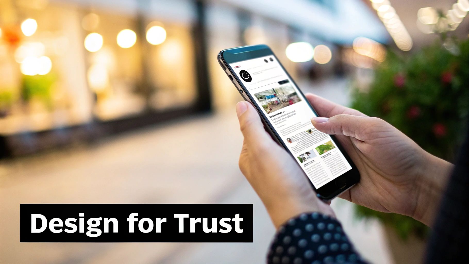
Designing for Trust and Action, Not Just Aesthetics
Let’s be honest: a beautiful website that doesn’t bring in business is just an expensive digital brochure. While looks matter, the real test of a small business website is its ability to build trust and nudge a visitor toward a specific, profitable action.
Many business owners get sidetracked by colors and fonts, but those are just finishing touches. The hard work happens beneath the surface, in the thoughtful structure and psychology of the design. We call this User Experience (UX). Don't let the jargon put you off. It's simply about making your website effortless and intuitive for your ideal customer.
Think of it like a well-organized hardware store. The aisles are clearly marked, the tools you need are where you expect them to be, and there’s someone helpful nearby. A website with good UX gives visitors that same feeling of clarity and confidence.
The Non-Negotiable Foundation of Good Design
Before we get into persuasion, let’s lock down the three foundational pillars every modern website must have. Getting these wrong is like building your shop on a shaky foundation—it doesn't matter how great the paint job is if the walls are crumbling.
- Clean, Uncluttered Layout: White space is your best friend. A crowded, busy design overwhelms visitors and makes it impossible to find what they need. A clean layout draws their eye to the important stuff, like your contact button.
- Intuitive Navigation: Can a first-time visitor find your services, learn about your company, and figure out how to contact you in a few clicks? Your menu needs to be simple, logical, and predictable.
- Mobile-First Responsiveness: More people will likely see your website on their phone than on a desktop. A mobile-first approach means your site is designed primarily for that small screen, ensuring text is readable and buttons are easy to tap. This isn't just a feature; it's a must-have.
These elements aren't just about looking professional. They're about respecting your visitor's time and making their journey on your site as painless as possible.
Guiding Visitors with Purposeful Choices
Once that solid foundation is in place, we can layer on the elements that actively turn visitors into leads. This is where we blend smart design with human psychology. Your goal is to make the next step—calling your office or filling out a form—feel like the most obvious and natural thing to do.
A great website doesn't just present information; it builds a compelling argument. It uses design, copy, and imagery to answer the visitor's unspoken question: "Why should I choose you over everyone else?"
Every single element on the page needs to help answer that question. Nothing should be there "just because."
Turning Clicks into Customers
So, how do we put these principles into action? Here are the practical, on-page elements that deliver real results:
1. Write Copy That Solves Problems
Your website copy isn’t about you—it’s about your customer and their problems. Stop listing features and start talking about benefits. A commercial cleaning company doesn't just "mop floors"; they "create a healthier, more productive work environment for your team." Speak directly to your customer's frustrations and position your service as the clear solution.
2. Use Authentic, High-Quality Imagery
Nobody is fooled by generic stock photos of smiling business people. Your customers can spot a fake a mile away. Invest in professional photos of your actual team, your workplace, and your finished projects. If you're a local contractor, showing the real faces of the crew who will be in a customer's home is incredibly reassuring. Authenticity creates an instant connection.
3. Craft Irresistible Calls-to-Action (CTAs)
Your call-to-action button is the most important piece of real estate on any page. It has to stand out visually (think a bold, contrasting color) and use clear, action-focused language. "Learn More" is weak. "Get Your Free Quote Now" is powerful because it promises a specific, valuable outcome and tells the user exactly what will happen when they click.
By combining a clean, mobile-friendly foundation with persuasive words, authentic visuals, and compelling calls-to-action, you create more than a website. You build a strategic tool that works 24/7 to build trust, guide visitors, and grow your business.
Choosing the Right Path for Your Budget and Goals
Alright, let's talk about the big question: what does a website actually cost? The investment can feel like a black box, but it doesn't have to be. The key isn't to look at the price tag; it's about matching your budget to your business goals and picking a path that will actually make you money.
There are three main ways a small business owner can approach this. Each has its own trade-offs, so let's break them down.
Three Common Approaches to Web Design
Picking the right tool or partner is the first major hurdle. Each of these options is a good fit for different business stages and budgets.
-
DIY Website Builders (like Squarespace or Wix)
- Best for: Brand-new businesses, solopreneurs, or anyone with a tight budget and simple needs.
- Pros: Low upfront cost, easy-to-use templates, and you're in the driver's seat.
- Cons: This route is incredibly time-consuming. You instantly become the designer, writer, and strategist, pulling you away from running your business. These platforms can also box you in as you grow, making it tough to add custom features or advanced SEO.
-
Hiring a Freelance Web Designer
- Best for: Businesses ready for a professional, custom look but don't need the full strategic muscle of an agency.
- Pros: You'll typically pay less than an agency, you talk directly to the person doing the work, and you end up with a unique design.
- Cons: Quality can be a mixed bag. A freelancer might be a design genius but know nothing about marketing strategy, copywriting, or local SEO. You often have to hire and manage several different people to get the whole package.
-
Partnering with a Web Design Agency (like us!)
- Best for: Established businesses that are serious about growth and seeing a long-term return on their investment.
- Pros: You get a whole team of specialists—strategists, designers, developers, and copywriters—all on the same page. The focus is on business results, not just making something pretty. An agency acts as a strategic partner to ensure your site is a powerful sales tool.
- Cons: This is the highest upfront investment, but that's because it's a comprehensive service built to deliver measurable ROI.
The right choice isn't about spending the least amount of money. It's about investing in the solution that will generate the most revenue and save you the most time in the long run.
Understanding the Investment and ROI
So, what should you really expect to budget? A professional website build for a small business can vary, but a realistic range is typically $2,000 to $9,000. It’s no surprise that over 50% of small businesses end up hiring pros. A bad website isn't just a missed opportunity; it's a direct cost to your business. Slow-loading or poorly designed sites contribute to billions in lost sales every year, which proves that investing in quality pays for itself.
The final price tag comes down to things like custom features, the number of pages, and the depth of the strategy. For a more detailed look, check out our guide on the average cost of web design. And if you're weighing your options, resources that break down the best website builders for small business can also help clear things up.
Think of your website as a critical piece of business infrastructure, just like your storefront or work truck. A cheap DIY site might feel like a win today, but a strategic, professionally built website is the asset that will bring in qualified leads for years to come.
Common Questions About Website Design for Small Business
Investing in a website is a big decision, and it’s natural to have questions. Here are the straightforward answers to the questions we hear all the time from business owners.
How Long Does It Take to Build a Website?
This is the classic "how long is a piece of string?" question, but we can give you a solid ballpark. A straightforward, well-designed website for a local business—like a plumber or a consultant—usually takes around 4 to 6 weeks from our kickoff meeting to going live.
If you need something more complex, like a full e-commerce shop or a custom client booking system, you're probably looking at a timeline closer to 8 to 12 weeks. The biggest variable? Content. Having your text, photos, and service details ready to go is the single best way to keep the project on track.
How Much Should a Small Business Website Cost?
You're going to see a huge range of prices, but for a professionally built, lead-generating website, a realistic budget falls somewhere between $5,000 and $15,000. This isn't just for a pretty design; it covers the strategy, research, copywriting, and development needed to create a site that actually brings in customers.
A word of caution: be skeptical of rock-bottom quotes. A cheap website often turns into an expensive paperweight when it fails to produce results, forcing you to rebuild it all over again in a year or two.
The goal isn't to find the cheapest option; it's to make the smartest investment. Your website should be a profit center, not just an expense line on your budget.
Do I Really Need a Blog on My Website?
For nearly every local or service-based business, the answer is an emphatic yes. Think of a blog less like a diary and more like a powerful marketing engine. Every article is a chance to answer a question your ideal customer is searching for on Google.
A local roofer, for example, could write articles like "5 Signs Your Shingles Are Failing" or "How to Prepare Your Roof for Winter in [Your City]." This does two things brilliantly: it shows you know your stuff, building trust, and it helps you show up in local search results when people need you most.
Here's a quick-reference table with some of the most frequent questions we get.
| Question | Answer |
|---|---|
| Can I update the website myself? | Absolutely. We build our sites on user-friendly platforms like WordPress so you can easily update text, add blog posts, and change photos without needing to call a developer. |
| Will my website work on mobile phones? | Yes, 100%. All modern websites must be "responsive," meaning they automatically adjust to look and work great on any device, from a desktop computer to a smartphone. It's non-negotiable. |
| What's the difference between a template and a custom design? | A template is a pre-made layout that can be a fast, cheap option, but it often looks generic and can be inflexible. A custom design is built from scratch around your specific business goals, brand, and customer needs, leading to much better results. |
| Do I need to pay for ongoing maintenance? | It's highly recommended. Just like a car, a website needs regular tune-ups. Maintenance plans typically cover software updates, security scans, and backups to keep your site running smoothly and securely. |
Hopefully, these answers give you a clearer picture of what to expect. Every project is a little different, but understanding these fundamentals is the first step.
Ready to stop wondering and start growing? If you're tired of a website that doesn't pull its weight, it might be time for a change. The team at Uncommon Web Design specializes in building strategic, high-performing websites that act as 24/7 sales engines for your business. Book a no-obligation strategy call with us today and let’s talk about what's possible.


