
You don't start building a house without a blueprint. So why would you build a website that way?
Strategic web page planning is the process of creating that blueprint. It’s not about picking colors or fonts. It's about ensuring every headline, button, and image on a page works together to achieve a specific business goal—like generating qualified leads or booking consultations. It's the difference between an online brochure and a 24/7 sales machine.
Why Your Website Isn't Generating Leads
Let's be direct. A beautiful website that doesn't bring in business is an expensive hobby. If you've poured money into a site that looks great but isn't making the phone ring, the problem isn't the design—it's the lack of a plan.
Too often, business owners treat their website like a checklist item. They get a logo, some photos, and a bit of copy, then hand it off to a designer and hope for the best. This approach completely misses the point of having a website in the first place.
Your website should be your hardest-working employee. It works around the clock to qualify leads, answer common questions, and convince your ideal customers to take the next step. That doesn't happen by accident. It happens through methodical, deliberate web page planning.
Shifting from "How It Looks" to "How It Performs"
The only metric that matters for a service business website is its impact on your bottom line. A solid plan forces a crucial shift in thinking, moving you from subjective questions about aesthetics to objective questions about performance.
It makes you confront the tough questions from day one:
- What is the single most important action we want a visitor to take on this page?
- Who, exactly, is this page for? What specific problem are they trying to solve right now?
- What information do they need to see to trust us enough to get in touch?
- How will we guide them from their initial question to that final click?
For an auto shop, success isn't website traffic; it's a confirmed appointment for a brake inspection. For a dental practice, it's a new patient form submission. These tangible business outcomes are born from a plan.
Your website fails to generate leads because its pages lack a clear job. Each page must act as a skilled salesperson, understanding the visitor's needs and guiding them confidently toward a solution—your solution.
The Cost of No Plan
When you wing it, your website becomes a confusing maze. Potential customers arrive, can't find what they need, get frustrated, and leave—often clicking right over to a competitor whose site provides the clarity they crave.
This isn't just a missed opportunity; it's actively costing you business.
This guide will fix that. We'll walk you through the web page planning process we use to build websites that become predictable growth engines for our clients. It's time to turn your online presence from a passive expense into an active, lead-generating machine.
Nailing Your Page Goals and Knowing Your Audience
Before you even think about design, we need to answer two fundamental questions:
- What is this page’s one job?
- Who, exactly, are we building it for?
Answering these up front is the single biggest factor separating a page that sits there from one that actively brings in business. This isn't marketing fluff; it's about building a precision tool for a specific task and a specific person.
From Fuzzy Ideas to Concrete Business Goals
Most businesses start with a vague goal like, "I need this page to get more leads." That’s a wish, not a plan. It gives your team zero direction. A solid planning process forces you to get crystal clear.
Give every important page a specific, measurable mission tied directly to a business result.
Let's translate "get more leads" into a real goal:
- A local HVAC company: "This page needs to generate 25 qualified quote requests for AC installations every month."
- A B2B software firm: "We need to increase scheduled demos from the homepage by 20% this quarter."
- A dental practice: "Our goal is 15 new patient form submissions for teeth whitening each month from this landing page."
See the difference? That level of clarity is a game-changer. It tells everyone what the most important action on the page is—the primary conversion. From there, every element can be designed to nudge visitors toward that one specific outcome.
A web page without a specific, measurable goal is like a salesperson without a commission plan. They might show up and look busy, but they aren't focused on the one thing that actually moves the needle. Clarity is everything.
Defining Your Ideal Client Profile
Once you know what you want the page to do, you have to get laser-focused on who it's for. Many businesses fall into the trap of trying to be everything to everyone. The result? They connect with no one.
The solution is a simple but powerful Ideal Client Profile (ICP). This isn’t about inventing a fictional character. It’s a practical tool to get inside the head of your best customer—the one you wish you could clone. For a service business, this profile is almost always based on your top 10% of clients.
To build your ICP, ask these questions:
- What's their real problem? A landscaping business isn’t just selling lawn mowing; they’re selling "getting my weekends back" or "making my neighbors jealous without lifting a finger."
- What are their burning questions? What are the top three things they must know before they'll even consider calling you? This is usually about price, process, or timeline.
- What are their biggest hesitations? Are they worried about getting ripped off? Have they been burned by a contractor who did a sloppy job?
- What does success look like for them? When it's all said and done, what is the perfect outcome they're imagining?
When you know their fears, you can crush those objections with testimonials or a solid guarantee. When you know their questions, you can answer them on the page and build instant trust. Your planning process becomes an exercise in empathy, letting you build a page that makes your ideal client feel seen, understood, and confident that you’re the right choice.
Mapping the Customer Journey and Site Structure
You’ve defined your page’s mission and you know who you're talking to. Now it's time to build the roadmap that guides a curious visitor from stranger to customer. This is where we map out the customer journey and use it to build a logical, intuitive site structure.
A great website anticipates a visitor's questions and answers them in the right order, building trust and momentum along the way. For most service businesses, the journey is about turning skepticism into confidence. A potential client rarely lands on your site ready to buy. They’re looking for proof, clarity, and reasons to believe you can solve their problem.
From First Click to Confident Contact
Let’s walk through a real-world example for a custom kitchen remodeler. A homeowner finds their website through a local search. What's going through their mind?
- "Am I in the right place?" Their Homepage needs to answer this in three seconds. A powerful headline ("Tired of your dated kitchen? We build beautiful, functional spaces that last.") paired with high-quality images of their work immediately confirms they've found a specialist.
- "Can they do what I need?" The next logical click is to a Services Page. This page must clearly detail their kitchen remodeling process, what’s included, and what sets them apart.
- "Okay, but are they any good?" Now they need proof. They'll look for a Portfolio or Case Studies page to see tangible examples of previous work and results delivered for other homeowners.
- "Can I trust these people?" To calm final nerves, they'll head to the About Us page. This is where they look for the human element—your story, your values, your team. It's all about building a personal connection.
- "How do I get started?" Finally, with questions answered and confidence high, they're ready to act. A crystal-clear Contact Page or a prominent "Request a Consultation" button makes this final step frictionless.
This path isn’t an accident; it’s a deliberately planned sequence. Your web page planning must account for this natural progression of questions to create an experience that feels helpful, not pushy.
Structuring Your Site for Users and Google
Once you understand the customer's thought process, you can build a site structure—often called Information Architecture (IA) or a sitemap—that supports it. This is a logical hierarchy that makes sense to both real people and search engines.
A clean IA is critical. It ensures visitors can find what they need in two or three clicks. Remember, frustration is the number one conversion killer, and a confusing site map is a one-way ticket to a lost lead.
Think of your sitemap as the blueprint for your digital office. The homepage is the lobby, service pages are consultation rooms, and the contact page is the front desk. A clear layout ensures no one gets lost on their way to signing a contract.
This flow chart visualizes how these pieces fit together, starting with your goals and your client's needs.
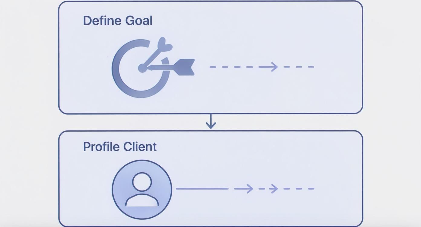
As the graphic shows, a successful structure isn’t built on assumptions. It begins with a clear goal and a deep understanding of your client, which then dictates what pages you need and how they should connect.
This also has a massive SEO benefit. When Google's crawlers can easily understand how your pages are related, it helps them index your content and recognize your site as an authority. A great user experience almost always translates into better search rankings. Plan your site for the customer first, and Google will reward you.
Wireframing: Your Blueprint for Persuasion

You have your journey map and site structure. The urge to jump into visual design is strong. Resist it. Skipping the next step—wireframing—is one of the most common and costly mistakes you can make.
A wireframe is the skeleton of your page. It's a simple, low-fidelity layout using basic shapes and placeholder text to define structure and hierarchy. There are no colors, fonts, or images. Its sole purpose is to figure out where everything goes and why.
Think of it like an architectural blueprint. You wouldn't let a construction crew start building a house without one. A wireframe serves the same critical function, forcing you to make big decisions about layout and priority before getting lost in aesthetic details. This simple step saves a mountain of time and money on redesigns down the road.
Deciding What Matters Most
The real power of a wireframe is establishing a clear visual hierarchy. It forces you to answer the most critical question on any page: What is the very first thing a visitor needs to see? What's second? And so on.
A wireframe for a local contractor’s service page would likely place a powerful, problem-solving headline at the top. The next most prominent element would be an impossible-to-miss call-to-action button, followed by a gallery of their best work.
This process sparks essential conversations about what's truly necessary versus what's just "nice to have." By stripping away the design, a wireframe shines a spotlight on whether your page’s structure actually supports your business goals.
Marrying Content Strategy with Structure
A wireframe is just empty boxes without a plan for what goes inside them. That’s why you should develop it alongside a content brief—a document that outlines the page's messaging from top to bottom.
A good content brief nails down:
- The Core Message: The one big idea the page must convey. For a family dentist, it might be, "Painless, anxiety-free dentistry for your entire family."
- Key Value Propositions: The top 3-5 reasons a customer should choose you.
- Calls-to-Action (CTAs): The main action you want them to take ("Book a Free Consultation") and any secondary options ("Download Our Pricing Guide").
- Essential Proof Points: A list of the specific testimonials, case studies, or certifications needed to build trust and overcome objections.
Creating the wireframe and the content brief in tandem ensures that your design serves the message, not the other way around. Every box has a purpose, and every word has a home where it can make the biggest impact.
This dual-track approach creates a persuasive one-two punch. The wireframe provides the logical flow, while the content brief ensures the words filling that structure are compelling and conversion-focused.
Essential Elements of a High-Converting Service Page
Here's a breakdown of the key components every high-converting service page should have, organized from top to bottom, to help you connect the wireframe's structure with the content's purpose.
| Page Section | Purpose | Example Content |
|---|---|---|
| Above the Fold | Grab attention and validate the visitor is in the right place. | "Expert Kitchen Remodeling in Austin" + a stunning hero image. |
| Primary CTA | Make the desired action clear and easy to take, right from the start. | A prominent button that says "Get Your Free Estimate." |
| Social Proof (Initial) | Build immediate trust with logos of past clients, awards, or star ratings. | "As Seen On HGTV" or "Rated 5 Stars on Google." |
| Problem/Solution | Agitate the user's pain point and introduce your service as the clear solution. | "Tired of your outdated kitchen? We create functional, beautiful spaces." |
| Service Benefits | Focus on the outcome for the customer, not just the features of what you do. | "Enjoy more family time," "Increase your home's value." |
| How It Works | Simplify your process into 3-4 easy steps to reduce friction and build confidence. | "1. Consultation → 2. Design → 3. Build." |
| Social Proof (Detailed) | Use full testimonials or case studies to provide in-depth proof of your value. | A customer quote with a headshot and name: "They finished on time and on budget!" |
| Overcome Objections (FAQ) | Address common hesitations or questions head-on to remove barriers to converting. | "How much does it cost?" or "How long does the process take?" |
| Final CTA | Provide a last, compelling reason and opportunity to convert for those who scrolled. | "Ready to build your dream kitchen? Schedule a no-obligation call today." |
This kind of detailed planning transforms a simple web page into a persuasion machine. To dive deeper, our guide on how to boost your website’s conversion rate with proven strategies is a great next step.
Plan What Happens After a Visitor Converts

Getting a visitor to hit "submit" isn't the finish line. For your new lead, that click is just the beginning of their journey with you. An effective web page plan anticipates this and maps out the entire post-conversion experience to build trust from the very first interaction.
Leaving a new lead in silence is the quickest way to kill momentum and introduce buyer's remorse. They just took a leap of faith by giving you their information. Your immediate response needs to tell them they made a smart choice. This is your first chance to show you’re organized, professional, and ready to help.
The Immediate, Automated Handshake
The moment someone converts, two things need to happen automatically. Your team gets a notification, and the new lead gets an immediate confirmation. This isn't just good manners; it's about managing expectations and starting the relationship off right.
A simple, automated confirmation email works perfectly. It should cover:
- Confirm you got it: "Thanks! We’ve received your quote request."
- Set expectations: "Our team will review your details and get back to you within 24 business hours."
- Reiterate the value: A quick sentence reminding them why they reached out.
This small step prevents "I'm not sure if it went through" anxiety and stops them from calling you just to check. You can get more advanced with this, and many email strategies for growing your email list also apply to lead nurturing.
A silent post-conversion experience is a massive missed opportunity. Your follow-up process should feel like a firm, confident handshake that reassures the customer they’re in good hands.
Design a Thank You Page That Adds Value
Too many businesses dump users on a generic "Thank You!" page after a form submission. This is a huge waste of digital real estate. That person is highly engaged in that moment—don't let that energy fizzle out.
Your Thank You page is prime territory for guiding them to the next logical step. Instead of a dead end, think of it as an opportunity to keep the conversation going.
- Offer a helpful resource: A kitchen remodeler could link to a downloadable "Remodel Planning Checklist."
- Showcase powerful social proof: Embed a compelling video testimonial from a happy client.
- Direct them to a case study: Show them exactly how you solved a similar problem for someone else.
By thoughtfully planning these post-conversion touchpoints, you turn a simple lead capture into the start of a real relationship. It demonstrates you’re not just trying to make a sale; you’re genuinely invested in helping them succeed.
Making Sure Your Page Gets Seen and Works for Everyone
A brilliant web page plan can still fail if no one can find the page or if some people can't use it. This final stretch of planning is about making sure your page is built to be found, used by everyone, and measured effectively from day one.
Your wireframes and content create the persuasive argument. SEO, accessibility, and analytics get that argument in front of the right audience and prove it's working. Skipping this step is like having the world's best salesperson who happens to be invisible.
Building to Be Found with SEO
Search Engine Optimization (SEO) isn't black magic. It's about making it crystal clear to search engines what your page is about and who it's for. When you bake SEO into your planning from the start, you align your page with the exact words your ideal customers are typing into Google.
For every page, your plan should define these on-page SEO basics:
- A Primary Keyword: What is the number one search term this page needs to rank for? A local plumber isn't targeting "plumbing services"; they're targeting "emergency plumbing Menifee." Specificity wins.
- Keyword-Driven Headings: Your H2s and H3s should naturally include your primary keyword or related terms. This gives Google strong clues about the page's topics.
- A Click-Worthy Meta Description: This is your sales pitch in the search results. While it doesn't directly impact rank, a compelling description convinces a real person to click your link instead of a competitor's.
Choosing the right keywords is half the battle. Our guide on how many keywords for SEO can help you focus your efforts for maximum impact.
Making Your Page Accessible to Everyone
Accessibility isn't just a compliance checkbox; it's smart business. When you build a page that everyone can use—including people with disabilities who rely on assistive technologies— you widen your potential customer pool. Ignoring accessibility is like putting a "Closed" sign on your door for 10% of your prospects.
The reality is shocking: 96.3% of home pages have Web Content Accessibility Guidelines (WCAG 2) failures. The average page has 56.8 accessibility errors. You can read more about these website statistics and see how common these problems are.
The good news? By planning for basic accessibility, you leapfrog most of your competition. This isn't complicated. We're talking about:
- Using good color contrast so text is easy to read.
- Writing descriptive "alt text" for images so screen readers can explain them.
- Ensuring the entire page can be navigated using only a keyboard.
Measuring What Matters with Analytics
Finally, how will you know if any of this is working? You can't improve what you don't measure. Before you write a single line of code, you must decide what success looks like and how you'll track it, usually with a tool like Google Analytics 4.
A website without clear conversion tracking is a hobby, not a business asset. You're just guessing. Setting up goals turns your analytics from a confusing dashboard of numbers into a clear report card on your page's performance.
Is the goal to get contact form submissions? Track that. Is it to get phone calls from a "click-to-call" button on mobile? Track that, too. Defining these goals upfront means you can make decisions based on real data later, turning your web page into a predictable engine for growth.
Common Questions About Web Page Planning
Even with a detailed playbook, questions come up. Here are answers to a few of the most common ones we hear.
How Long Should This Planning Phase Actually Take?
It always depends, but for an important page—like your homepage or a core service page—the planning should take longer than the design and build.
We stick to a 40% planning, 60% execution rule. It might feel slow at first, but rushing the foundational work—goals, audience research, journey mapping, and content strategy—is the number one reason websites need expensive overhauls later. Get the blueprint right, and the build is ten times smoother.
Can’t I Just Use a Template and Get This Done Faster?
Templates are great for kickstarting the visual side of things, but they are not a substitute for strategy. A template gives you an empty shell; your plan is what fills it with the right words, images, and flow to actually convince your ideal customer to take action.
Think of it this way: A template is a beautiful, empty house. A strategic plan is the architectural blueprint that ensures the house is built on a solid foundation, in the right location, with a layout that perfectly suits your family.
Without a plan, you're just decorating rooms at random, not building a strategic asset for your business.
What's the Single Biggest Mistake People Make?
Hands down, the biggest mistake is building the page around what you want to say, not what your customer needs to hear.
Your website isn't for you; it's a tool to serve your audience. Every decision, from the main headline to the button text, has to be seen through their eyes. What are their problems? What questions are they asking? What's their ultimate goal? Focus on that, and you're already ahead of 90% of your competition.
Feeling like your current website plan is missing that strategic spark? At Uncommon Web Design, we build conversion-focused websites that work as hard as you do. Let's schedule a chat to map out a plan that can turn your site into your most valuable team member. Learn more about our approach at uncommonwebdesign.com.


