
If your website isn't bringing in leads or sales, it's just an expensive digital brochure. Many business owners treat their site like a static business card, crossing their fingers and hoping customers stumble upon it and decide to call. That’s a recipe for leaving money on the table.
A truly effective website works for you 24/7. Think of it as your best salesperson—one that never sleeps, never takes a vacation, and is always ready to qualify prospects and drive revenue. This guide gets straight to the point. We'll show you exactly how to transform a passive online presence into an active growth engine.
We’ll break down Conversion Rate Optimization (CRO) in simple terms, demonstrating how a few smart tweaks can have a massive impact on your bottom line.
What Is a Good Conversion Rate Anyway?
It’s easy to get bogged down in data, but benchmarks put the opportunity into perspective. The global average website conversion rate hovers around a surprisingly low 2.35%. Meanwhile, the top-performing sites are converting at 11.45% or higher.
That huge gap tells a story: the "average" is dragged down by a sea of poorly optimized websites. If your site is converting at 3%, you're already doing better than most, but the leaders in your industry are likely hitting 8-12%.
Where Does Your Website's Conversion Rate Stand?
See how your site compares to global benchmarks and what separates an average site from a top performer.
| Performance Tier | Conversion Rate | What This Means for Your Business |
|---|---|---|
| Top 10% | 11.45%+ | You have a finely tuned sales machine. Customers find it incredibly easy to buy from you. |
| Top 25% | 5.31%+ | Your site is a strong performer, clearly resonating with your target audience. |
| Median (50%) | 2.35% | You're on par with the average, but there's a huge opportunity for growth. |
| Bottom 25% | 0.50% | Your website has significant friction, likely frustrating users and costing you sales. |
The goal isn't just to hit some arbitrary number. It’s about closing the gap between where you are now and what’s actually possible. The difference between a 2% and a 5% conversion rate might not sound like much, but for a business with 5,000 monthly visitors, that’s the difference between 100 and 250 leads. That's a game-changer.
From Brochure to Business Engine
The core principles of turning traffic into customers aren't complicated. It’s all about combining crystal-clear messaging with a smooth, intuitive user experience. We believe in this so strongly that we wrote an entire guide on user experience design best practices.
A great website immediately answers three simple questions for any visitor:
- What do you offer?
- How does it make my life better?
- What do I do next?
If your site can’t pass that test in five seconds, you're bleeding leads. For a deeper look at this concept, check out these practical strategies to increase sales.
The Big Takeaway: Your website shouldn't just exist; it should work. Every single element—from the headline on your homepage to the button on your contact form—is an opportunity to either win a customer or lose one.
This guide provides the actionable steps to make sure you're winning far more often than you're losing. It’s time to make your digital investment pay for itself, many times over.
So, Where Do You Start? A Practical Website Conversion Audit
Before you start changing button colors or rewriting headlines, you need a plan. Randomly tweaking your site is like throwing darts in the dark—you might hit something eventually, but it's inefficient and usually a waste of money. Real conversion rate optimization begins with a diagnosis, not a prescription. You have to find the leaks before you can patch them.
This diagnostic process is all about pinpointing exactly where you're losing potential customers. Instead of guessing, we’re going to use real data to identify the specific friction points that are costing you sales.
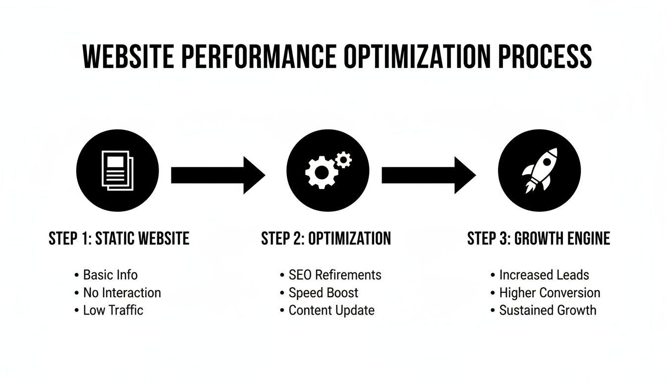
The journey from a static, brochure-style website to a dynamic growth engine is all about optimization. This is the bridge that turns your site from a simple online presence into a machine that generates leads and sales.
Let's break down how to find those problems.
Start With the Data You Already Have
Your first stop should be Google Analytics. Don't worry, you don't need to be a data scientist to pull out some incredibly valuable insights here. We’re just looking for the story your traffic is telling us.
Navigate to the Behavior > Site Content > All Pages report. This is a goldmine. It shows you which pages are getting the most eyeballs, and more importantly, how people are behaving on them.
Keep a close eye on two columns: Bounce Rate and % Exit.
- High Bounce Rate: This means a lot of people land on a page and leave without clicking anything else. It's a classic sign that your messaging isn't hitting the mark, the page is confusing, or it's just loading too slowly.
- High % Exit on Key Pages: This one is a major red flag. If people are bailing from your "Services" page or your "Request a Quote" form, it’s like a customer walking into your store, picking up a product, and then immediately walking out. Something is scaring them away right at the crucial moment.
This initial look gives you a treasure map of your problem areas. If your most popular service page has an 85% bounce rate, you know exactly where your attention needs to go first.
See Your Website Through Your Customer’s Eyes
Numbers tell you what is happening, but they don't explain why. For that, you need to literally see what your users are seeing. This is where tools like heatmaps and session recordings are invaluable.
Heatmaps give you a visual breakdown of where people click, scroll, and move their cursors. A tool like Microsoft Clarity (which is completely free) can show you things you'd never guess. You might find that dozens of people are clicking on an image that isn't a link, which signals major confusion. Or you might discover that 80% of your visitors never scroll far enough to even see your main call-to-action button.
Your goal here is simple: Pinpoint areas of frustration. These tools help you spot broken links, confusing navigation, or design choices that just aren't working in the real world—all without having to survey a single customer.
Walk a Mile in Your Customer’s Shoes
Okay, this is the most important step, and it's one most business owners skip. You need to perform a customer journey test. Open an incognito browser window and try to become a customer on your own website.
Start from your homepage and try to complete your main business goal. Can you find the info you need? How painful is it to fill out your contact form? Time yourself. Take detailed notes on every single thing that feels clunky or annoying.
Be on the lookout for these common roadblocks:
- A Confusing Form: Are you asking for a phone number, full address, and blood type just for a simple inquiry? Keep it lean.
- Hidden Contact Info: Can a new visitor find your phone number in less than five seconds? If not, you're losing calls.
- Unclear Next Steps: After someone submits a form, do they know what happens next? A simple confirmation message can make a world of difference.
This simple exercise is often the most eye-opening part of the whole audit. You’ll be shocked at the small hurdles that feel like massive roadblocks to a potential customer.
To give you a hand, we've put together a comprehensive guide you can reference in our free web audit checklist. When you combine this hands-on approach with the data from your analytics, you get a complete picture. You can finally stop guessing and start making smart, informed improvements.
High-Impact Fixes to Boost Conversions Immediately
Alright, you've done the diagnostic work and have a list of friction points that are probably costing you business. Now it's time to get to work. But don't get paralyzed by a massive to-do list. We're going to focus on the "low-hanging fruit"—the foundational fixes that give you the biggest bang for your buck.
Think of it as stopping the bleeding. These are the changes that patch the biggest leaks in your conversion funnel and set you up for real growth down the road.
Make Your Website Faster Right Now
Honestly, one of the biggest conversion killers often has nothing to do with your design, your copy, or your offer. It’s your website's speed.
We live in a world of instant gratification, and a slow website is a dealbreaker. If someone lands on your site and has to drum their fingers on the desk for more than a few seconds, they won't just get impatient. They'll leave. And they'll head straight to your competitor. This isn't just a hunch; it's a measurable reality that directly hurts your wallet.
Page load speed has a dramatic effect on your bottom line. B2B websites, for example, can see up to 3x higher conversion rates just by getting their load time down from five seconds to one. The story is similar for e-commerce, with a potential 2.5x multiplier. Every single second counts. You can see more data on this in Crazy Egg's breakdown of CRO statistics.
Here’s a quick-hit list to get your site moving faster:
- Shrink Your Images: Nine times out of ten, massive, unoptimized images are the main culprit behind a slow site. Use a tool like TinyPNG to compress your images without making them look terrible.
- Re-evaluate Your Hosting: If you’re paying a few bucks a month for a cheap, shared hosting plan, you’re sharing a server with hundreds of other sites. That’s like living in a crowded apartment building with slow plumbing. Upgrading to a quality managed host can make an instant, noticeable difference.
- Turn on Caching: Caching creates a "snapshot" of your site so it doesn't have to be rebuilt from scratch for every single visitor. It’s a simple switch you can flip on with most modern hosting providers, and it provides a massive speed boost.
Clarify Your Message in Three Seconds or Less
Once your site loads in a snap, you face the next hurdle: the three-second test. Can a brand-new visitor land on your homepage and, in less time than it takes to tie their shoes, understand exactly what you do, who you do it for, and why they should stick around?
If the answer is no, you’ve got a messaging problem. Confusion is the enemy of conversion. People are busy and simply won't waste brainpower trying to figure out a clever-but-unclear headline. Your value proposition needs to be a punch in the face—in a good way. It must be direct, powerful, and all about the customer's problem.
A simple framework we use with our clients is: We help [Your Target Customer] achieve [Their Desired Outcome] by [Your Unique Method].
For a local auto shop, that might look like: "We help Murrieta drivers get back on the road safely with honest, guaranteed repairs." For a contractor: "We help homeowners in Temecula transform their outdated kitchens into beautiful, functional spaces they love."
This kind of clarity instantly tells the right people they're in the right place. To dig into this further, check out our guide on conversion rate optimization best practices.
Overhaul Your Annoying Forms
Finally, let's talk about your contact forms. This is the finish line! A customer is ready to take the next step, but if your form is a long, intimidating wall of questions, you're putting a huge roadblock right in front of them.
Every single field you add to a form increases the odds they'll just give up. Seriously, do you really need to know their company's annual revenue or their full mailing address just for an initial chat? Probably not.
Your goal here is simple: make it as easy as possible to get in touch.
- Cut the Fat: Go through your form and slash every field that isn't absolutely critical for that first conversation. Name and email might be all you need to start.
- Use a Single Column: Multiple columns are confusing and visually overwhelming, especially on a phone. A simple, top-to-bottom single-column layout is much easier to process.
- Set Expectations: After they hit "submit," don't leave them hanging. A simple confirmation like, "Thanks! We've received your message and will be in touch within one business day," removes all the guesswork and builds a little bit of trust.
Nailing these three areas—speed, messaging, and forms—gives you the best foundation for a high-converting website. By tackling these issues first, you're addressing the most common reasons visitors bail, giving the traffic you worked so hard to get the best possible chance to become a customer.
Earning Trust and Kicking Doubt to the Curb

Here's a hard truth: a visitor will never, ever become a customer if they don't trust you. It's really that simple. In a world overflowing with options, doubt is the ultimate conversion killer. A fast, clean website might get them in the door, but it's trust that actually closes the deal.
And trust is more than just having an SSL certificate (that little padlock by your URL). It’s the sum of dozens of small signals that quietly tell a visitor your business is legit, professional, and can be counted on. Every single element on your page either builds that confidence or slowly chips away at it.
The Undeniable Power of Social Proof
Nothing builds trust faster than seeing that other people—real people just like them—have already had a great experience with you. We call this social proof, and frankly, it's the most powerful tool in your entire CRO toolkit.
You have to make it ridiculously easy for a new visitor to see your history of making people happy.
- Client Testimonials: Get quotes from happy customers and use their full name and city. For a local contractor, a glowing review from a homeowner in the same town is infinitely more persuasive than any sales copy you could write.
- Case Studies: A quick "before-and-after" story is golden. It shows you don't just sell a service; you understand a customer's problem and have a proven process for fixing it.
- Industry Certifications & Logos: Are you ASE certified? Do you work with well-known local brands? Display those logos. They’re instant shortcuts to credibility.
We once worked with a dental office that had decent website traffic, but the phone just wasn't ringing. We added a prominent section on their homepage with short video testimonials from actual patients. Within two months, their new patient bookings from the website jumped by over 30%. People don't trust brands nearly as much as they trust other people.
Professionalism Isn't Optional
An outdated, clunky, or just plain sloppy design sends a clear message: you don't care about the details. For a business owner thinking about hiring you, that's a massive red flag. A clean, modern design isn't just about looking good; it's a fundamental trust signal.
Think of it this way: would you trust a financial advisor whose office was a chaotic mess? Of course not. Your website is your digital office, and it needs to look the part.
This extends to being transparent, too. Hidden fees or surprise charges are the fastest way to lose a sale at the very last second. Be upfront with pricing. If your services are custom, clearly explain how you create a quote. Clarity erases uncertainty, and uncertainty is just another word for doubt.
Prove You're a Real, Live Human
In the anonymous world of the internet, proving you're a real, accessible business is absolutely critical. Don't make people dig around for your contact info. If a potential customer can't find your phone number or address in a few seconds, they’ll often assume you're hiding something.
Your website should feature, right where people can see it:
- A physical address (especially for local businesses)
- A local phone number
- A professional email address (think
contact@yourbusiness.com, notyourbusiness@gmail.com)
This information screams stability and accountability. It tells customers that if something goes wrong, they know exactly where to find you.
Finally, think about adding a guarantee. A "satisfaction guaranteed" promise or a clear warranty policy can be the final nudge a hesitant buyer needs to pull the trigger. It transfers the risk from their shoulders to yours, showing you have immense confidence in the value you provide. Every one of these elements works together to dismantle doubt and build the rock-solid confidence someone needs to become your next customer.
Crafting Calls to Action That Actually Work

So, you’ve built trust and delivered a fantastic message. Now for the moment of truth: asking for the conversion. Your call-to-action (CTA) is that critical point where you tell a visitor exactly what you want them to do next.
A vague, boring, or hidden CTA is like a salesperson who spends an hour explaining all the benefits of a product, only to mumble the price and walk away. It’s a surefire way to lose a sale you’ve worked incredibly hard to earn.
Your job is to make that next step so obvious, simple, and compelling that the visitor doesn’t even have to think twice. It’s time to ditch the lazy, generic “Submit” button and start using language that actually drives action.
Speak Their Language, Not Yours
The single biggest mistake we see on business websites is using CTAs that describe what the business gets, not what the customer gets. Nobody wakes up in the morning excited to "submit" a form. That’s a chore.
What they are excited about is solving their problem. Your CTA text should mirror their end goal, using action-oriented words that put them firmly in the driver’s seat.
Think about the psychology here. A small shift in wording transforms a sterile command into a valuable, tangible outcome for the user.
A few simple language shifts can dramatically improve how your buttons and links perform. It’s all about shifting from a passive command to an active benefit for the user.
Transforming Vague CTAs into Powerful Actions
| Instead of This (Vague & Passive) | Try This (Specific & Action-Oriented) | Why It Works |
|---|---|---|
| Submit | Get My Free Estimate | Focuses on the user’s benefit (a free estimate), not the site's action (submitting). |
| Send | Schedule My Appointment | Puts the user in control and clarifies the specific outcome of clicking. |
| Contact Us | Request My Quote | "Request" is a stronger, more specific verb than the generic "Contact." |
| Learn More | See Pricing & Plans | Sets a clear expectation of what the user will find on the next page. |
See the difference? These changes are small, but they reframe the entire interaction around the user's goals, which is a powerful motivator.
Pro Tip: The best CTAs complete the sentence, "I want to…" When a visitor reads your button, it should align perfectly with their own internal motivation. "I want to… Get My Free Estimate." It just clicks.
Make Your CTA Impossible to Miss
Even the most perfectly worded CTA is completely useless if no one can find it. Your main call-to-action should be the most visually dominant, unmissable element on the page. This is not the time for subtlety.
Use high-contrast colors that make your button pop right off the page. If your website has a blue and white color scheme, an orange or green button will draw the eye instantly. Don’t let it blend in.
Placement is just as critical. A visitor should never have to hunt for the next step. A CTA should be clearly visible "above the fold" (the part of the screen you see without scrolling) and then repeated further down on longer pages. For service pages, having a CTA near the top and again at the very bottom is a solid rule of thumb.
Use Primary and Secondary CTAs to Guide Everyone
Look, not every visitor is ready to buy right this second, and that's perfectly okay. Pushing for the main conversion (what we call a "macro-conversion," like a sale or lead) is essential, but you also need to give less-committed visitors a way to stay engaged.
This is where primary and secondary CTAs come into play.
- Primary CTA: This is your main goal. It's the big, bold, high-contrast button that you really want people to click. Example: "Start My Project."
- Secondary CTA: This is a lower-commitment alternative. It's often just a text link or a less prominent button. Example: "View Our Portfolio."
This two-pronged strategy gives you multiple ways to win. You make it dead simple for ready-to-buy prospects to convert while offering a valuable, low-pressure next step for those still doing their research. The key is making sure the secondary CTA is visually subordinate so it doesn’t compete with your main objective. You're simply removing the final piece of friction standing between them and becoming your next customer.
How to Measure Your Conversion Rate Growth
Making changes to your website without measuring the results is like driving with your eyes closed. You might be moving, but you have no idea if you're actually headed in the right direction. Tracking your progress isn't about becoming a data wizard; it's about confirming that your hard work is actually paying off.
You simply can't improve what you don't measure. The good news? You only need to focus on a couple of key numbers that tie directly to your business goals. For a contractor, that's probably the number of "Request a Quote" form submissions. If you're a dental office, it’s how many people click that "Call Now" button.
Setting Up Your Scoreboard
The easiest way to keep score is by setting up conversion goals in Google Analytics. This free tool can monitor almost any important action happening on your site. When you have it configured correctly, it gives you a clean, simple report showing how many people completed your desired action each week or month.
This creates your baseline. Let's say you know your site currently generates 10 leads per month. After you tweak your call-to-action buttons, you can check back and see if that number is now 15. That’s a real, measurable 50% increase in leads—a clear win.
To get a quick, accurate read on your performance, a dedicated conversion rate calculator can be a huge help. It does the math for you, so you can stay focused on the strategy.
One Change at a Time with A/B Testing
If your business gets a decent amount of traffic, you can take your measurement game up a notch with A/B testing. This is simply the process of testing one change at a time to see what your audience responds to best.
For example, you could test two different headlines on your homepage:
- Version A (The Original): "Quality Landscaping Services"
- Version B (The Challenger): "Get a Yard You Love in 7 Days"
An A/B testing tool automatically shows Version A to half of your visitors and Version B to the other half. It then tracks which version gets more people to fill out your contact form. This is how you remove the guesswork and let your customers' actions tell you what works.
For most small businesses, however, consistency beats complexity. Simply tracking your main conversion goal every month in Google Analytics gives you the feedback you need to make smarter, more profitable decisions. It’s the ultimate proof that your website is turning from a digital brochure into a genuine growth engine.
Got Questions About Conversion? We've Got Answers.
Even after you've made a few smart tweaks and seen some positive signs, questions always pop up. It's only natural. Let's tackle some of the most common ones we hear from business owners who are just starting to get serious about improving their website's performance.
How Long Does This Actually Take?
Everyone wants to know how quickly they'll see a return, and the honest answer is: it depends.
Some changes can make a difference almost immediately. If you fix a confusing headline or get rid of a few unnecessary fields on your contact form, you could see a jump in leads within a couple of weeks, especially if you have steady traffic coming to your site.
Bigger projects, like a full homepage overhaul or a deep dive into speeding up your site, naturally take longer. You're probably looking at 1-3 months to see a clear, undeniable trend in your data. The trick is to focus on making smart, incremental changes and keeping a close eye on the numbers.
So, What’s a "Good" Conversion Rate Anyway?
It’s tempting to look for a magic number, but the truth is, a "good" rate is all about context. The global average sits around 2.35%, but that figure is almost meaningless without knowing the industry.
Think about it:
- An online store selling cool t-shirts might be happy with a 3% conversion rate.
- A B2B software company selling a high-ticket subscription could be thrilled with 1.5%.
- A luxury home builder might only convert 0.5% of visitors into qualified leads, but each one is worth a fortune.
Don't get hung up on averages. Your real goal should be to beat your own numbers. Turning your 1% conversion rate into 1.5% is a massive 50% increase in leads, and that’s a win worth celebrating.
Do I Need to Buy a Ton of Fancy Software?
Definitely not. This is a huge misconception. You can get incredibly far and uncover powerful insights with tools that are completely free.
You can run a surprisingly deep audit with just two platforms:
- Google Analytics: This is non-negotiable for tracking what's happening, measuring traffic, and seeing if your changes are actually working.
- Microsoft Clarity: It’s 100% free and gives you heatmaps and recordings of real user sessions. You can literally watch where people are clicking, getting stuck, and giving up. It's like looking over their shoulder.
The real value comes from the insights you gather, not the price tag of the tool you use to find them.
Ready to stop guessing and start building a website that actively grows your business? The team at Uncommon Web Design can help you create a clear, strategic roadmap to turn more of your visitors into valuable customers. Book a no-obligation consultation today.


