
Your website should be your best salesperson, working 24/7 to bring in new business. But if it gets traffic and your phone isn’t ringing, it’s not doing its job. The problem isn’t a lack of visitors; it’s a leaky bucket.
You're losing potential customers through cracks in your website's experience. This guide will show you how to find those leaks and plug them for good. We’ll follow a simple, repeatable framework: diagnose the problem, plug the biggest holes with high-impact fixes, and continuously improve based on real data.
Why Your Website Is Leaking Money and How to Fix It
Let's be blunt. If your website gets traffic but not leads, you don’t have a traffic problem—you have a conversion problem.
For a business owner, this isn't a technical glitch; it's lost revenue, day after day. Imagine a potential customer—say, a homeowner who needs an emergency plumber—lands on your site. Do they immediately see a message that confirms, "You're in the right place"? Or are they forced to hunt for a phone number?
Every second of confusion, every slow-loading page, and every clunky contact form is another hole in your bucket. The customer gets frustrated, hits the back button, and calls your competitor.
A Practical Framework for Growth
This isn’t about chasing vanity metrics or flashy design trends. It's about a practical framework we use to help business owners stop guessing and start making data-backed changes that actually grow their bottom line. The goal is simple: turn your website into a reliable engine for new business.
Here’s the straightforward process we follow to find and fix what's broken.
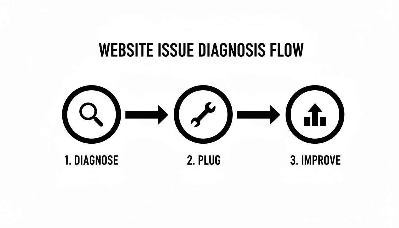
This three-stage approach—Diagnose, Plug, and Improve—creates a repeatable cycle that turns your website from a sunk cost into a powerful asset that generates predictable returns.
The Big Picture: Conversion rate optimization isn't about tricks or gimmicks. It's about building a clearer, more helpful, and more trustworthy experience for your visitors. When you make it genuinely easy for them to solve their problem, they reward you with their business.
We’re going to focus on the core principles of conversion from a business owner’s perspective, centered on clarity, trust, and creating a smooth path from visitor to customer. For a deeper look at turning site performance into real dollars, you can explore how to boost your profits by improving conversion rates.
Establishing Your Baseline: What the Data Is Really Saying
Before you touch a single button, you have to know where you stand. Trying to improve your website's conversion rate without data is like driving in a new city without a map—you'll just go in circles, wasting time and money.
The first step is a no-nonsense website audit. This isn't about becoming a data wizard overnight. It's about using free, powerful tools like Google Analytics to uncover the story your traffic is already telling you. Your website data holds the answers to critical business questions, but you have to know which questions to ask.
Think of it like a doctor diagnosing an illness before writing a prescription. We need to find the exact pain points before we can start fixing them.
Key Metrics That Actually Matter for Your Business
Forget vanity metrics like total site visits. We're zeroing in on the numbers that directly impact your bottom line. A solid audit should pinpoint your biggest opportunities by answering these questions:
- Where are visitors coming from? Knowing your traffic sources (Google search, Facebook, email newsletters) tells you which marketing channels are delivering qualified leads and which ones are sending tire-kickers.
- Which pages have the highest exit rates? If 80% of visitors leave from your main services page, that page has a serious problem. It’s failing to build trust or guide them to the next step, acting as a dead end in your sales funnel.
- What path are users taking through your site? Following the user journey reveals where people get stuck. Do they land on a service page and immediately go to your contact form? Or do they click around aimlessly and then leave? This shows whether your site's structure is intuitive or just plain confusing.
The most important piece of this puzzle is your conversion funnel—the sequence of steps a user takes to complete a goal, like filling out a quote request form.
If 100 people land on your contact page but only 5 actually submit the form, you have a 95% abandonment rate on that single step. That's a massive leak that needs to be plugged immediately. For a step-by-step guide to finding these leaks, check out our comprehensive website audit checklist.
This is where you'll find your low-hanging fruit—the problems you can fix quickly for the biggest impact.
Quick Wins vs. Strategic Overhauls
This table helps you decide what to tackle now versus what to plan for down the road.
| Area of Focus | Quick Win (Implement This Week) | Strategic Overhaul (Plan for This Quarter) |
|---|---|---|
| Call-to-Action (CTA) | Reword a button from "Submit" to "Get My Free Quote." | A/B test multiple CTA designs, colors, and placements across key pages. |
| Page Speed | Compress images on your slowest-loading page. | Migrate to a faster hosting provider or implement a Content Delivery Network (CDN). |
| Mobile Experience | Fix a form field that's hard to tap on a smartphone. | Redesign key landing pages with a "mobile-first" approach. |
| Messaging | Clarify the headline on your homepage to state the main benefit. | Rewrite all service page copy based on customer interviews and feedback. |
Focusing on a few quick wins first can often boost your conversion rate while you gather the resources for bigger projects.
Setting Realistic Benchmarks
So, what’s a "good" conversion rate? It depends entirely on your industry.
Across all sectors, the average website conversion rate is around 2.9%. But context is everything. An analysis on conversion rate benchmarks shows just how much this can vary.
High-consideration industries like real estate or automotive often see rates closer to 2% because the sales cycle is long. On the other hand, professional services can hit rates as high as 3.2% from paid search traffic, where user intent is much stronger.
The Takeaway: Don't get hung up on chasing an arbitrary number. The real goal is to understand your starting point and aim for consistent improvement. A jump from 1% to 2% might not sound like much, but you've just doubled the number of leads your website generates—without spending a single dollar more on ads.
By establishing this baseline, you move from guessing to making informed, data-backed decisions. You’ll know precisely which pages to fix first and have the numbers to prove the impact of every change you make. This is the foundation of a website that doesn't just exist—it performs.
Where to Start? Focus on High-Impact Fixes First
After digging into your data, you probably have a long list of things to improve. It's tempting to fix everything at once, but that's a surefire way to get overwhelmed and accomplish nothing.
The smart move is to apply the 80/20 rule. We're going to zero in on the 20% of fixes that will deliver 80% of the results. For most small business websites, a few common culprits are responsible for the biggest leaks.
Let's tackle the four most critical conversion killers: slow load times, a broken mobile experience, confusing messaging, and weak calls-to-action (CTAs). Nailing these will give you the biggest and fastest return on your effort.
Is Your Website Too Slow for Modern Customers?
Patience is a virtue most online visitors simply don't have. If your page takes more than a few seconds to load, they're gone. And they probably aren't coming back. A slow site doesn't just frustrate people; it subtly suggests your business is outdated or unreliable.
Every second matters. Research shows that a page load time jumping from just 1 second to 3 seconds can increase the probability of a visitor bouncing by 32%. You're losing a third of your potential customers before they even see what you offer.
- Check Your Speed: Run your site through a free tool like Google's PageSpeed Insights. It gives you a clear score and a punch list of technical issues, like massive images or clunky code, that are bogging you down.
- Invest in Good Hosting: We see this all the time. Cheap, shared hosting is a common bottleneck. Upgrading to a quality managed host is one of the best investments you can make for performance.
- Compress Your Images: Large, unoptimized images will kill your load times. This is often the biggest offender. Use a simple tool or plugin to shrink their file size without sacrificing much visual quality.
Fixing your site speed is non-negotiable. For a deeper dive, check out our guide on how to improve page load speed.
Does Your Site Actually Work on a Phone?
More than half of all web traffic now comes from mobile devices. If your website is a pain to use on a smartphone—forcing people to pinch, zoom, and struggle to tap tiny buttons—you are actively pushing away the majority of your audience.
A poor mobile experience is inexcusable. It immediately tells visitors you aren't keeping up.
The Reality Check: A website that isn't built for mobile first is telling over half its visitors, "We don't really care about your business." This is a massive, self-inflicted wound to your bottom line.
Do this right now: pull out your phone and go to your website. Can you easily read the text? Is the navigation thumb-friendly? Can you fill out your contact form without getting frustrated? If you answered "no" to any of these, you've found a top-priority fix.
Does Your Messaging Pass the 5-Second Test?
When someone lands on your homepage, you have about five seconds to answer three crucial questions in their mind:
- Where am I?
- What can I do here?
- Why should I stick around?
If your main headline is vague, stuffed with industry jargon, or just says "Welcome to Our Website," you've failed. Your core message—your value proposition—needs to be crystal clear and instantly communicate the main benefit you provide.
For example, a local auto shop's headline shouldn't be "Automotive Excellence Since 1998." A much better one would be "Honest, Reliable Car Repair in Menifee—Guaranteed." One is fluff; the other solves a real problem and builds immediate trust.
Are Your Calls-to-Action Actually Calling for Action?
Your Call-to-Action (CTA) is the button or link meant to guide a visitor to the next step. Yet so many businesses cripple their own efforts with vague, lazy CTAs like "Submit," "Learn More," or "Click Here." These are conversion killers because they create uncertainty.
A strong CTA needs to be specific, use an action verb, and clearly state the value. It tells the user exactly what will happen when they click.
| Weak, Generic CTA | Strong, Action-Oriented CTA |
|---|---|
| Submit | Get Your Free Quote Now |
| Learn More | View Our Project Gallery |
| Contact Us | Schedule Your 15-Minute Consultation |
The change is subtle but incredibly powerful. A strong CTA removes mental friction and gives the user the confidence they need to take that next step.
By focusing on these four areas first—speed, mobile, messaging, and CTAs—you're tackling the most common issues that stop websites from turning visitors into customers.
Designing a Customer Journey That Converts
A great website isn't just a collection of pages; it's a guided path. When someone lands on your site, they have a problem to solve. Your website's job is to anticipate their questions, answer them in a logical order, and make the next step feel natural.
This is the essence of mapping a customer journey. When you design this path with real empathy, your conversion rate will thank you. You stop making people hunt for information and start leading them directly to the solution.

Imagine a homeowner looking for a local contractor. Their mental checklist probably looks like this:
- Homepage: "Are they local? Can I trust them with my project?"
- Services Page: "Do they handle kitchen remodels specifically?"
- Gallery/About Page: "What does their work look like? Do they seem like reliable pros?"
- Contact Page: "Okay, I'm sold. How do I get a quote?"
Your website’s flow should mirror this thought process.
Structuring Key Pages for Clarity and Trust
Every page on your site has a job to do. If one fails, the journey stops, and you've lost a customer.
Your Homepage is your digital front door. It needs to answer three questions in five seconds: What do you do? Who do you help? Why should I choose you? A powerful, benefit-focused headline and a can't-miss call-to-action are non-negotiable.
The Service Pages are where you close the deal. Don't just list what you do—explain the value. For every service, cover:
- The specific problem you’re solving.
- Your process for solving it (this builds confidence).
- The clear, tangible result they can expect.
Finally, the Contact Page should be the easiest part of the experience. The goal is zero friction. Make getting in touch feel effortless, not like a tax form.
The Undeniable Power of Social Proof
Here’s a simple truth: people trust other people far more than they'll ever trust your marketing copy. That's what makes social proof—like reviews, testimonials, and case studies—one of your most powerful conversion assets.
But it’s not just about having reviews; it's about where you put them.
Strategically sprinkle testimonials throughout the customer’s journey.
- On the Homepage: Feature a strong, outcome-driven quote right under your main headline for instant credibility.
- On Service Pages: Add a testimonial from a customer who used that exact service. The relevance makes it incredibly persuasive.
- Near Contact Forms: A simple line like "Join 150+ happy clients" or a short, reassuring review can provide the final push someone needs.
To really nail this, you need to improve user experience beyond the basics. For a deeper dive into page structure, our guide on landing page design best practices lays out a detailed blueprint.
Fixing the Leaks for E-Commerce and Service Businesses
The friction points that kill conversions look a little different depending on your business model.
For e-commerce sites, the biggest leak is almost always the checkout process. Global e-commerce conversion rates are around 1.9%, but the best sites hit nearly 7%. The primary culprit for this gap? Cart abandonment, which sits at over 70%, often because of surprise shipping fees and convoluted checkout forms. The solution is simple: be upfront about all costs and make your checkout brutally efficient.
For service-based businesses, the leak is usually the contact form. We see it constantly—forms demanding a dozen mandatory fields that feel more like an interrogation than an inquiry.
The Golden Rule of Forms: Only ask for what you absolutely need to start the conversation. A name, email, phone number, and a message box are almost always enough. You can always get more details later.
By mapping out an empathetic customer journey, you guide visitors from being curious onlookers to confident buyers. You answer their questions before they ask and make it easy for them to say "yes."
Using Testing to Drive Long-Term Growth
A great website is never truly ‘finished.’ It should evolve based on what your real customers do, not on what you think they want. This is where testing comes in. It’s all about replacing guesswork with hard evidence.
This iterative approach is the engine of sustainable growth. By making small, informed improvements over time, you create a powerful compounding effect that steadily pushes your conversion rate higher. This is how a site goes from a static online brochure to a dynamic, lead-generating machine.

Demystifying A/B Testing for Business Owners
At its heart, A/B testing (or split testing) is simple. It’s a direct comparison between two versions of a webpage to see which one performs better. You show the original version ('A') to half your visitors and a modified version ('B') to the other half. Then you measure which one gets more conversions.
The golden rule? Only test one change at a time. If you change the headline, the button color, and the main image all at once, you’ll have no clue which element made the difference.
Let's take a local HVAC company as an example. Their main call-to-action button says "Contact Us." They have a hunch that something more direct might work better.
- Version A (Control): The existing button with "Contact Us."
- Version B (Variation): A new button that says "Request a Free Estimate."
After running the test, they discover that Version B gets 35% more clicks. Just like that, they’ve made a data-backed decision that will reliably generate more leads from the exact same amount of traffic. That’s the power of testing.
Creating a Simple Framework for Your Tests
You don't need expensive tools to get started. The process is straightforward and should always focus on results.
Here’s a simple framework:
- Start with a Hypothesis: Go back to your data. Where are people dropping off? Use that evidence to form a clear "if-then" statement. For example: "Changing our generic 'Submit' button to a benefit-driven 'Get My Free Quote' will increase form submissions because it clarifies the outcome for the user."
- Identify Your Metric: What specific action are you trying to improve? Is it clicks on a button? Form submissions? Phone calls? Define the one metric that will prove your test is a success.
- Run the Test: Use a tool to split your traffic. It’s crucial to let the test run long enough to achieve statistical significance—this just means the results aren’t a random fluke. For most small business websites, this means letting a test run for at least two to four weeks.
- Analyze and Implement: Once the test ends, the data will show a clear winner. Make the winning version permanent and, just as importantly, document what you learned. Every test, win or lose, teaches you something valuable about your customers.
What Should You Test First?
While you can test almost anything, some elements tend to pack a bigger punch. If you're wondering where to start, focus on these high-impact areas:
- Headlines and Value Propositions: Does your main headline immediately state the benefit you provide?
- Calls-to-Action (CTAs): Test the button text, color, size, and placement.
- Page Layout: Try moving your contact form higher up the page or placing testimonials right next to your service descriptions.
- Images and Videos: Does a real picture of your team build more trust than a generic stock photo? Run a test and find out.
For B2B services, lead generation conversion rates can range from 1.7% to an incredible 10.8%. That huge gap, much wider than in e-commerce, shows that targeted strategies and trust-building are paramount in high-value deals. You can learn more from an analysis of industry-specific conversion benchmarks.
The Takeaway: Continuous testing turns your website into a learning machine. Every small win stacks on top of the last, creating a powerful compounding effect that drives long-term, sustainable growth.
Common Questions About Improving Your Website Conversion Rate
When you start digging into conversion optimization, a few questions always pop up. We hear them all the time from business owners who are ready to turn their website traffic into actual revenue. Let's get right to it.
How Long Does It Take to See Conversion Rate Improvements?
It comes down to two things: the impact of your changes and the amount of traffic your site gets.
Simple, high-impact fixes—like clarifying a confusing headline or fixing a broken contact form—can show positive results within weeks, especially if you have a decent flow of visitors. For a site with a few thousand visitors a month, even a 0.5% bump in conversions becomes statistically clear in a short time.
Bigger projects, like a complete page overhaul, need more data and patience. A typical A/B test should run for at least two to four weeks to be sure the results are reliable. The goal isn't a one-off spike; it's steady, incremental growth over time.
Think of it like investing: consistent, small improvements made month after month are what build significant long-term returns. It’s a marathon, not a sprint.
What Is a Good Conversion Rate for a Local Service Business?
The internet says the average conversion rate is around 2.9%, but for local service businesses, that number is only part of the story. For lead generation—someone filling out a form or picking up the phone—a "good" rate can be anywhere from 3% to 8%, sometimes even higher.
A lot depends on your industry and traffic source. Someone who Googles "emergency plumber near me" is ready to buy and will convert at a much higher rate than someone who lands on your blog from Facebook.
Traffic from paid search ads, which targets high-intent keywords, often converts at 3-5% or more because the person is actively searching for a solution right now. At Uncommon Web Design, our goal is to get our clients well above these benchmarks. If your rate is sitting below 2%, that’s a sign there’s a massive opportunity waiting to be unlocked.
Can I Do This Myself or Should I Hire an Agency?
You can absolutely get started on your own. In fact, you should.
Working through the steps in this guide—auditing your analytics, fixing obvious problems like slow page speed or clunky messaging—can make a real difference. Many business owners find early wins by focusing on these fundamentals. The value of bringing in a partner like us boils down to deep expertise and efficiency.
We’ve run hundreds of tests across dozens of industries, so we have a good idea of what works for businesses like yours. That experience helps you skip costly mistakes and wasted time. We also have the professional tools to diagnose tricky user experience problems and implement the technical fixes that make it all work seamlessly.
It's like this: you can change your car's oil, but you’d call a mechanic to rebuild the engine. If you want to turn your website into a reliable growth engine for your business, a dedicated partner makes sure it’s done right.
Your website should be your best salesperson, not just a digital brochure. If you're ready to stop guessing and start building a high-performing website that drives real growth for your business, we can help. At Uncommon Web Design, we build conversion-focused websites that turn your traffic into customers.


