
If your website gets visitors but isn't bringing in calls, quote requests, or sales, it's not just underperforming—it's actively costing you money. The good news is that this is a fixable problem.
Improving your website's conversion rate is the process of turning more of your visitors into customers. It’s about methodically finding why people are leaving your site without taking action, and then making smart, data-backed changes to your design, messaging, and user experience to fix the issues.
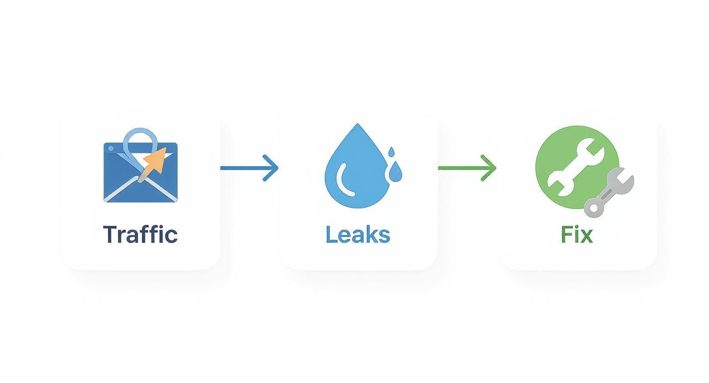
Your Website Is a Leaky Bucket—Here’s How to Fix It
Let's be blunt: if your website gets traffic but doesn’t generate leads or sales, it's not a business asset. It's an expensive digital brochure. You're paying for hosting, content, and maybe even ads, all to bring people to a digital front door they never walk through. This is where so many business owners get stuck—with a website that’s a passive placeholder instead of a 24/7 salesperson.
Learning how to improve your site's conversion rate isn’t about marketing jargon. It’s about finding and plugging the leaks where you're losing potential customers and revenue. This process, known as conversion rate optimization (CRO), provides a framework to make your website work harder for your business. You stop guessing and start using data to make decisions that actually drive growth. To get started, you'll want to implement a modern conversion optimization strategy.
Why Your Website Is Losing You Money
We think of a website as a bucket. All your marketing—SEO, social media, ads—is the water you're pouring in. But if that bucket is full of holes, most of that effort just leaks right out.
A "pretty" website that doesn't convert is like a flashy car with no engine. It looks great, but it won't take your business anywhere. The goal is to build a high-performance machine that turns interest into action.
Those leaks are the friction points on your site: a confusing navigation menu, a page that takes forever to load, or a contact form that asks for too much information. Each one is a chance for a potential customer to get frustrated, give up, and go straight to your competitor.
This diagram breaks down the simple but powerful idea of identifying your traffic sources, finding the leaks, and applying the right fixes.
The key takeaway is that the solution isn't always about getting more traffic. It's about getting more from the traffic you already have. By focusing on fixing these leaks, you stop wasting your marketing budget and start seeing a real return on your investment.
Where to Find Your First Easy Wins
Ready to get started? Here’s where you can find the biggest opportunities for improvement right away. Focusing on these areas typically gives you the most bang for your buck.
| Focus Area | Why It Matters for Your Business | Your First Action Step |
|---|---|---|
| Call to Action (CTA) | The CTA is the final step before a lead or sale. If it's weak or unclear, you're losing customers at the finish line. | Review your main CTA button. Is the text specific (e.g., "Get a Free Quote" vs. "Submit") and does its color stand out? |
| Above-the-Fold Content | This is the first thing visitors see. It must instantly answer, "Am I in the right place?" and "Why should I stay?" | Look at your main headline. Does it clearly state the value you provide your customer in 5 seconds or less? |
| Mobile Experience | Over 50% of your customers are likely on a phone. A clunky mobile site is like having a broken front door. | Open your site on your phone. Can you easily tap the buttons and read the text without pinching and zooming? |
| Page Load Speed | Slow pages kill sales. Every extra second of load time is another reason for a visitor to leave and go to a competitor. | Run a free speed test using Google PageSpeed Insights to see where you stand and find what's slowing you down. |
This table isn't exhaustive, but it's a solid starting point. Nail these fundamentals, and you'll already be ahead of most of your competition.
Find the Leaks in Your Sales Funnel with Data
Making changes to your website without data is like driving blindfolded. You might get somewhere, but you’ll probably cause more damage than you fix. Before you change a headline or a button color, you need to understand what’s actually broken.
This isn't about becoming a data scientist. It's about using free, powerful tools to see how real people behave on your site. Guesswork is expensive; a data-first approach means you focus your time and money on fixes that will actually move the needle.
Think of your website like a physical store. You wouldn't want customers getting lost on their way to the register. Your website has a similar path, and right now, potential customers are getting stuck and leaving. Our job is to find out exactly where that’s happening.
Start with the Right Tools
You don’t need a huge budget for this. The single most powerful tool is likely already on your site: Google Analytics 4 (GA4). If it’s not set up, that is your absolute top priority. GA4 is like having security cameras all over your website, showing you where people come from, what pages they visit, and—most importantly—where they leave.
Another fantastic tool is a heatmap. Services like Hotjar or the free Microsoft Clarity create a visual map of where users click, move their mouse, and how far they scroll. This gives you an immediate understanding of what grabs their attention and what they're completely ignoring.
Identify Your High-Traffic Drop-Off Points
Your first mission is to find the pages that act like roadblocks. In GA4, you can explore user path reports to see the journey visitors take through your site. Pay close attention to pages with a high exit rate. This metric shows you the last page someone saw before they gave up.
Imagine you run a local contracting business. You look at your data and see that 90% of visitors who land on your "Request a Quote" page leave without filling out the form. That’s not a traffic problem; it’s a page problem. You’ve just found a massive leak.
Finding a high-exit page isn't a failure—it's a massive opportunity. You've just pinpointed the exact spot where a small improvement can lead to a significant increase in leads or sales.
Once you’ve found these problem pages, use heatmaps to dig deeper. Are people trying to click on an image that isn't a link? Are they completely scrolling past your contact form? The data will tell you the story.
Set Up Simple Conversion Goals
You can’t improve what you don’t measure. A conversion goal is simply you telling Google Analytics what a "win" looks like for your business. It's the key action you want visitors to take.
Your goals should be tied directly to real business outcomes. For example:
- For a service business (auto shop, dental office): A submitted contact form, a click-to-call, or a booked appointment.
- For an e-commerce store: A completed purchase, an item added to the cart, or a newsletter signup for a discount.
Setting up goals lets you see which marketing channels (Google search, Facebook ads, etc.) are actually bringing you valuable customers. You might discover that while Facebook sends a lot of traffic, visitors from Google are three times more likely to request a quote. That's a powerful insight that tells you exactly where to focus your efforts.
This diagnostic phase is the foundation of boosting your website's conversion rates. If you want a structured way to go through these elements, our comprehensive website audit checklist provides a clear roadmap for identifying these crucial data points. It’s all about building a foundation of facts, so every change you make is strategic, not speculative.
Build Trust and Clarity with Strategic Design and Copy
You’ve dug into the data and found the leaky spots in your funnel. Now it's time to fix them. When it comes to persuading visitors to take action, your two biggest levers are strategic design and clear, compelling copy. They work together to build trust and prove to visitors they’re in the right place.
Many business owners think website design is just about making things look pretty. That’s a mistake. The real job of your website's design is to build instant credibility. Your visitors are smart and skeptical. They form an opinion about your business in milliseconds. A clean, professional, and intuitive layout immediately signals that you're a legitimate operation that cares about the details.

Write Headlines That Solve Problems
Your copy is the conversation you have with your potential customer. Forget clever taglines and confusing industry jargon. Your headlines need to speak directly to your visitor's problems and show them a clear path to a solution.
Think about a local plumber. A headline like "Local Plumbing Services Since 1998" is fine, but it doesn’t solve an urgent problem. Now, consider this: "Fast, Reliable Emergency Plumber—We’ll Be There in 60 Minutes." That headline connects instantly with someone whose kitchen is flooding. It zeros in on their pain point (urgency) and offers a concrete solution (a fast response). That’s how you grab attention and show value.
Your website copy should act like your best salesperson. It needs to anticipate questions, soothe anxieties, and make visitors feel confident they've found the right answer.
Writing great website copy is a skill that blends customer psychology with straightforward communication. To dive deeper, we've put together a guide on how to write website content that turns browsers into buyers.
Create Calls to Action That Are Impossible to Ignore
Every page on your website needs to guide the visitor to the next step. That's the job of your Call to Action (CTA). A weak or generic CTA like "Submit" or "Learn More" creates hesitation. A great CTA, on the other hand, is specific, action-oriented, and lowers any perceived risk for the user.
Let's look at the difference:
-
Generic CTA: "Contact Us"
-
Better CTA: "Get Your Free, No-Obligation Quote"
-
Generic CTA: "Sign Up"
-
Better CTA: "Start Your 30-Day Free Trial"
The better versions work because they tell the user exactly what happens next and highlight a clear benefit (it's free, there's no risk). Your CTA button also needs to stand out visually. Use a contrasting color to make it the most obvious clickable element on the page. For a masterclass on this, check out this best practice landing page guide.
Let Your Happy Customers Do the Selling for You
One of the quickest ways to build trust is to let other people sing your praises. This is called social proof, and it's incredibly powerful. When a new visitor sees that others have had a great experience with you, it eases their anxiety and validates their decision to stick around.
You can weave social proof into your site in a few smart ways:
- Customer Testimonials: Feature quotes from real clients. Adding their name and photo makes them even more credible. We like to place these right next to a CTA to give people that final nudge.
- Case Studies: Tell a simple before-and-after story of how you helped a customer solve a problem. This is pure gold for service-based businesses.
- Reviews and Ratings: Pull in your star ratings from Google, Yelp, or other industry review sites. It's a quick, objective stamp of quality.
Customer reviews are especially powerful. One study found that when visitors interact with customer-generated content, the conversion rate can increase by over 100%. Why? Because it feels more authentic and trustworthy than anything you could ever write about yourself.
Eliminate Friction from Your Forms and Checkout
I’ve seen it happen countless times: a business does everything right to get a visitor to the final step, only to lose them because of a clunky, frustrating form. Nothing kills a potential sale or lead faster. This is a massive money-leak for many companies, and the worst part is, it's not because the customer wasn't interested—it's because you made the process too difficult.
Think of your contact form or checkout page as the final handshake. If you make it awkward, the deal can fall apart. Every unnecessary field, confusing label, and poorly placed error message adds friction. Our job is to sand down those rough edges until the experience is completely seamless.

Simplify Your Contact and Quote Forms
If you run a service business—whether you’re a contractor, a consultant, or an auto shop—your "Request a Quote" form is your digital cash register. Make it easy to use, and you'll get more leads. It's that simple. Yet, studies show that nearly 27% of users will abandon a form just because it's too long or confusing.
Here are the most common mistakes we see, and how to fix them:
- Asking for too much, too soon. Do you really need to know a company's annual revenue to provide a basic landscaping quote? Probably not. Stick to the absolute essentials you need to start a conversation: name, email, phone, and a message box.
- Using vague field labels. A field simply labeled "Request" is confusing. Change it to something clear and action-oriented, like "How can we help?" or "Tell us about your project."
- Hiding error messages. When someone makes a mistake, the error message should appear right next to the field in question, in a bright, obvious color. Don't make them hunt for what they did wrong.
A great form feels less like an interrogation and more like the start of a helpful conversation. The goal is to make it feel effortless, removing any reason for a potential customer to second-guess hitting "submit."
Treat every field on your form as a small cost to the user. Is the information you're asking for really valuable enough to risk them leaving? If not, get rid of it.
Streamline the E-Commerce Checkout Experience
For anyone selling products online, the checkout is where the money is made or lost. The average cart abandonment rate hovers around 70%, and a difficult checkout is one of the biggest reasons why. You’ve already done the hard work of getting a product into their cart; don't fumble the ball on the one-yard line.
Here’s your tactical checklist for building a checkout that converts:
- Offer Guest Checkout. Forcing people to create an account is a notorious conversion killer. Always provide a "Checkout as Guest" option. You can ask them to create an account after the purchase is complete.
- Show a Progress Indicator. A simple visual bar showing "Shipping > Payment > Review" reduces user anxiety. It tells customers exactly where they are and how much is left.
- Provide Multiple Payment Options. Don't assume everyone uses a credit card. Integrating trusted, one-click options like PayPal, Apple Pay, or Google Pay can give your conversion rate a serious boost.
- Keep It All on One Page (If Possible). A single-page checkout almost always performs better than a multi-step process. It feels faster and less intimidating.
By removing these common roadblocks, you make it as easy as possible for customers to give you their money. Every piece of friction you eliminate directly contributes to a higher conversion rate.
The High Cost of a Slow Website
In a world where attention spans are measured in seconds, your website's speed isn't just a technical detail—it's your digital customer service. A slow, clunky website doesn't just frustrate visitors; it actively bleeds money by telling potential customers you don't value their time. If you’re serious about improving conversion rates, speed is non-negotiable.
Think of it this way: a customer walks into your brick-and-mortar store, and you ignore them for five solid seconds. They’d be out the door in a flash. Your website is no different. Every fraction of a second a user waits for your page to load is another moment they could be clicking over to your competitor.

Why Every Second Counts for Conversions
The link between speed and revenue isn’t a theory; it's a rule backed by massive amounts of data. Walmart famously found that for every 1-second improvement in load time, they saw conversions jump by 2%. That’s a staggering return for what seems like a small technical tweak.
This isn’t just an e-commerce problem. Imagine you run a local garage. A potential customer is stranded on the side of the road, searching for help on their phone. They aren’t going to wait ten seconds for your mobile site to load. They’ll hit the back button and call the next shop on the list—the one that loaded instantly.
Speed isn't a feature; it's a prerequisite for trust. A fast website feels professional and reliable. A slow one feels broken and untrustworthy, creating doubt right when you need to be building confidence.
This is exactly why Google now uses Core Web Vitals as a ranking factor. They know that snappy, stable websites provide a better user experience, and they reward those sites with more visibility in search results.
Practical Steps to a Faster Website
You don't need to be a coding expert to get a handle on this. It's about knowing what to prioritize. Here’s where to start:
- Compress Your Images: Huge, unoptimized images are the #1 cause of slow websites. Modern tools can shrink file sizes dramatically without sacrificing visual quality. Your photos should look sharp, not act like digital anchors.
- Invest in Quality Hosting: Cheap, shared hosting is like building your business on a swamp. It's slow and can't handle traffic spikes. Investing in one of the best managed WordPress hosting providers is one of the smartest moves you can make for speed and security.
- Keep Your Site Lean: Piling on too many plugins, flashy animations, or third-party scripts can grind your site to a halt. Every element you add should serve a clear purpose for the user.
Your Mobile Experience Is Your Real First Impression
Let's be clear: optimizing for mobile isn't just an option anymore—it's everything. With well over half of all web traffic now coming from smartphones, your mobile site is your website for the majority of your visitors.
If your site is a pain to navigate, hard to read, or slow to load on a phone, you're effectively closing your doors to most of your potential customers. A truly responsive design flows perfectly on any screen. Buttons must be easy to tap with a thumb, forms have to be simple to fill out, and no one should have to pinch and zoom to read your text.
If a user has to work to use your site on their phone, you've already lost. Making your site fast and effortless on mobile is one of the most direct and impactful ways to boost your overall conversion rate.
Frequently Asked Questions About CRO
When you start digging into conversion rate optimization, a few questions always come up. Here are the most common ones we hear from business owners.
What Is a Good Website Conversion Rate?
This is the big one, and the honest answer is… it depends entirely on your industry and business model. A "good" conversion rate for a local plumber getting quote requests is worlds away from what an e-commerce brand considers a success.
You might see a global average thrown around—something like 2.9%—but that number is mostly trivia. It’s not a useful benchmark for your business. For instance, a high-intent local service business could realistically hit 6%, while a fashion store might be thrilled with 2%.
The only "good" conversion rate that matters is one that's better than what you had last month. Focus on your own progress, not on chasing a generic industry number.
Your first move is to figure out your own baseline. Once you know where you stand today, your real goal is to consistently beat your previous performance. That’s how you build real momentum.
How Long Does It Take to See CRO Results?
This isn't an overnight fix, but you won’t have to wait a year, either. The timeline depends on the scale of the change and the amount of traffic your website gets.
Simple, high-impact fixes can deliver results quickly. If you fix a broken contact form or clarify a confusing headline on a key page, you could see a jump in leads within a few days—as long as you have enough visitors to notice the difference.
Bigger changes, however, require more patience. If you're A/B testing a completely redesigned product page, you need to let the test run. A trustworthy test typically needs at least 2 to 4 weeks to collect enough data for a statistically significant result.
The key is to think of CRO as a process, not a project. It’s a continuous cycle of testing, learning, and refining how your website serves your customers.
Should I Redesign My Whole Website to Improve Conversions?
It's a tempting thought: scrap it all and start fresh. But this is usually the wrong move—and a very expensive one. A full redesign is a massive project that can easily backfire if you unknowingly get rid of elements that were actually working well.
A much smarter and safer approach is to be iterative. Use diagnostic tools like Google Analytics and heatmaps to find the specific pages or elements that are underperforming.
Start there. Make small, targeted changes you can measure:
- Tweak the headline on your most popular service page.
- Test a new color and text on your main call-to-action button.
- Remove a couple of non-essential fields from your lead form.
This methodical approach lets you see the direct impact of every change. You’ll learn exactly what your audience responds to, building a foundation of proven improvements. A full redesign should only be considered if your site has deep, systemic problems—like it’s broken on mobile, has severely outdated branding, or is built on ancient technology that can’t be salvaged with smaller fixes.
Ready to stop guessing and start turning your website into a reliable growth engine? The team at Uncommon Web Design has over 25 years of experience building high-performing websites that turn traffic into measurable revenue. We help you find the leaks in your funnel and implement a clear strategy to drive more leads and sales.
Book a no-obligation consultation today to see how we can help you achieve your business goals. Visit us at https://uncommonwebdesign.com.


