
Your website should be your hardest-working salesperson. But if it’s missing the right ingredients, it’s just a pretty (and expensive) digital brochure. We're talking about the core elements of conversion—the specific things on your site that turn casual browsers into paying customers. This is what separates a website that costs you money from one that makes you money.
Your Blueprint for a High-Converting Website
Think about it. You’re investing in ads, SEO, and social media to get people to your website. But what happens when they land there? For too many businesses, the answer is… nothing. They click, look around for a few seconds, and leave. That’s a bounce, and it means you’re paying for traffic that disappears instantly. It's like pouring water into a leaky bucket.
This isn't about adding flashy animations. It's about strategic clarity. A website built to convert works like a well-oiled machine, guiding visitors from their first moment of curiosity straight through to a confident purchase. Each element plays a crucial part in building trust, showing your value, and making it dead simple for a customer to say "yes." Without these key pieces, your marketing efforts hit a dead end.
To stop that leak, you need to get two things right: how you get people to your site (traffic generation) and what you do with them once they arrive (on-page conversion). When you nail both, like in these Facebook ad examples that convert, your website finally starts working for you. It becomes a reliable engine for growth.
From Visitor to Customer
The entire goal is to create a clear, simple path that moves people through what’s called the conversion funnel. They start as anonymous visitors, become interested leads, and finally turn into happy customers. This visual shows you exactly what that journey looks like.
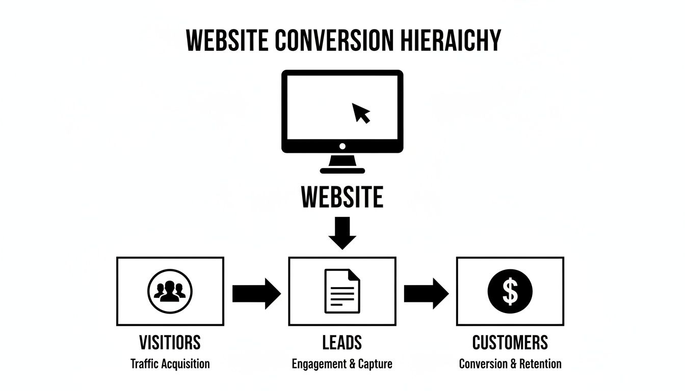
As you can see, every visitor is a potential lead, and every lead is a potential customer—but only if your website does its job guiding them from one stage to the next.
When you focus on these elements, you stop leaving money on the table. You build a system that turns clicks into actual, measurable business results. For any business owner tired of a website that doesn't pull its weight, understanding these principles is the first step toward building a true digital asset.
If you notice people leaving your site almost as soon as they arrive, you’ll want to learn more about how to reduce website bounce rate to keep them engaged longer.
So, let's break down the 9 non-negotiable elements you need to have in place.
The 9 Core Elements of Conversion at a Glance
Here’s a quick summary of the essential ingredients your website needs to effectively convert visitors into customers. Think of this as your high-level checklist before we dive into the details of each one.
| Element | What It Does | Why It Matters for Your Business |
|---|---|---|
| Value Proposition | Clearly answers, "Why should I buy from you?" | Differentiates you from competitors and grabs attention in seconds. |
| Call to Action (CTA) | Tells visitors what to do next. | Guides users toward the conversion goal, like "Buy Now" or "Get a Quote." |
| Trust Signals | Builds credibility and makes visitors feel safe. | Overcomes skepticism with things like reviews, awards, and security badges. |
| Page Speed | How fast your website loads. | Prevents visitors from leaving out of frustration. A slow site kills conversions. |
| User Experience (UX) | The overall feeling of using your website. | An easy, intuitive site keeps people engaged and moving toward a purchase. |
| Forms | The tool for capturing leads or information. | Simple, frictionless forms increase sign-ups and reduce abandonment. |
| Visuals | Images, videos, and graphics. | Communicates value quickly and emotionally, making your offer more compelling. |
| Social Proof | Shows that other people trust your brand. | Uses testimonials and case studies to build confidence and reduce risk. |
| Targeting & Personalization | Tailoring content to specific visitor segments. | Makes the experience more relevant, leading to higher engagement and sales. |
Getting these 9 elements right is the foundation of a website that doesn't just look good—it gets results. Now, let’s explore what each one means for your business.
What's in It for Them? And What's Next?
Before anyone glances at your services or pricing, their brain is firing off two critical questions: “What’s in it for me?” and “What do you want me to do?” If you don't have clear, immediate answers, they're gone. It's that simple.
This is where the two most foundational elements of conversion come into play: your Value Proposition and your Call to Action (CTA). Nailing these isn’t just good practice—it's the bedrock of a website that actually brings in business. Everything else we cover is built on this core promise and a clear, simple ask.

The Promise: Your Value Proposition
Think of your value proposition as your elevator pitch, boiled down to a single, powerful sentence. It’s the tangible result a customer gets from choosing you, and just as importantly, why they should pick you over the competition.
This isn't a fluffy marketing slogan. It’s a direct, clear-cut explanation of the specific value you deliver, aimed squarely at your ideal customer's biggest headache.
Your value proposition is the number one thing that determines if a visitor sticks around or hits the back button. It needs to be front and center, usually as the main headline on your homepage.
For example, a local HVAC company could have a weak value proposition like, “Quality Heating and Cooling Services.” It's forgettable because everyone says it. A much stronger one would be: “Same-Day AC Repair. We Get Your Home Cool Again in Hours, Not Days.” See the difference? It’s specific, it’s focused on the outcome, and it solves an urgent problem. For more help crafting compelling promises like this, check out our guide on how to write website content.
To dial in your own value proposition, start by asking these three questions:
- What specific problem do we solve? Don’t be vague. Instead of “we fix cars,” try “we specialize in transmission repairs that save you from buying a new car.”
- What are the measurable benefits? Can you quantify the results? Do you save clients 10 hours a week? Do you help them increase sales by 20%?
- What makes us the obvious choice? Pinpoint your unique edge. Is it your speed, your rock-solid guarantee, your one-of-a-kind process?
The answers to these questions are the building blocks for a value proposition that grabs attention and makes a potential customer feel like you truly get them.
The Ask: Your Call to Action (CTA)
Once you've made a compelling promise, you have to tell people exactly what to do next. That's the entire job of your Call to Action (CTA). It’s the "ask" that logically follows the "promise." A CTA is usually a button or a link using action-oriented words that guide the user toward your end goal.
A confused mind always says no. Without a clear CTA, visitors are left to wander. They might love your value proposition, but if they can't figure out the next step, they'll just leave.
Great CTAs are impossible to miss. They should pop visually and use language that’s crystal clear.
- Vague CTA: “Learn More”
- Powerful CTA: “Get Your Free Quote Now”
The second one works so much better because it’s specific, it creates a sense of immediacy (“Now”), and it offers tangible value (“Free Quote”). The words you choose matter immensely and should tie directly back to the value proposition on the page.
If your page explained how your accounting software saves businesses time, the CTA shouldn’t just say “Sign Up.” It should say “Start Saving Time Today.” This simple alignment between the promise and the ask is one of the most overlooked yet powerful elements of conversion you have at your disposal.
Building Unshakable Trust and Credibility
Okay, so you've nailed your value proposition and have a clear call to action. You've made your promise and your ask. Now comes the biggest hurdle: getting people to actually believe you.
In the real world, a firm handshake and a confident smile can go a long way. Online, your website has to do all that heavy lifting on its own. People are naturally skeptical—we’ve all been burned by companies that overpromise and underdeliver. Your job is to systematically dismantle that skepticism with overwhelming proof that you're the real deal. This is where trust becomes one of the most powerful elements of conversion.

Let Your Customers Do the Selling
Here’s a secret: the best way to build credibility isn't by talking about how great you are. It’s by letting your happy customers do it for you.
This is the incredible power of social proof. It’s based on a simple human truth: we trust other people way more than we trust marketing messages. When a potential customer sees that others just like them have already chosen you and had a fantastic experience, their sense of risk plummets. It makes the decision to move forward feel safe, smart, and validated.
Effective social proof isn't just a nice-to-have; it's a core business asset. For a small business, these types are the most impactful:
- Testimonials and Reviews: Quotes from happy clients are pure gold. Always use their full name and city (with their permission, of course) to make them feel genuine. Even better? Pull in live reviews directly from Google or Yelp.
- Case Studies: A short story that walks a visitor through a customer's problem, your solution, and the amazing result is incredibly persuasive. It lets a new lead see the exact journey they’re about to take with you.
- Client Logos: If you serve other businesses, especially well-known local ones, displaying their logos instantly positions you as a trusted partner in the community.
Try placing these elements strategically near your calls to action. You'll be amazed at the difference it makes.
Signaling Safety and Professionalism
Beyond customer stories, your website needs to send constant, subtle signals that you're a legitimate, trustworthy operation. We call these trust signals, and they often work on a subconscious level to make visitors feel secure.
Think of it like walking into a physical store. A clean, well-lit space with professional signs puts you at ease. A dark, messy shop makes you want to bolt for the door. Your website creates the exact same impression online.
A professional website isn't just about looking good. It’s about signaling to potential customers that you are a serious, reliable business they can count on.
Some of the most common—and non-negotiable—trust signals include:
- Professional Contact Info: A clear phone number, physical address, and a professional email (not a generic Gmail account) are essential.
- Security Badges: Displaying logos for things like your SSL certificate (the little padlock in the browser bar) or secure payment processors like Stripe instantly tells visitors their data is safe.
- Industry Certifications & Affiliations: Logos from the Better Business Bureau, your local Chamber of Commerce, or any trade associations signal expertise and accountability.
These details might seem small, but together, their effect is huge. They quietly remove friction and erase doubt from the decision-making process.
Show, Don't Just Tell, With Visuals
Finally, let's talk about photos and videos. They are critical trust-building tools. But please, step away from the generic stock photos of smiling models in a boardroom. They do more harm than good, signaling that you aren't a real company with real people.
Authentic visuals are your best friend. High-quality photos of your actual team, your workspace, and your finished projects create an immediate human connection. For a contractor, this means crisp photos of that stunning kitchen remodel. For a dental office, it’s a warm, inviting picture of the real staff who will greet patients.
These visuals prove you do what you claim you do. They make your business tangible and relatable, turning a faceless company into a group of people a customer can trust. Industries like food and beverage (7.9%) and legal services (7.4%) lead the pack in conversions, proving that compelling visuals and strong trust signals translate directly into more business. You can explore more industry conversion benchmarks to see how you stack up.
Ensuring a Flawless Customer Journey
You’ve nailed your message and built some serious trust. Fantastic. But all that hard work can evaporate in an instant if the actual experience of using your site is clunky, slow, or just plain frustrating. The technical nuts and bolts of your website are every bit as important as the promises you make. A confusing journey will send people straight to your competitors. I’ve seen it happen time and time again.
This is where we get into the mechanics of what makes a website convert. Think of it like a high-performance engine. It doesn't matter how slick the car looks if the engine sputters and dies. These next three elements of conversion—Page Speed, User Experience, and Forms—are what make the customer's journey smooth, fast, and effortless.

Speed Isn't a Feature; It's a Requirement
In our world, patience is measured in milliseconds. If your website takes more than a couple of seconds to pop up, a massive chunk of your audience is already gone. Page speed isn't a "nice-to-have"; it’s a foundational conversion element. Even a one-second delay can torpedo your conversion rates.
For a local business running Google Ads, this means you're literally paying for clicks from people who never even see your offer. With more than half of all web traffic coming from mobile, a slow site is a disaster. Studies show you can lose 53% of visitors if your site takes longer than three seconds to load. For a closer look at the data, you can explore how page speed impacts conversions.
Think of a slow website like a physical store with a locked door during business hours. A potential customer might jiggle the handle once, but they won't stand around waiting. They'll just go next door.
Boosting page speed usually comes down to a few key actions we prioritize for our clients:
- Optimizing Images: Huge, uncompressed image files are the number one killer of website speed. We ensure every visual is sized correctly and compressed for the web.
- Choosing Quality Hosting: Cheap, shared hosting is a false economy. It's often slow and unreliable. Investing in performance-tuned hosting is one of the single best moves you can make for consistent speed.
- Minimizing Code: A bloated theme or an army of plugins can drag a website to a halt. We focus on clean, efficient code that delivers a snappy experience.
Make Your Website Effortless to Use
Once your site loads in a flash, the next question is: can visitors easily find what they're looking for? This is the heart of User Experience (UX). Great UX feels intuitive, logical, and simple to navigate. Poor UX, on the other hand, creates friction and frustration—and those are absolute conversion killers.
Imagine a homeowner frantically searching for an emergency plumber. They land on your site, but your phone number is buried three clicks deep. They're not going to stick around and play detective. They’ll bounce and find a competitor whose number is plastered right at the top of the page.
A solid user experience is built on clarity and simplicity. This means a logical site structure with a clear navigation menu, readable fonts with plenty of white space, and, most importantly, a design that works perfectly on a mobile phone. A mobile-unfriendly website today is basically telling half your potential customers you don't want their business.
Stop Making People Hate Your Forms
Finally, let’s talk about forms. Whether it’s a contact form, a quote request, or a checkout page, this is often the final hurdle before a visitor becomes a real lead or customer. It's the moment of truth. And yet, so many businesses turn their forms into a painful, tedious chore.
A long, complicated form with too many fields is one of the fastest ways to lose someone. Every extra box you ask them to fill out is another opportunity for them to give up and leave. Does your auto shop really need a potential customer's fax number to schedule an oil change? I'm guessing not.
The goal is to make your forms as frictionless as possible. Here’s how:
- Keep it simple: Only ask for the absolute minimum information required to take the next step. You can always gather more details later on.
- Use clear labels: Don't make people guess what information goes in which field.
- Provide helpful error messages: If someone messes up, tell them exactly what’s wrong and how to fix it without forcing them to re-enter everything.
By making sure your website is fast, easy to navigate, and simple to interact with, you remove the technical roadblocks that stand between a curious visitor and a paying customer.
Using Personalization to Boost Relevance
Once you have a solid foundation, you can start exploring the more advanced strategies that truly separate high-converting websites from the rest. This is where we get into Targeting and Personalization—the art of showing the right message to the right person at just the right moment.
Think about it. A visitor who lands on your site from a Google Ad for "emergency plumbing services" is in a completely different headspace than someone who clicked a link in your monthly email newsletter. The first person is in crisis mode; they need a phone number and immediate reassurance. The second is already warmed up to your brand and might be interested in a preventative maintenance special.
Personalization means you stop treating everyone the same. You stop shouting a generic message and start having a one-on-one conversation that’s actually relevant to them.
Speaking Directly to Your Visitors
This might sound like something only massive corporations can pull off, but modern tools have made it accessible for just about any business. You can personalize key parts of your website based on simple things like where a visitor is located, how they found you, or what they've looked at before.
This level of relevance is a huge conversion driver because it makes people feel seen and understood.
Here are a few ways this plays out in the real world:
- Geographic Targeting: A landscaping company could show different hero images or testimonials to visitors from different towns in their service area. Someone in Temecula sees a project from Temecula, making the connection instant and local.
- Traffic Source Personalization: Imagine showing a unique discount code only to visitors who clicked through from a specific Instagram ad. It makes that campaign feel more exclusive and compelling.
- Behavioral Content: If a user has visited your "commercial roofing" page three times, your website could automatically feature a case study about a local business you helped.
This turns your website from a static, one-way brochure into a dynamic salesperson that intelligently adapts its pitch to the person it’s talking to.
Personalization is about acknowledging that not all visitors are the same. By tailoring the experience, you shorten the distance between their problem and your solution, making it much easier for them to say "yes."
This isn't futuristic stuff anymore; it’s a practical strategy that gets results. In fact, AI-driven personalization is a game-changing element of conversion, with some studies showing it can lift rates by as much as 30% by serving up tailored recommendations.
Take the bakery Goldelucks, for instance. They saw a massive 31.56% jump in orders after they started using AI-powered optimizations on their site. You can dig into similar stats in this breakdown of e-commerce benchmarks.
The data is clear: making your marketing more relevant directly makes it more effective. When you move beyond a one-size-fits-all approach, you meet customers where they are and create a far more persuasive journey.
Now that we’ve broken down all nine essential conversion elements, it’s time to put this knowledge to work on your own site.
Use this simple checklist below to do a quick audit. It's designed to help you spot the low-hanging fruit—the areas where a few small tweaks could make a big difference in your conversion rates.
Your Website Conversion Element Checklist
Use this checklist to audit your own website and identify areas for immediate improvement.
| Conversion Element | What to Check | Your Next Action Step |
|---|---|---|
| Value Proposition | Is your core promise clear and compelling on your homepage? | |
| Call-to-Action (CTA) | Are your CTAs specific, visible, and action-oriented? | |
| Trust Signals | Do you display reviews, certifications, or testimonials prominently? | |
| Page Speed | Does your site load in under 3 seconds on mobile? | |
| User Experience (UX) | Is your navigation intuitive and easy to use? | |
| Forms | Are your contact forms short, simple, and mobile-friendly? | |
| Visuals | Are your images and videos high-quality and relevant? | |
| Social Proof | Do you showcase customer logos, case studies, or user counts? | |
| Personalization | Could you tailor content based on location or traffic source? |
Go through each row and be honest with yourself. Jot down one simple, concrete action you can take for each element that needs work. You'll be surprised how quickly these small, targeted improvements can add up to a major boost in leads and sales.
How to Measure and Improve Your Conversion Rate
Knowing the essential elements of conversion is one thing. Actually using them to get more customers is another. You can't improve what you don't measure, and flying blind is a surefire way to burn through your time and budget.
To make any real progress, you need a simple framework for tracking what's working and making decisions based on data, not just a gut feeling. This approach takes the emotion out of the equation and lets the results do the talking. The idea is to build a continuous feedback loop: analyze, hypothesize, test, and repeat.
Start with the Right Metrics
Before you can start improving, you need to know your numbers. It’s easy to get lost in an ocean of data, but for a business owner, only a handful of metrics truly matter when it comes to conversions.
- Conversion Rate: This is your north star. It’s simply the percentage of visitors who do what you want them to do (like buy a product or fill out a form). If you have lots of traffic but a tiny conversion rate, something is broken in your website's message or flow.
- Bounce Rate: This tells you the percentage of people who land on a page and leave without clicking anything else. A high bounce rate is often a huge red flag that your page didn't meet their expectations or your value proposition wasn't clear.
- Time on Page: Are people actually sticking around to read what you've written? If they're gone in just a few seconds, they clearly aren't engaged and haven't found what they were looking for.
- Goal Completions: Tools like Google Analytics let you set up specific goals, like “Contact Form Submissions.” Tracking these gives you a hard number for how many leads your site is actually generating.
Think of these numbers as a story about your website's health. They show you exactly where the leaks are in your sales funnel, helping you focus your energy on the pages that will make the biggest impact.
Eliminate Guesswork with A/B Testing
So, you’ve found a problem area—let's say it's a service page with a sky-high bounce rate. How do you fix it? This is where A/B testing shines. It's a simple yet powerful method for testing one change at a time to see what your audience actually responds to.
The process is straightforward. You create two versions of a single page: Version A is your original (the "control"), and Version B has just one thing changed. You then show these different versions to segments of your audience to see which one performs better.
A/B testing is the difference between hoping for better results and engineering them. It replaces "I think this will work" with "I know this works because the data proves it."
For example, you could test:
- A different headline that more directly addresses a customer’s biggest frustration.
- Changing the text on your call-to-action button from a generic "Submit" to a more compelling "Get My Free Quote."
- Placing a powerful customer testimonial right below your main contact form.
By changing only one thing at a time, you can confidently attribute any increase in conversions to that specific tweak. This kicks off a cycle of continuous improvement that will steadily lift your website's performance.
If you’re running an online store, there are tons of proven strategies you can test. For a closer look, you can learn how to increase conversion rate ecommerce with specific tips on user experience and trust signals.
Ultimately, mastering the elements of conversion isn’t a one-and-done task; it’s an ongoing process. For more on this, our guide on how to improve website conversion rates offers more practical steps to take.
Your Top Website Conversion Questions, Answered
After digging into the mechanics of what makes a website convert, you probably have some questions swirling around. That’s a good thing! It means you’re ready to get practical. Let’s tackle some of the most common questions we hear from business owners who are serious about making their website work for them.
I’m Overwhelmed. Which Conversion Element Should I Fix First?
Start with your Value Proposition and your Call to Action (CTA). Always. These two are the bedrock of your entire conversion strategy.
Think of it this way: if your core message is fuzzy or you don't clearly ask visitors to take the next step, all the other tweaks—faster page speed, shiny trust seals—won't matter much. Your homepage has to immediately answer, "What's in it for me?" Once that's nailed down, make sure every page has a clear, compelling CTA. Getting these two fundamentals right almost always delivers the biggest and quickest wins.
How Can I Tell if My Website Is Actually Converting Well?
Before you can answer that, you have to define what a "conversion" is for your business. Is it a filled-out contact form? A phone call? A product purchase? Once you know, set up that specific action as a "Goal" in Google Analytics.
You’ll see industry averages for conversion rates thrown around, often landing between 2-5%. But honestly, the only benchmark that truly matters is your own. A "good" conversion rate is one that’s getting better each month. If you have plenty of traffic but a quiet inbox and a silent phone, that's a glaring sign your site’s conversion elements are falling flat.
Forget about chasing arbitrary industry averages. The real goal is consistent, measurable improvement based on your own data.
Do I Need a Full Website Redesign to Improve My Conversions?
Absolutely not. And frankly, you shouldn't start there. Jumping into a massive, expensive redesign is rarely the most effective first move. A much smarter, more budget-friendly approach is to make small, strategic improvements through A/B testing.
You can test individual changes to see what really resonates with your audience. For example:
- Tweak a headline to focus more on a benefit than a feature.
- Experiment with a different color or wording on a key CTA button.
- Place a glowing customer testimonial right beside your sign-up form.
These focused, incremental changes can add up to huge gains over time—all without the cost and headache of a total overhaul.
At Uncommon Web Design, we build websites that are more than just pretty brochures; they are strategic tools designed to generate real, measurable results. If you’re ready to build a website that acts as your hardest-working salesperson, 24/7, let's talk. Book a no-obligation consultation with us today.


