
A website mockup is the full-color, static blueprint of your future website. It's where we move beyond basic sketches and define exactly how every page will look and feel—complete with your brand's colors, fonts, and imagery. It is the final visual guide before a single line of code gets written.
Think of it as the architectural rendering for your most important business asset.
Why a Website Mockup Is Your Business Blueprint
Your website should be your 24/7 salesperson. You wouldn't send a new hire into the field without a script and a strategy, and you shouldn't build a website without a detailed plan. The mockup is that plan—the most critical architectural drawing for your digital presence.
It’s more than a pretty preview. A solid mockup is your best insurance policy against expensive development changes down the road. It forces your team—from marketing to sales—to align on a single, clear vision. Most importantly, it sharpens your message and strategy before you're financially committed to the build.
You'd never build a custom home by showing up with a truck of lumber and winging it. You’d start with a detailed architectural plan. For a business owner, the mockup is the highest-ROI step in the web design process, ensuring your final site is engineered to generate leads from day one.
Understanding where the mockup fits into the broader steps of the design process is key. It transforms your website from a passive digital brochure into an active business asset.
From Plan to Profit
A well-crafted mockup isn't just about aesthetics; it's a strategic map of the customer journey, designed to guide visitors toward your business goals. This is where we turn abstract ideas into a tangible plan for growth.
This flow shows exactly how that works—a strategic blueprint evolves into a design that actively generates leads.
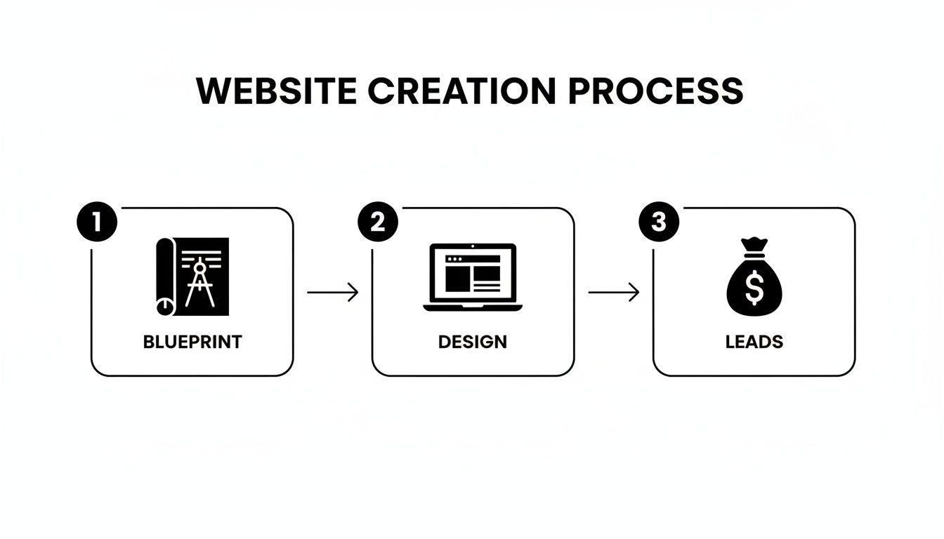
The takeaway is simple: leads aren't an accident. They are the direct result of a thoughtfully designed process.
Every element in the mockup, from a button's placement to a headline's wording, is a deliberate choice. This meticulous planning is the foundation of a successful web page strategy that converts visitors into customers.
Building for Today's Customer
In today's market, an effective mockup starts with a mobile-first mindset. This isn't a suggestion—it's a requirement for growth.
Consider the reality for your business:
- More than half of your potential customers will find you on a mobile device.
- A clunky mobile experience is the fastest way to lose a sale.
- A staggering 94% of a visitor's first impression is based purely on design.
A mockup forces you to perfect that crucial mobile experience first. This ensures your site not only looks great but also works flawlessly for the majority of your audience, turning that traffic into tangible leads.
Turning Raw Ideas Into a Structured Wireframe
This is where your strategy starts to look like a real website. Before we get into colors, fonts, and images, we have to build the skeleton. This stage is called wireframing, and it's about one thing: how the site works for your customer.
Think of a wireframe as the architectural blueprint for your website. It’s a simple, black-and-white layout that maps out where every key element will live and how a visitor will get from point A to point B. By focusing on structure first, we sidestep expensive design changes later. Getting this right from the start can save you thousands.

Stripping away all visual flair forces you to answer the hard questions. Is the "Get a Quote" button impossible to miss? How many clicks does it take to find your services page? This is pure function, not decoration.
Defining Critical User Paths
Not every visitor comes to your site for the same reason. Your wireframe needs to anticipate their needs and guide them efficiently. Someone clicking a Google Ad for "emergency plumbing" is in a different mindset than a client researching a kitchen remodel.
Let's use a local contractor as an example. You might have these visitors:
- The Urgent Lead: A homeowner with a leaky roof just saw your ad for "24/7 Roof Repair." The wireframe for that landing page must put a phone number and an emergency contact form front and center. No distractions.
- The Researcher: Someone is planning a large project six months from now. Their path should be exploratory, guiding them toward your project gallery, testimonials, and maybe a "Remodeling Budget Checklist" download.
- The Existing Client: A past customer needs warranty info. Your wireframe should ensure a "Customer Support" or "Client Portal" link is easy to find in the footer or menu.
When you map these journeys in a simple wireframe, you ensure your website serves every type of visitor. It becomes an automated tool that gets the right people to the right information, fast.
A great wireframe doesn't just show where things go; it dictates the conversation your website has with every visitor, ensuring the right message reaches the right person at the right time.
Your Pre-Wireframe Checklist
Before opening a tool like Figma or Balsamiq, you need a game plan. A fuzzy strategy leads to a confusing website. Answering these questions first makes the entire process smoother.
The goal is to define the "one big thing" for each of your most important pages.
- Homepage: What is the single most important action a new visitor should take? (e.g., "Schedule a Consultation," "View Our Work").
- About Page: What's the core message that builds trust and proves you're the expert? (e.g., "Showcasing our 20+ years of local experience").
- Services Page: How can you make it dead simple for users to find what they need and see its value? (e.g., "Use clear service blocks with direct links to learn more").
- Contact Page: Beyond a form, what information does someone need right now? (e.g., "A map to our office, direct phone numbers for sales and support").
Nailing these objectives provides the raw material for a website mockup that’s tied to your business goals. It's the unglamorous but essential work that ensures your final website is a high-performing asset, not just a pretty face.
Breathing Life and Brand Into Your Visual Design
You’ve got the blueprint. The wireframe has nailed the structure and flow, but now it’s time to bring it to life. We're moving from a black-and-white plan to a full-color, high-fidelity mockup. This is where we inject your brand’s personality into every pixel, turning that functional skeleton into a digital experience that feels uniquely yours.
This isn't just "making it pretty." It's strategic visual communication. Your brand identity—the logo, colors, and fonts—are serious business assets. When applied correctly in the mockup, they build trust and recognition with your ideal customers from the second they land on your page.

Think of it as translating your real-world reputation into a compelling online first impression. Every visual choice has a purpose: to reinforce your message and connect with your audience.
Wireframe vs Mockup What Is the Difference
People often confuse the blueprint (wireframe) and the visual design (mockup). This table clarifies the distinct purpose of each stage, helping you understand what to focus on and where feedback is most valuable.
| Characteristic | Low-Fidelity Wireframe | High-Fidelity Mockup |
|---|---|---|
| Purpose | Structure, layout, and functionality | Visual design, branding, and feel |
| Fidelity | Low (grayscale, placeholders) | High (colors, fonts, real images) |
| Focus | "Does this work?" "Is it intuitive?" | "Does this look right?" "Does it feel like us?" |
| Tools | Pen & paper, Balsamiq, Whimsical | Figma, Sketch, Adobe XD |
| Feedback | User flow, content hierarchy | Color scheme, imagery, typography |
Understanding this distinction is key. Judging a wireframe on its looks is like criticizing a building's blueprint for not having wallpaper. Each stage has a role, and respecting that process leads to a much stronger final product.
Translating Brand Identity into Digital Trust
How your brand feels online should mirror the experience customers have with you in person. The mockup is our canvas to make that happen.
A local contractor's mockup needs to project dependability and professionalism. We’d use strong, trustworthy colors like navy, pair them with clear, no-nonsense fonts, and ensure certifications are front and center. The goal is to visually communicate "reliability" before a visitor reads a word.
Contrast that with a local dental practice. Their mockup might feature a calming, softer color palette, welcoming typography, and photos of happy patients. This approach creates an emotional connection, helping anxious patients feel at ease.
The visuals in your mockup aren't decoration. They are a powerful, non-verbal way to answer your customer’s first question: "Is this business for me?"
Consistency is what holds it all together. When every button, headline, and image aligns with your brand's promise, you create a seamless and professional experience. That visual harmony turns a skeptical first-time visitor into an interested lead.
Core Elements of Visual Mockup Design
Moving from a basic wireframe to a high-fidelity mockup means layering in several key design components. Each one plays a critical role in shaping how users perceive your business.
Here’s what we're focused on:
- Color Palette: We strategically apply your brand colors to guide the user's eye, establish a clear visual hierarchy, and evoke the right emotions. This means defining specific colors for buttons, links, and backgrounds to make the interface crystal clear.
- Typography: The fonts you choose say a lot about your brand. We select and pair typefaces for headlines, body text, and calls-to-action that are both on-brand and highly readable on any device.
- Imagery and Iconography: Those gray placeholder boxes from the wireframe are replaced with actual photos, illustrations, and custom icons that tell your story. Sourcing high-quality, authentic imagery is non-negotiable for building trust.
- Spacing and Layout: We refine the wireframe’s structure, carefully adjusting spacing (white space) to improve readability and give the design a balanced, uncluttered feel. This makes your content easier to scan and your calls-to-action stand out.
These elements must work in concert to create a cohesive whole. This detailed process ensures the final design isn't just nice to look at, but is also a functional tool for converting visitors—a core idea we explore in our guide on landing page design best practices.
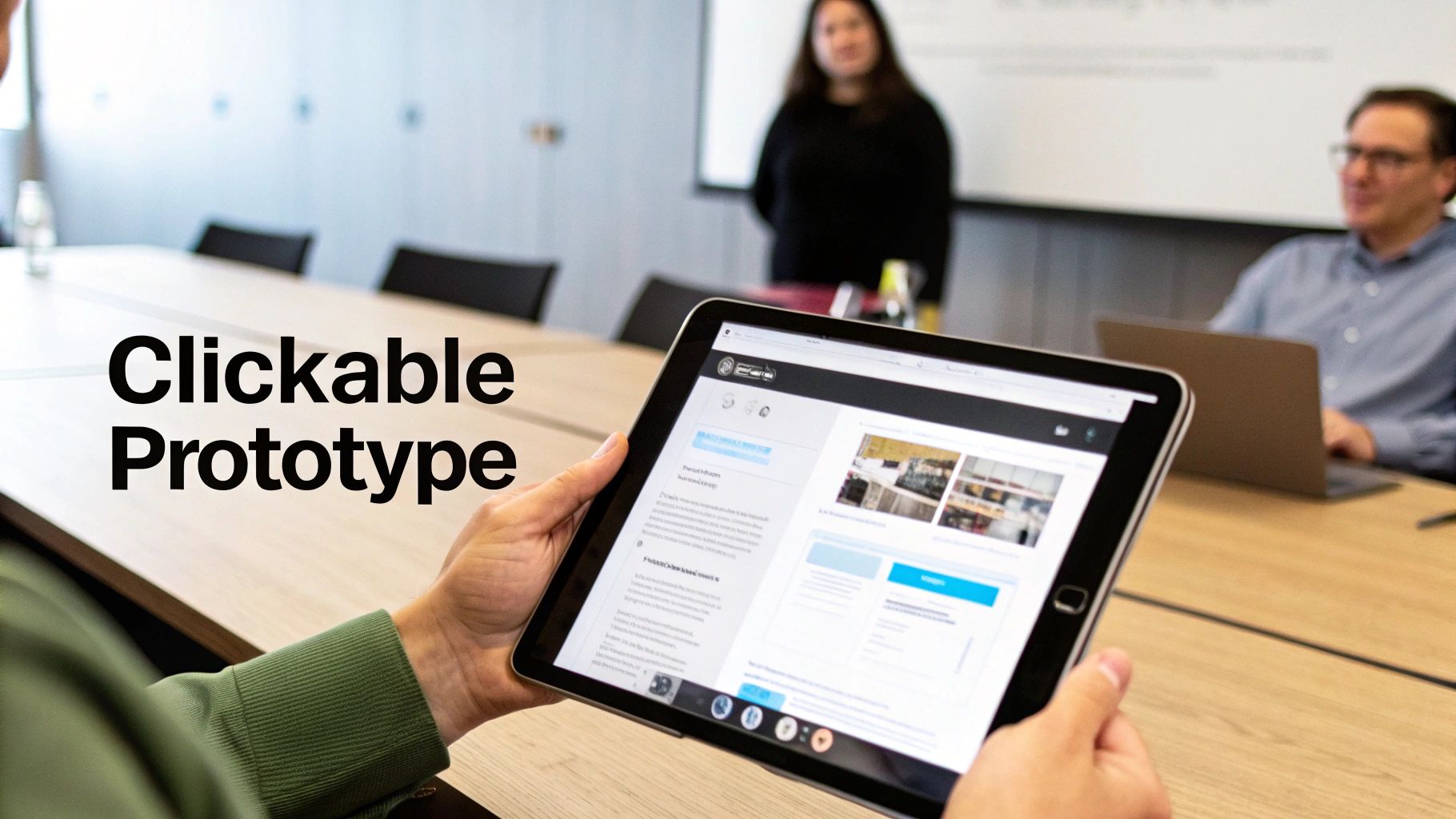
Testing the Flow with an Interactive Prototype
A static mockup shows you what your website will look like, but it can’t tell you how it will feel. This is where we separate a good design from a great business tool. The real test comes when we transform that flat mockup into a clickable, interactive prototype.
A prototype lets you and your team actually use the website just like a real customer would, long before a dollar is spent on development. You can click through menus, test forms, and experience the user journey firsthand. This isn't a simulation; it's a dress rehearsal for your digital salesperson.
This is the ultimate test of your site’s logic. Is the path from the homepage to your services page obvious? Can someone find your contact info in under 5 seconds? Prototypes expose awkward workflows and confusing navigation before they become expensive, hard-coded mistakes.
Why a Clickable Prototype Saves You Money
Every business owner understands the pain of rework. It’s like framing an entire house only to realize a hallway is too narrow—the cost to fix it is immense. An interactive prototype is the digital equivalent of walking through that building before the first nail is hammered.
It helps us answer critical business questions, like:
- Is the primary call-to-action working? We can see if users are naturally drawn to the "Get a Quote" button or if they get lost.
- How intuitive is the navigation? Does clicking "Services" lead people exactly where they expect to go, or is there confusion?
- Are there any dead ends? We can spot pages where users get stuck without a clear next step—a huge reason for lost leads.
Catching these issues at the prototype stage is a simple design tweak. Catching them after the site is built can mean hours of expensive developer time.
A prototype shifts the most expensive mistakes from the development phase, where they cost thousands, to the design phase, where they cost pennies to fix. It's the highest-leverage activity you can do to protect your budget and timeline.
Experiencing the Customer Journey
Using tools like Figma, we connect all the individual mockup screens into a seamless, clickable experience. You won’t just look at a picture of the homepage; you’ll click the "About Us" button and land on the actual "About Us" page mockup.
For a local auto shop, this means you could test a customer booking an appointment. You’d click from a service description to the scheduling calendar to the final confirmation page. If any step feels clunky, we fix it right there. This hands-on testing is invaluable for optimizing the path to conversion and is fundamental to learning how to improve website conversion rates.
Gathering Real Feedback Before It’s Too Late
The interactive prototype is the perfect tool for getting meaningful feedback. Instead of asking, "Do you like the colors?" we can ask, "Could you easily find the phone number?" This grounds the conversation in tangible user experience, not subjective taste.
It’s your final chance to confirm that the design works in practice, not just on paper. This validation ensures that when we hand off the approved designs, we're building a website that has already been proven to be intuitive, effective, and ready to turn visitors into customers. Understanding this process is also helpful if you ever want to learn how to build a prototype of a product for any digital tool.
Finalizing the Design for Developer Handoff
Once the interactive prototype gets the final green light, we hit the last phase before code gets written: the developer handoff. Getting this right is the secret to launching on time, on budget, and without frustrating last-minute surprises.
Think of it like this: we’ve finalized the architectural blueprints. Now, we need to package them so the construction crew can build the house perfectly, without a single wall out of place.
A sloppy handoff is where projects go off the rails. Details get missed, features are misinterpreted, and the website that goes live is a "close enough" version of what you approved. It’s how a slick, professional mockup devolves into a clunky website.
To prevent that, we treat the handoff as a formal, documented process. It guarantees the development team has everything they need to turn our mockup into a pixel-perfect, fully functional website that behaves exactly like the prototype.
The Pre-Handoff Final Review
Before packaging things up, we do one last, meticulous review of the approved mockup. This is our internal quality control, and it's a step you cannot skip.
Your final sweep should feel like a pre-flight check. Here’s our list:
- Design Consistency: Are all button styles, fonts, and color codes exactly the same on every page? Little inconsistencies are what make a finished site feel cheap.
- Asset Check: Have all images, icons, and logos been finalized and prepped for the web? Look for high-resolution files that are named logically. No more placeholder images.
- Responsive Views Confirmed: Take one more look at the final designs for desktop, tablet, and mobile. Does anything look cramped or broken on smaller screens?
- No More "Lorem Ipsum": Ensure every piece of placeholder text has been replaced with the final, approved copy. Developers need real content to get spacing and layout right.
This final check is about catching minor oversights before they become major development headaches. It's your last chance to polish every detail.
A great developer handoff isn't a transfer of files; it's a transfer of knowledge. It leaves zero room for guesswork, ensuring the vision you approved is the website that gets built.
Packaging the Design for Flawless Execution
With the final review done, it's time to create a comprehensive handoff package. This is essentially an instruction manual for the developers. A professional developer will love you for this.
Modern tools like Figma have made this incredibly efficient, but the core components of a solid handoff package are timeless.
Here’s what our complete developer handoff package always includes:
- The Interactive Prototype Link: This is non-negotiable. It lets developers click through the site, see the user flow in action, and understand the context behind each screen. It’s their living reference point.
- A Comprehensive Style Guide: This document breaks down every visual element: exact color codes (HEX, RGB), typography rules (font families, sizes, weights for H1s, body text), and button states (default, hover, clicked). It leaves nothing to interpretation.
- Exported Image Assets: Every image, logo, and icon is exported in the correct format (SVG for icons, optimized JPG/PNG/WebP for photos) and organized into clearly labeled folders.
- Technical Notes and Annotations: We add notes directly onto the mockups to explain complex interactions or animations. For instance, a note might say, "This image carousel should auto-play every 5 seconds."
This meticulous preparation is what separates a professional, predictable project from a chaotic one. It’s the final step that ensures the strategic and visual integrity of your design is perfectly preserved in the final, coded website.
Common Questions About Website Mockups
Even with a clear process, it's normal to have questions. Over the years, we've found that a few key questions pop up time and again. Here are straight answers to the most common things business owners ask about the website mockup process.
What Is the Difference Between a Wireframe, Mockup, and Prototype?
This is the most frequent point of confusion. The easiest way to think about it is to compare it to building a custom home. Each stage serves a distinct, critical purpose.
- A wireframe is the architectural blueprint. It shows the layout and structure—where walls and doors go—but has no decorative detail. It’s all about function.
- A mockup is the interior designer's full-color rendering. This is where we add the visual layer—colors, fonts, and finishes—so you can see exactly how the finished space will look.
- A prototype is a virtual walkthrough of the finished house. It’s an interactive version where you can open doors and walk from room to room to experience the layout.
Each stage builds on the one before it, moving from raw structure to refined visuals to a real-world user experience.
What Tools Do You Use to Create Mockups?
Our go-to is Figma. It’s the industry standard because it allows for deep collaboration, rapid prototyping, and a seamless handoff to development. It ensures everyone is looking at the same source of truth.
While tools like Figma, Sketch, and Adobe XD are technically available to anyone, mastering them takes years of expertise in user experience (UX) and user interface (UI) design. For a busy business owner, a DIY mockup is almost always a false economy.
It often leads to designs that look amateurish and, more importantly, fail to convert visitors into customers. Your time is far better invested in running your business while we handle the expert design and strategy.
How Much Does a Website Mockup Cost?
A mockup isn't a standalone item you can buy off a shelf. Its cost is a foundational part of a comprehensive web design project. That price reflects the strategic thinking, user research, and design expertise needed to create a visual plan that drives business results.
A professional mockup is an investment in your website's future ROI. It's the mechanism that prevents costly development revisions, clarifies your marketing message, and ensures the final product is a powerful 24/7 sales tool, not just a pretty picture.
While you can find cheap freelance options, they often skip the strategic steps that make a website successful. This upfront investment saves significant money on lost opportunities and expensive fixes down the road.
How Does a Mockup Help with SEO?
This is a fantastic and often overlooked question. A strategic mockup process has a direct and powerful impact on your website's ability to rank on Google.
Here’s how we build SEO into the design from day one:
- Content Hierarchy: During wireframing, we plan the website's structure and content layout. This includes defining clear heading structures (H1s, H2s, H3s) and logical navigation, which are fundamental signals for search engines.
- Performance-Driven Design: We design with fast load times in mind from the beginning. This means making smart choices about image placement and element complexity long before a developer touches the project.
- Mobile-First Blueprint: Most importantly, we design with mobile-first principles, which is a massive Google ranking factor. The entire user experience is perfected for smaller screens first, ensuring your site meets the standards of modern search algorithms.
By embedding SEO strategy directly into the design blueprint, we ensure your website is structurally sound and ready to perform from the moment it launches. It's not an afterthought; it's part of the foundation.
Ready to see how a strategic design process can turn your website into a lead-generation machine? At Uncommon Web Design, we don't just build websites—we build growth systems. Let's discuss your goals and create a plan to get you there. Schedule your free consultation today.


