
If your online store gets plenty of clicks but sales are flat, you don't have a traffic problem—you have a conversion problem. It’s a common trap to think more ad spend is the solution. But sending visitors to a "leaky" website is like pouring water into a bucket full of holes. This playbook is about plugging those holes.
Your Website Is Leaking Money. Let's Fix It.
We’re going to move past vanity metrics and dive into a systematic process. We'll diagnose your sales funnel, pinpoint the exact friction points costing you money, and roll out proven fixes. This isn't about guesswork or chasing trends; it's about building a reliable sales engine that works for you 24/7.
Let's get straight to the framework for finding and fixing what's broken, so every visitor has the best possible chance to become a customer.
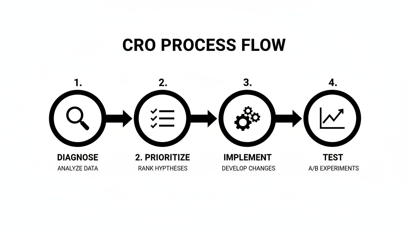
This simple, four-step process—Diagnose, Prioritize, Implement, and Test—is the core of our strategy. It's a continuous loop, a flywheel that ensures you're always making data-backed improvements instead of just guessing what might work.
The Conversion Rate Optimization Flywheel
This table breaks down the entire CRO process into its core pillars. Think of it as your high-level roadmap for systematically improving how your store turns visitors into buyers.
| Pillar | Core Focus | Key Outcome |
|---|---|---|
| Diagnose | Find the "leaks" in your funnel using analytics, heatmaps, and user feedback. | A clear understanding of where and why users are dropping off. |
| Prioritize | Rank potential fixes based on impact, confidence, and effort (ICE framework). | Focus on changes that will deliver the biggest wins with the least effort. |
| Implement | Make targeted improvements to user experience (UX), trust signals, and site speed. | A smoother, faster, and more trustworthy path to purchase for your customers. |
| Test | Validate changes with A/B testing to confirm they actually improve conversions. | Data-proven results that directly increase revenue and user satisfaction. |
By constantly cycling through these four pillars, you create a system of continuous improvement that builds on itself over time, generating more and more momentum for your business.
The Conversion Rate Landscape
The challenge of turning visitors into customers isn't new, but the goalposts are always moving. Back in the early 2000s, average ecommerce conversion rates were a dismal 1.5% to 2.5%. Fast forward to the 2020s, and better design, faster sites, and stronger trust signals have pushed that average up to a more respectable 3.0%–4.2%.
But here's where it gets interesting—there's a huge gap between devices. While desktop converts at a healthy 4.8%, mobile—which now drives a whopping 73% of all traffic—lags far behind at just 2.9%.
This massive disparity is a big reason why cart abandonment on phones hits a staggering 77.2%. This data, which you can explore further with these ecommerce benchmarks on Speedcommerce, points to a massive opportunity for any business willing to truly optimize their site for mobile users.
Key Takeaway: Your biggest opportunity for growth almost certainly lies in optimizing the mobile experience. If you’re still treating your mobile site like a shrunken-down version of your desktop site, you're leaving a significant amount of money on the table.
This guide provides a clear roadmap to address these issues head-on. We'll start by showing you exactly how to find those specific leaks in your sales funnel.
Diagnosing Your Sales Funnel Like a Pro
Before you start tweaking button colors or rewriting product descriptions, you need to play detective. Trying to boost your conversion rate without knowing where the problems are is like a mechanic trying to fix an engine with a blindfold on. You might get lucky, but you'll most likely just waste time and money. Our first job is to build a data-backed "hit list" of your site's biggest conversion killers.
Let's map out your customer's journey and pinpoint the exact moments they're hitting the eject button. The best part? You can uncover a goldmine of insights using free tools you probably already have installed.

Uncovering Leaks With Google Analytics
Your first stop should always be Google Analytics (GA4). It's the most powerful free tool out there for understanding how people actually move through your website. We’re not here to look at vanity metrics like total visitors; we’re hunting for patterns that signal expensive problems.
The key is to set up a funnel exploration report. This report gives you a crystal-clear visual of the path customers take from one step to the next—from viewing a product, to adding it to their cart, to starting the checkout, and finally, making a purchase. Most importantly, it instantly shows you the drop-off rate between each stage.
For instance, you might see that 90% of users who add an item to their cart click through to the checkout page. Fantastic! But then you see that only 40% of those who start the checkout actually finish it. That tells you the problem isn’t your product pages; the leak is happening somewhere in the checkout flow. Is it a surprise shipping cost? A confusing form? This data acts like a flashlight, pointing you directly at the trouble spot.
Watching How Real People Use Your Site
Analytics tells you what is happening, but user behavior tools tell you why. This is where you get to see your website through your customers' eyes, and trust me, the insights can be shocking.
Tools like Hotjar or the completely free Microsoft Clarity provide two game-changing features:
- Heatmaps: These are visual overlays on your webpages showing where users click, move their cursors, and scroll. You might discover that dozens of people are clicking on a non-clickable image, or that almost no one is scrolling down far enough to see your glowing customer testimonials.
- Session Recordings: This is where the magic happens. You can watch anonymous, screen-recorded playbacks of real people trying to use your site. Imagine watching a customer on their phone repeatedly trying—and failing—to enter a discount code because the input box is too small. That’s not just data; that’s a clear, actionable problem you can fix today.
We always say that watching a few session recordings is the most humbling and productive hour a business owner can spend. You’ll quickly see that what seems perfectly obvious to you is often confusing for your customers.
Key Metrics That Actually Matter
As you dive into your data, stay focused on the numbers that directly impact your ability to increase ecommerce conversion rates. It’s easy to get lost in a sea of metrics. Start with these critical few and understand what they're telling you about your bottom line.
Bounce Rate on Product Pages
- What it is: The percentage of visitors who land on a product page and then leave your site without doing anything else (like clicking "Add to Cart" or viewing another page).
- What it signals: A high bounce rate points to a major disconnect. It could be low-quality product photos, a confusing description, or an unclear price. Essentially, your page failed its one job: to create enough interest to take the next step.
Add-to-Cart Rate
- What it is: The percentage of visitors who add at least one item to their shopping cart during their visit.
- What it signals: This metric is a direct reflection of how persuasive your product pages are. If this number is low, you likely have issues with your product presentation, a lack of social proof (like reviews), or a weak call-to-action button.
Checkout Completion Rate
- What it is: The percentage of users who start the checkout process and successfully complete the purchase.
- What it signals: A big drop-off here is a massive red flag. This is the online equivalent of a customer walking to the register with cash in hand, only to turn around and leave. The culprit is usually friction—things like forced account creation, unexpected shipping fees, or not offering trusted payment options like PayPal or Apple Pay.
By analyzing these three core metrics, you're no longer guessing. You'll have a clear, data-driven list of the biggest leaks in your sales funnel, which is the essential foundation for everything we're going to fix next.
Prioritizing Fixes With a High-Impact Checklist

Okay, you’ve done the hard work and now have a data-backed hit list of problems. The biggest mistake we see at this stage? Trying to fix everything at once. It’s a recipe for burnout and a bunch of half-finished projects.
A scattered approach won't move the needle; a focused one will. The real key to making progress is to prioritize everything based on a simple framework: impact versus effort.
You’re looking for the low-hanging fruit. Start with the changes that take the least effort but promise the biggest potential boost to your conversion rate. A confusing navigation menu is a much easier fix than a complete checkout redesign, but both can be absolute conversion killers. We always start with these quick wins to build momentum and get some immediate ROI in the bank.
To get you started, we’ve broken down the most common issues into three critical areas. Think of this as your high-impact checklist for plugging the most expensive leaks in your website.
User Experience and Navigation
Your website's user experience (UX) is the digital equivalent of your store's layout and customer service. If people can't find what they're looking for, they won't just get frustrated—they'll leave. A confusing website is a loud and clear signal that you don't value your customer's time.
Here’s where to focus your attention first:
- Simplify Your Main Menu: Your navigation should be dead simple. Pare down your top-level categories to the absolute essentials. If a customer has to think for more than a second about where to click, your menu is too complicated.
- Make Product Filters Flawless: For stores with a deep catalog, filters are non-negotiable. Customers must be able to easily narrow down their options by size, color, price, brand—whatever matters for your products. Broken or slow filters send them straight to a competitor.
- Supercharge Your Search Bar: Your most motivated buyers often go straight for the search bar. It needs to be smart, offering auto-suggestions and forgiving typos. A search that returns "no results" is a guaranteed lost sale.
We once worked with a local auto parts store whose conversion rate was stuck below 1%. Session recordings showed us dozens of customers abandoning the site because they couldn't confirm if a part would fit their truck. By adding a prominent "Fits Your Vehicle" feature on product pages, we more than doubled their conversion rate in under 60 days.
Website Speed and Performance
Every single second your website takes to load is costing you money. The relationship between load time and bounce rate is brutal; the longer people wait, the more of them will leave. In ecommerce, speed isn't a feature—it's a fundamental requirement. A slow site just feels untrustworthy and unprofessional.
Here are the most impactful performance fixes:
- Optimize Your Images: This is the #1 cause of slow websites, bar none. High-resolution product photos are critical, but they have to be compressed for the web. Use modern image formats like WebP to slash file sizes without sacrificing quality.
- Invest in Quality Hosting: Bargain-basement hosting is a false economy. If you're running a serious ecommerce business, you need hosting that can handle traffic spikes without breaking a sweat. Slow hosting will sabotage every other marketing dollar you spend.
Device performance is especially critical. While mobile devices drive 70-76% of traffic, they convert at a measly 2.3% compared to desktops. That gap is almost always due to a slow, clunky mobile experience. With mobile cart abandonment at a staggering 77.2%, optimizing your site's speed for phone users is a direct path to reclaiming lost sales.
Building Trust and Authority
Before someone hands over their credit card information, they have to trust you. This is especially true for smaller businesses competing against giants like Amazon. Your website must scream "legitimate and secure" from every single page. Doubt is the ultimate conversion killer.
Focus on these essential trust signals:
- Showcase Authentic Reviews: Feature real customer reviews—the good and even the occasional bad—right on your product pages. A whopping 93% of consumers say online reviews impact their purchasing decisions.
- Display Security Badges: Clearly show familiar security logos (like Norton or McAfee) and payment options (Visa, PayPal, Apple Pay) in your footer and throughout the checkout. These are instant visual shortcuts for "your information is safe here."
- Be Transparent About Policies: Make your shipping, return, and privacy policies incredibly easy to find. Hiding this information just makes customers suspicious. A clear, fair return policy can actually increase ecommerce conversion rates by reducing the perceived risk of buying.
By systematically working through these three areas, you can be confident you're focusing on changes that will actually make a difference. For a more exhaustive list of potential issues, you can reference our detailed web audit checklist to make sure you haven't missed any critical gaps.
Nailing Your Product and Checkout Pages
This is where the rubber meets the road. You can do everything right to get a customer to your product page, but if you drop the ball here, the sale is lost. Think of it this way: your product page is your best salesperson, and the checkout is your cashier. Both have to be exceptional.
Even the smallest bit of friction in these final steps can send your conversion rates off a cliff.
Let's break down how to get these two critical stages right. The goal is simple: make it effortless, compelling, and totally trustworthy for someone to hit "buy" and follow through.
Perfecting the Product Page
A product page really only has one job: build enough confidence and desire for a visitor to click "Add to Cart." It needs to answer questions before they're even asked and dissolve any hesitation. If this page doesn't work, nothing else in the funnel matters.
Your product images are your number one asset here. Customers can't touch or feel the item, so your photos have to do all the heavy lifting.
- High-Quality, Multi-Angle Shots: Show the product from every conceivable angle—front, back, side, and zoom in on key details. If you're a contractor selling custom cabinets, that means showing close-ups of the wood grain, the hardware, and a shot of the finished product installed in a real home.
- Show the Product in Context: Help people visualize owning it. Selling outdoor gear? Show it on a muddy trail. Selling coffee mugs? Show someone wrapped in a blanket, enjoying a warm drink. Contextual storytelling is so much more persuasive than a product floating on a white background.
- Use Video Whenever Possible: A short video showing the product in action can be a game-changer. It’s the closest thing to holding the item in their hands and can slash uncertainty.
Next up, your product description. You need to sell the outcome, not just list the features. People don't buy a drill; they buy the ability to hang a family portrait.
Your copy should focus on the transformation or the problem solved. Instead of just saying "durable leather," try "a wallet built to last a lifetime, so you'll never have to buy another one." That little shift connects the product directly to a tangible customer benefit.
Finally, social proof is absolutely non-negotiable. Display customer reviews and ratings right where people can see them. Remember, an average rating of 4.5 stars from 50+ reviews builds a lot more trust than a perfect 5-star rating from only two people.
Designing a Frictionless Checkout
The checkout is where a staggering number of potential sales go to die. The average cart abandonment rate hovers around 70%, and most of that is caused by a clunky, confusing, or surprising checkout flow. Your mission is to eliminate every single obstacle.
A simplified checkout isn't just a nice-to-have; it's a core strategy to increase ecommerce conversion rates.
Key Checkout Optimizations
- Offer Guest Checkout: Forcing someone to create an account is a top reason for abandonment. Always, always provide a guest checkout option. You can always ask them to create an account on the "Thank You" page after the money is in the bank.
- Simplify Your Forms: Only ask for what you absolutely need to process the order. Do you really need their phone number? Or their company name? Every extra field is another reason for them to walk away.
- Be Upfront About All Costs: Surprise shipping fees are the number one conversion killer. Show all costs, especially shipping, as early as you can—ideally right in the shopping cart before the checkout even starts. Transparency builds trust.
- Display Security Seals Prominently: Show logos for trusted providers like Visa, PayPal, and Apple Pay. Add security badges from services like Norton or McAfee to reassure shoppers that their financial info is safe.
To appeal to more buyers and cut down on abandoned carts, think about adding a range of payment options, including popular alternative payment methods. Offering one-click choices like Apple Pay or Google Pay can drastically speed things up, especially for mobile users.
Getting these pages right isn’t just about pretty design; it's about understanding buyer psychology and methodically removing every last shred of doubt from their mind.
Using Email Automation to Nudge Shoppers Across the Finish Line
Your website might be the main event, but it doesn't exist in a bubble. Powerful channels like email marketing are your secret weapon for bringing qualified buyers back, turning a one-time visitor into a loyal customer. Forget the weekly newsletter blasts—we're talking about strategic, automated emails that act like your best salesperson, working 24/7.
Instead of shouting the same message at everyone, automation lets you whisper the perfect message at the exact right moment. This is how you reclaim sales that would have otherwise vanished into thin air.
The Must-Have: Abandoned Cart Emails
The abandoned cart is the lowest-hanging fruit in all of ecommerce. Think about it: someone liked your product enough to add it to their cart but got distracted or had second thoughts. A well-timed email sequence is often the only nudge they need to complete the purchase.
But a single "Hey, you forgot this!" email rarely cuts it. A truly effective abandoned cart sequence doesn't just remind; it persuades.
- Email 1 (Sent ~1 hour later): This is a gentle, friendly reminder. Keep it simple. Show them a picture of the item and include a clear, direct link straight back to their cart. The goal here is just to jog their memory while the purchase is still top of mind.
- Email 2 (Sent ~24 hours later): Time to address their hesitation. Did they worry about shipping costs or your return policy? Remind them of your great policies or highlight a key product benefit they might have missed. This email is all about building confidence.
- Email 3 (Sent ~48-72 hours later): If they're still on the fence, it's time to introduce a compelling offer. A small discount or a free shipping code is often the final push needed to get them over the line.
Other High-Impact Automation Plays
Beyond abandoned carts, a couple of other automated emails deliver incredible returns and are surprisingly easy to set up. These work so well because they are triggered by a specific customer action, making them incredibly relevant and timely.
Key Takeaway: The goal of email automation isn't to be clever; it's to be helpful. By sending timely, relevant messages based on user behavior, you provide value that naturally leads to more sales and stronger customer relationships.
Back-in-Stock Notifications
If you have a popular item that sells out, you absolutely need a "notify me" list. When that item is restocked, an automated email goes out to a pre-qualified list of people who have literally raised their hands and said, "I want to buy this." It’s consistently one of the highest-converting emails you can possibly send.
Post-Purchase Follow-ups
The conversation shouldn’t die the moment the credit card is charged. A post-purchase email, sent a week or two after delivery, is a golden opportunity. You can ask for a product review, offer helpful tips on using their new item, or even suggest a few complementary products. It’s a simple gesture that builds loyalty and plants the seed for their next purchase.
The numbers don't lie—email is a conversion giant. While paid social converts around 0.9%-2.1% and organic search hits 2.1%-4.0%, email consistently averages between 2.8% and 10.3%. Get specific, and the results are even better: back-in-stock emails see a 7.28% conversion rate, and abandoned cart emails can hit a whopping 10.7%. With global cart abandonment sitting at an average of 71.3%, these targeted strategies are essential for clawing back lost revenue. You can find a deeper analysis of ecommerce conversion rates by industry on ConvertCart.com.
By setting up these simple flows, you create an automated system that works tirelessly to increase ecommerce conversion rates. To explore this further, check out our guide on implementing marketing automation for ecommerce.
Turning Insights into a Continuous CRO Action Plan
All this research is great, but it’s just theory until you put it into practice. So, let's build a simple, sustainable plan you can actually start using today. Think of your website not as a finished project, but as a living, breathing part of your business. It needs constant attention to stay in top shape. The goal here isn't a one-and-done facelift; it's about creating a culture of continuous improvement.
This means you’re always looking at the data, forming a hypothesis, and testing a solution. It’s a cycle. The small, data-driven tweaks you make over time are what really compound into massive results down the road.
Get Serious About A/B Testing
The heart of any solid CRO program is A/B testing. This is where you graduate from guessing what your customers want to knowing what they want. It’s a beautifully simple concept: instead of throwing ten changes at the wall to see what sticks, you test one specific element at a time.
Maybe you test the text on your "Add to Cart" button, or you try a different color for your main call-to-action. You show the original version (Version A) to 50% of your visitors and the new version (Version B) to the other 50%. Once enough people have seen both, the data will tell you which one performs better. This process strips ego and opinion out of the decision-making—you just follow the numbers.
One of the biggest mistakes we see people make is calling a test too early. You have to wait until you have a statistically significant sample size. Be patient! Acting on flimsy data is just as bad as guessing.
To make sure your continuous CRO action plan is built on a solid foundation, it helps to incorporate top conversion rate optimization best practices from day one.
When you make this loop of diagnosing, testing, and implementing a core part of your operations, you’re essentially building an automated salesperson that gets smarter and more effective with every test. It’s truly the most reliable way to increase ecommerce conversion rates and build a powerhouse online store.
A Few Common Questions We Get
When business owners start digging into conversion rates, a few questions always come up. Let's tackle them head-on.
What’s a Good Ecommerce Conversion Rate to Aim For?
It’s tempting to look for a magic number, but the truth is, "good" is relative. While you’ll see the global average float around 2-4%, this number is almost meaningless without context.
A store selling gourmet snacks might hit 5-7% because it’s a low-cost, impulse-friendly purchase. On the other hand, a custom furniture business might celebrate a 1-2% conversion rate because their average order value is in the thousands. The industry makes a huge difference.
The best benchmark is your own current performance. A truly "good" rate is one that’s better than last month. Focus on beating yourself. A 10-20% lift from your current baseline is a fantastic, and totally achievable, first goal.
How Long Until I See Results From CRO?
This really depends on what you change. Some fixes give you an almost immediate payback.
For example, simple tweaks like clarifying your shipping costs right on the product page or getting your site speed up can lift conversions in just a few days. People feel more confident and stick around longer.
Bigger projects, like a full-blown checkout redesign, will naturally take longer. You'll need to run A/B tests for a few weeks to collect enough data to know for sure if the new version is a winner. The golden rule here is patience. Let the numbers tell the story, not your gut feeling. Consistent effort always pays off.
Should I Get More Traffic or Fix My Conversion Rate First?
Fix your conversion rate. Always.
Think of it this way: driving traffic to a site with a poor conversion rate is like pouring water into a leaky bucket. You’re spending money to bring people in, only to have them slip through the cracks before they can buy anything. It’s a massive waste of your marketing budget.
Patch the holes in your sales funnel first. Once your site is a smooth, trustworthy, and easy-to-use machine, every new visitor you acquire is far more likely to become a customer. A 1% bump in your conversion rate will almost always be more profitable than a 20% traffic boost to a broken website.
Ready to turn your website into a reliable sales engine that works for you 24/7? At Uncommon Web Design, we build conversion-focused websites and marketing systems that drive measurable growth.


