
If your website gets traffic but not enough leads or sales, you don’t have a traffic problem—you have a conversion problem. The smartest move isn't to spend more on ads. It's to get more value from the visitors you already have.
Let's talk about how to do that.
Your Website Is Leaking Revenue. Let's Fix It.
Many business owners get stuck in a cycle: traffic is down, so they pour money into ads. But sending more people to a website that doesn't convert is like trying to fill a leaky bucket. You're wasting time and money on visitors who show up, get confused, and leave.
This is what we call a revenue leak. It’s the money you're losing every day because your website isn't built to guide visitors toward a specific action, like scheduling a call or making a purchase. The good news? These leaks are almost always fixable.
From "More Traffic" to "Better Results"
The process of plugging these leaks is called Conversion Rate Optimization (CRO). Think of it as a methodical system for turning your website into your best salesperson—one that works 24/7. This isn't about guesswork or trendy designs. It’s about understanding what your customers want and making it easier for them to take the next step.
The financial upside is significant. Consider this simple math:
- A 20% increase in traffic to a site with a 1% conversion rate gives you a small bump in business.
- But a 1% increase in your conversion rate—from 1% to 2%—literally doubles your sales from the exact same amount of traffic.
This shift in focus, from getting more visitors to getting more from your visitors, delivers a far greater return on your investment.
The real money isn’t in getting more people to your digital doorstep. It's in making sure the people who are already there want to come inside.
Why Small Improvements Create Big Wins
To know where you're going, you have to know where you are. Comparing your conversion rate to your industry average provides a helpful baseline and shows you what’s possible.
Conversion Rate Benchmarks by Industry
| Industry | Average Conversion Rate |
|---|---|
| Food & Drink | 4.99% |
| Health & Beauty | 3.89% |
| Electronics | 2.67% |
| Apparel & Fashion | 2.44% |
| Home Goods & Furniture | 1.71% |
| B2B Services | 2.23% |
Source: Data compiled from various 2023 industry reports.
Don't be discouraged if your numbers are lower—see it as an opportunity. Every element on your site either helps or hurts your conversion rate. A confusing menu, a slow-loading page, or an unclear call-to-action is a small leak that, over time, adds up to a massive loss. Revenue can also leak out when customers can't complete a purchase due to inventory issues; understanding the real impact of stockouts is crucial for both your conversion rate and overall profitability.
By focusing on CRO, you start making informed, data-driven decisions that plug these leaks one by one. You'll turn your website from a passive digital brochure into an active, revenue-generating machine.
Stop Guessing, Start Diagnosing: The Foundation of CRO
Before you change a single button or headline, you have to know what’s actually happening on your website. Improving conversions without data is like a mechanic trying to fix an engine blindfolded. You might get lucky, but you're far more likely to waste time and break something else.
The goal here is to stop guessing and start diagnosing. Your website is already telling you a story—what your visitors want, where they get stuck, and why they’re leaving. Your job is to learn how to listen.

This starts by forming a "problem hypothesis"—an educated guess about why people aren't converting, backed by real evidence. This isn’t about becoming a data scientist; it’s about making smart decisions based on facts, not just a gut feeling.
Find the "Why" Hiding in Your Analytics
Your first stop should be your website analytics platform, which for most businesses is Google Analytics 4 (GA4). It can feel overwhelming, but you only need to focus on a few key areas to find powerful insights.
Instead of getting lost in every metric, start by asking a few simple questions:
- Where do my best visitors come from? Check your landing page reports. You'll see which pages are the first stop for users who eventually convert. These are your heavy hitters, and even small tweaks here can lead to big wins.
- Where are people giving up? The "exit pages" report is pure gold. It shows you the last page a visitor saw before they left. If a key service page or your contact form has a high exit rate, that's a massive red flag telling you something’s wrong.
- What's their journey look like? Use the "Path exploration" report to see how people actually move through your site. You might find them clicking back and forth between two pages—a classic sign of confusing navigation or missing information.
Before making any changes, a thorough diagnostic of your sales funnel is essential. For comprehensive guidance on identifying and fixing these leaks, explore strategies for sales funnel optimization for higher ROI. This will help you map out the user journey and pinpoint exact drop-off points.
Go Beyond the Numbers and Watch Real People
Analytics tell you what happened, but they rarely tell you why. That's where user behavior tools are a game-changer. Free options like Microsoft Clarity or paid tools like Hotjar give you a direct window into your user's experience.
Two features are particularly invaluable:
Heatmaps give you a visual breakdown of where people click, move their mouse, and how far down the page they scroll. You might discover they're clicking on an image that isn't a link or that 90% of your visitors never even see your main call-to-action.
Session recordings are even better. These are anonymous video playbacks of real people using your website.
I’m not exaggerating: watching just five to ten session recordings can reveal more about your site’s problems than staring at spreadsheets for a week.
You'll see people rage-clicking a broken button, struggling to find a phone number, or getting lost in your menu. This is where abstract numbers become a tangible problem you can actually solve.
For instance, you might see three different users on mobile devices abandon your contact form because the fields are too small to tap. That’s no longer a guess—it’s a clear, evidence-based issue that's costing you leads.
When you combine hard data from analytics with human insights from recordings, you get a solid, prioritized list of things to fix. This diagnostic phase is the single most important part of the CRO process. To help you get started, we've even put together an in-depth web audit checklist.
Finding the Low-Hanging Fruit for Maximum Impact
After a thorough audit, you'll probably have a long list of potential website improvements. Don't panic. The goal isn't to fix everything at once—that’s a recipe for overwhelm. The secret is to prioritize the "low-hanging fruit": quick wins that deliver the biggest results with the least effort.
In our experience, the most impactful starting points almost always fall into three buckets: message clarity, user friction, and trust signals. If you can nail these three, you're building a rock-solid foundation for conversions.

Nail Your Message Clarity with the Grunt Test
Let's start with the most critical one: how clear is your message? Specifically, can a total stranger land on your homepage and, in five seconds, understand what you do, who you help, and why they should care?
We call this the "grunt test." If a caveman landed on your homepage, could he grunt and point to understand your business? If a visitor has to squint, scroll, and think too hard, they're gone. Confusion is the number one conversion killer.
To pass this test, your headline and sub-headline must instantly answer three questions:
- What do you offer? (e.g., "Emergency Plumbing Services")
- Who is it for? (e.g., "for Homeowners in Murrieta")
- What's the main benefit? (e.g., "Fast, Reliable Repairs 24/7")
A common mistake we see on contractor sites is a vague headline like "Quality Craftsmanship Since 2005." That fails the test. A much stronger version? "Expert Kitchen & Bath Remodels for Temecula Valley Homeowners. Get a Free Quote in 48 Hours." See the difference? It's specific, targeted, and tells the visitor they've found the right solution.
Reduce Friction to Make It Easy for Customers
Friction is anything that slows a user down or makes their goal harder to achieve. Every extra click, every confusing menu item, every slow-loading image adds friction. Too much, and they'll bounce to a competitor.
Your mission is to pave the smoothest possible path from where they are to where you want them to go.
Here are some of the most common friction points on small business sites:
- Bloated Forms: Is your contact form asking for a fax number in 2024? Keep your forms brutally simple. Only ask for what you absolutely need to start the conversation.
- Clunky Mobile Experience: Over half of all web traffic comes from phones. If your site is a pain to use on a mobile device, you're actively turning away potential customers.
- Confusing Navigation: Can people find your services, pricing, and contact info without a map? Your main menu should be dead simple, not a junk drawer of a dozen links.
Imagine a local dental office. If a potential patient has to click through five pages just to find a phone number, that's a mountain of friction. But placing a big, bold "Book an Appointment" button in the header? That removes friction and makes it ridiculously easy for them to become a patient.
Reducing friction isn't about fancy design; it's about respecting your visitor's time. Make it easy for them to give you their business.
The data backs this up. Landing pages built for a seamless mobile experience can see conversion rates topping 11%. Compare that to complex B2B e-commerce sites, which often have a tougher time converting because of their complicated user journeys. A fast, simple site is no longer a "nice-to-have." For a deeper dive, you can explore detailed conversion rate benchmarks by industry.
Build Unshakeable Trust with Your Visitors
People only do business with companies they trust. From the moment your website loads, it needs to communicate professionalism and credibility. Trust signals are all the little cues that tell visitors you're a legitimate, reliable business.
This is non-negotiable for any service business or e-commerce store asking for personal information or a credit card number.
Here’s what you need to showcase:
- Social Proof: Nothing works better than other people vouching for you. Feature customer testimonials, reviews from Google or Yelp, and detailed case studies.
- Clear Contact Info: A visible phone number, a real physical address, and a professional email address show you’re an accessible, established business.
- Professional Design: An outdated or broken website is an instant red flag. A clean, modern design shows you're serious about your brand.
- Security Badges: If you're selling online, showing logos from secure payment gateways (like Stripe or PayPal) and SSL certificates is an absolute must.
For an e-commerce shop selling handmade jewelry, this means high-quality photos, a crystal-clear return policy, and customer reviews right on the product page. These details work together to put a nervous buyer's mind at ease.
Running Smart Experiments Without Breaking Your Website
You've done the detective work, diagnosed the issues, and have a solid list of improvements. Now for the fun part: putting those ideas to the test with real users. This is where we stop guessing and start getting concrete answers by running simple, smart experiments.
This process is most commonly called A/B testing. Don't let the technical name fool you; it's a straightforward concept. You show one version of a page to half your visitors (Version A, the original) and a new version with a single change to the other half (Version B, the challenger). Then you measure which one gets more people to take the action you want.
The winning version gets rolled out to everyone. It’s a low-risk, high-reward way to learn exactly what makes your customers tick.
How to Choose Tests for the Biggest Wins
The golden rule is to test one significant change at a time. If you change five things at once—the headline, the button color, an image, and the form fields—you’ll have no idea which change actually made the difference. Your diagnostic work should have given you a great starting point for what to test first.
Focus on elements that have a direct impact on a user's decision-making process.
- Your Main Headline: This is huge. Does a benefit-focused headline like "Get a Greener Lawn in 30 Days" outperform a feature-focused one like "We Use Premium Organic Fertilizers"?
- Your Call-to-Action (CTA): Test the words on your main button. For a local contractor, does "Get a Free Quote" get more clicks than "Schedule a Consultation"?
- Page Layout and Flow: Sometimes reordering your content makes all the difference. Try moving your customer testimonials higher up the page to build credibility sooner.
- Form Friction: Can you get more leads by removing one non-essential field? That "How did you hear about us?" field might feel important, but it could be costing you submissions.
An experiment is never a "failure." Even a test that doesn't win teaches you something valuable about your audience. That insight is business intelligence you didn't have before.
A Practical Guide to Setting Up Your First A/B Test
The great news is you don’t need to be a developer to get this done. There are plenty of user-friendly tools that make setting up these tests surprisingly simple.
Platforms like VWO (Visual Website Optimizer) provide a visual editor where you can click on an element on your live site—like a button or headline—and change its text or color without touching a single line of code.
Here's the basic workflow:
- Pick Your Page: Start with a high-traffic page where a conversion lift would really move the needle, like your homepage or a primary service page.
- Define Your Goal: What action signifies a win? This could be a form submission, a specific button click, or a purchase.
- Create Your Variation: Use the tool’s editor to make your one change. For instance, change the CTA button text from a generic "Submit" to a specific "Get My Free Estimate."
- Launch the Test: Let it run. The tool will automatically split your website traffic and start gathering data on how each version performs.
To give you some inspiration, here's a quick list of simple but powerful tests almost any small business can run.
High-Impact A/B Test Ideas for Small Businesses
| Element to Test | Why It Matters | Example Variation |
|---|---|---|
| Headline | It's the first thing people read. It must grab attention and convey value immediately. | Original: "Expert Roofing Services" Variation: "Your Trusted Local Roofer for 25+ Years" |
| CTA Button Text | The words on your button should be a clear command that tells the user what to expect. | Original: "Submit" Variation: "Send My Request Now" |
| Hero Image | A picture is worth a thousand words. It sets the tone and builds an emotional connection. | Original: Stock photo of a house. Variation: A high-quality photo of your actual team working on a project. |
| Social Proof | People trust other people. Showcasing testimonials builds instant credibility. | Original: No testimonials visible "above the fold." Variation: Add a short, powerful customer quote directly under your main headline. |
| Form Length | Every extra field you ask for increases friction and can cause people to abandon the form. | Original: 5 fields (Name, Email, Phone, Address, Message) Variation: 3 fields (Name, Email, Message) |
These kinds of tests are perfect starting points because they target key psychological triggers—clarity, trust, and ease of use—that have a massive effect on conversions.
Be Patient and Let the Data Speak
This is critical. One of the biggest mistakes people make is calling a test too early. You need to let it run long enough to achieve statistical significance—a fancy way of saying you have enough data to be confident the result isn't a random fluke.
Most testing tools will tell you when you've hit this mark, but it often takes at least a couple of weeks, depending on your traffic.
This disciplined, data-driven approach is what separates strategic growth from just randomly changing things and hoping for the best. By testing your assumptions, you stop guessing what your customers want and start knowing.
For more ideas on what makes a truly high-converting page, check out these landing page design best practices we've put together from years of building and testing pages for clients.
Turning Test Results into Permanent Growth
A successful A/B test feels great, but it’s not the finish line. The real magic isn't in finding a single tweak that works; it's in building a system where every test makes your website smarter and more effective.
Once a test has a clear winner, it's time to hard-code that change. This ensures 100% of your future visitors get the best-performing experience, making that conversion lift a permanent part of your site.
But the most critical part of the process is asking one simple question: "What did we learn?"
From One-Off Fixes to a Growth Flywheel
Let's say you changed a button’s text from "Submit" to "Get My Free Quote" and it boosted leads by 20%. The lesson isn’t just that the new text is better. The real insight is that your audience responds to specific, value-focused language. Now you can take that learning and apply it to your email subject lines, your ad copy, and the headlines on other pages.
This is how you graduate from random acts of marketing to building a predictable growth engine. We call this the CRO Flywheel—a simple but powerful cycle that fuels ongoing improvement.
The flywheel model turns optimization from a one-time project into a core business function.
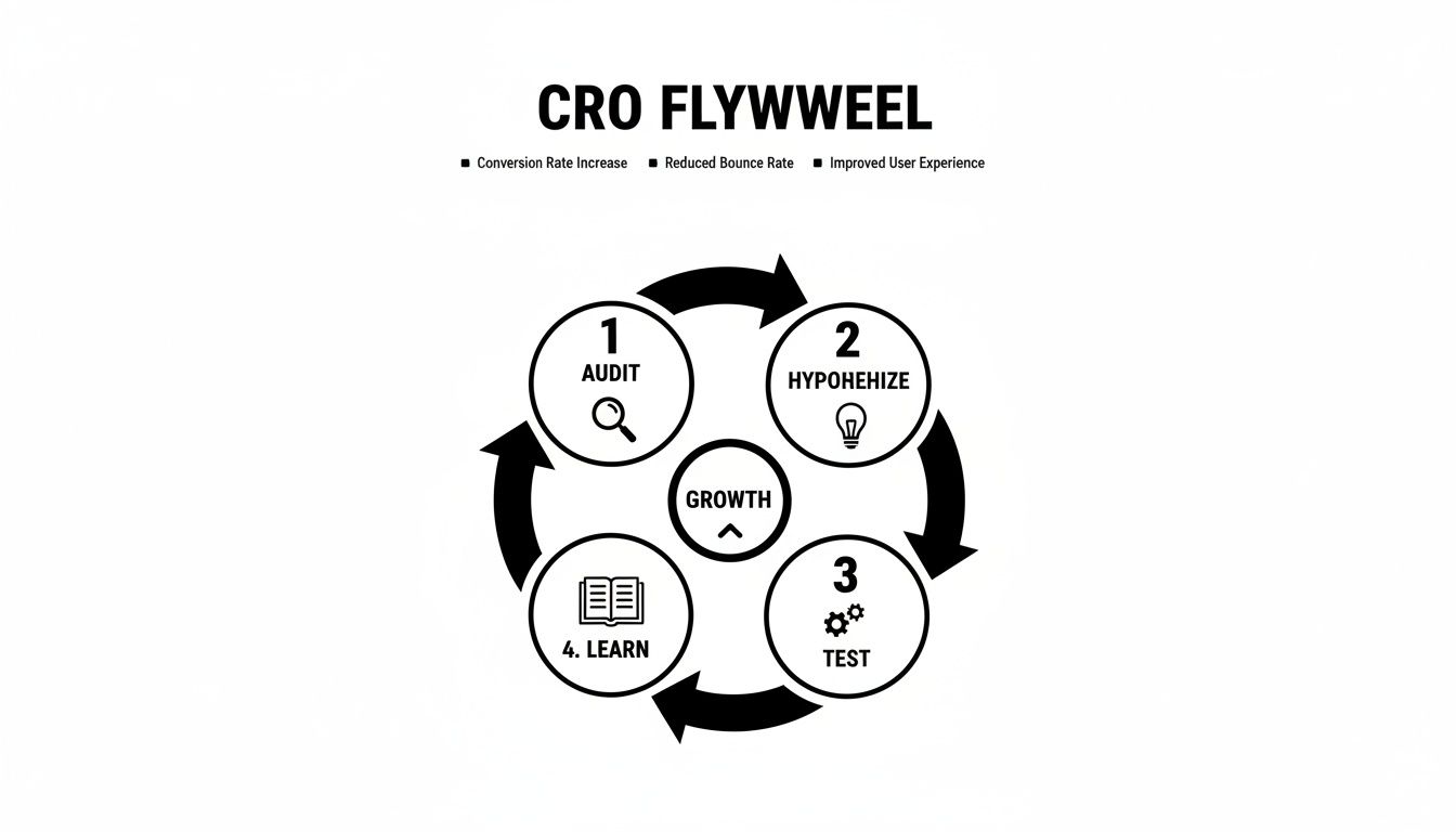
You can see how each step logically feeds the next, creating momentum. You audit your data to form a hypothesis, test it, and then use what you learn to kick off the next audit. It just keeps spinning.
How an Auto Shop Drove 40% More Bookings
Here's how this works in practice. We had a client, a local auto shop, who was getting decent traffic but the phone wasn't ringing. Their online booking form was a ghost town.
We put the CRO Flywheel to work:
- Audit: Heatmaps showed us people were landing on the "Book an Appointment" page and just… leaving. Analytics confirmed a massive exit rate. The page had a dozen fields to fill out.
- Hypothesize: Our theory was simple: the form was too much, too soon. Customers felt overwhelmed and weren't ready to commit to a full appointment without talking to someone first.
- Test: We ran a straightforward A/B test. Version A was the original, detailed form. Version B swapped it for a dead-simple, three-field "Request a Call-Back" form.
- Learn: The call-back version won by a landslide, generating 25% more leads in the first month. The lesson was clear: their customers valued speed and a low-commitment first step.
A "failed" test isn't a loss; it's just data. Discovering that a new headline doesn't work is valuable intelligence that stops you from making a permanent, site-wide mistake based on a gut feeling.
We didn't stop there. We took that "simplicity wins" insight and overhauled their service pages, replacing dense paragraphs of text with clean, scannable bullet points.
This systematic process, all driven by the flywheel, ultimately led to a 40% increase in total online bookings over six months.
This approach ensures your marketing gets smarter with every click. The data from these tests can even point to opportunities beyond your website, like improving your lead follow-up. For more on that, check out our guide on integrating your CRM with your website to streamline your sales process.
Got Questions About Conversion Rate Optimization? We've Got Answers.
Jumping into conversion optimization can feel like learning a new language. It’s natural to have questions. Here are the ones we hear most often from business owners like you.
How long until I see results?
You could see a lift from your very first A/B test, which might only run for a couple of weeks. But true conversion optimization is a marathon, not a sprint. It's an ongoing process of refinement.
Quick wins are possible. Tweaking a headline or a button on a high-traffic page can show a measurable impact in as little as 2-4 weeks. However, significant, needle-moving growth comes from building a consistent testing habit over 6-12 months. The real prize isn't a single successful experiment; it's creating a website that gets better at turning visitors into customers, month after month.
Do I need a ton of traffic to start A/B testing?
This is a common myth. While more traffic speeds things up, you don't need a massive audience to make smart improvements.
As a general rule, having at least 1,000 unique visitors per month to the specific page you want to test is a good starting point. This gives you enough data to reach a reliable conclusion.
If your traffic is lower, your focus just shifts from formal A/B testing to gathering qualitative insights. You can still apply CRO principles.
- Watch User Recordings: Use a tool like Microsoft Clarity to see exactly how real people use your site. You'll spot confusing navigation or broken elements without needing a single spreadsheet.
- Implement Best Practices: You don't need to test everything. Making changes based on proven usability principles—like simplifying your contact form or making your phone number more prominent—is a safe bet.
You can always make intelligent, data-informed improvements, even without the numbers for a high-volume A/B test.
What’s a “good” conversion rate, anyway?
The honest answer? It depends. A good conversion rate is all about context—your industry, your price point, and what you're selling all play a huge role.
An e-commerce store selling $50 t-shirts might be thrilled with a 2-3% conversion rate. But a local contractor selling $50,000 kitchen remodels would consider a 5-10% lead form conversion rate an incredible success. They're totally different worlds.
The only benchmark that truly matters is your own. The goal is to figure out your current baseline and then work systematically to beat it. A "good" conversion rate is one that's better than it was last month.
Can I do this myself, or should I hire someone?
You can absolutely get started on your own. In fact, you should. Using free tools like Google Analytics to find your leaky pages and Microsoft Clarity to see why they're leaking will give you a ton of ideas. Tackling that low-hanging fruit is a fantastic first step.
The challenge comes when you move from simple fixes to a structured testing program. Running statistically valid tests, correctly interpreting the results, and having the technical ability to build and launch test variations takes a specific skillset and a lot of time.
That's often when bringing in a partner makes sense. Working with an agency means you get a dedicated team to manage the whole process, from the audit to building the tests and analyzing the outcomes. It frees you up to do what you do best: run your business.
Ready to stop guessing and start turning more of your website visitors into paying customers? The team at Uncommon Web Design can build a data-driven roadmap to uncover your biggest growth opportunities.


