Let's cut to the chase. A call to action (CTA) is the specific instruction you give your website visitors. It's the moment you stop talking at them and tell them exactly what to do next.
Think of it as your digital salesperson confidently asking for the sale. Without it, your website is just a passive brochure. With it, your website becomes an active tool for generating leads and revenue.
Why a Call to Action Is Your Website's Most Important Job
A website without a clear CTA is like a beautiful storefront with no door. People can window-shop all day, but they have no way to step inside and become a customer. For a business owner, a powerful CTA isn't a minor detail; it's the engine that turns casual browsers into leads and paying customers.
Your CTA provides a direct path, guiding someone from "just looking" to taking a meaningful next step. It gives every visit a purpose.
Turning Traffic into Tangible Results
Many business owners pour money into ads and SEO to get people to their site, only to watch them click away without a trace. A strong CTA is what makes that investment pay off. It’s the final, crucial step that converts hard-earned attention into real action.
A well-crafted CTA directly boosts the effectiveness of all your other marketing. It’s the bridge between a visitor's interest and your income.
To see just how much this matters, let's compare a generic CTA with one designed to drive business.
The Impact of a Strong CTA
| Element | Weak CTA (e.g., 'Click Here') | Strong CTA (e.g., 'Get My Free Quote Now') |
|---|---|---|
| Clarity | Vague and uninformative. What happens when I click? | Tells the user exactly what to expect. |
| Motivation | Low. Offers no value or reason to click. | High. Offers a specific benefit (a free quote). |
| Urgency | None. The user feels no need to act now. | Implies immediate action ("Now"). |
| Result | User confusion, high bounce rates, and lost leads. | Increased conversions, a clear user path, and more business. |
Specificity wins every time. Vague buttons like ‘Click Here’ leave users guessing, but a precise command like ‘Get Your Free Quote’ cuts through the noise. The data backs this up. Simple tweaks to the words on a button can send conversion rates soaring, as detailed in this analysis on driving action with CTAs.
Without that direct instruction, you're relying on hope—hoping visitors will hunt down your contact page or figure out how to buy. A proper CTA replaces hope with a system, turning your website into a 24/7 salesperson that never sleeps.
The Different Types of CTAs and Where to Use Them
A call to action isn't a one-size-fits-all tool. The same "Buy Now" button that works on a product page would feel pushy on a blog post. If you want your website to consistently generate leads, you must use the right CTA at the right time.
Think of it like a conversation. You wouldn't ask for a huge commitment immediately. You build trust with smaller, lower-risk requests first. Your CTAs should work the same way, guiding visitors from initial curiosity to a final decision.
This flowchart shows the simple journey a visitor takes. The CTA acts as the critical bridge between traffic and actual business results.
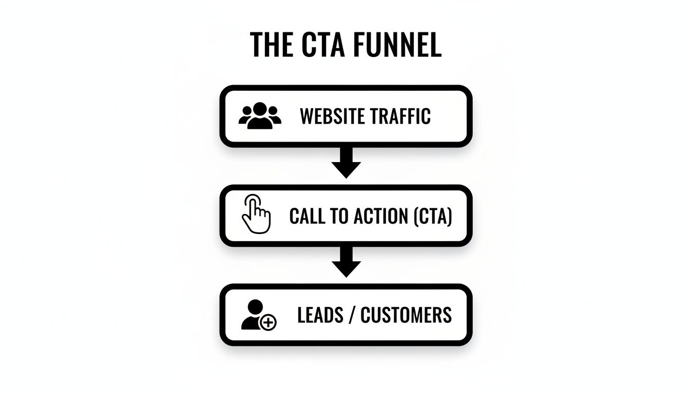
Without that clear instruction, your website traffic stays traffic. It never turns into the leads and customers you need to grow.
Lead Generation CTAs
The goal here is simple: capture a visitor's contact information so you can continue the conversation. These are the workhorses for your blog posts and resource pages, where you're offering valuable information. You're trading a useful asset for an email address.
- Download Our Free Guide: Offer a guide that solves a specific problem for your ideal customer.
- Get Your Custom Quote: Perfect for service businesses like contractors or B2B companies where pricing isn't standard.
- Subscribe to Our Newsletter: The classic way to build a long-term audience you can nurture over time.
These CTAs work because they offer immediate value with low commitment, turning anonymous visitors into qualified leads.
High-Intent Sales CTAs
These are your closers. You use them when a visitor has shown clear interest and is ready to take a significant step. They belong on your service pages, product pages, and dedicated landing pages where the goal is direct conversion.
A high-intent CTA is your digital handshake. It’s the moment you stop educating and confidently ask for the business. This is where your website makes you money.
Examples include:
- Schedule a Consultation: The go-to for service providers like dental offices, consultants, and agencies.
- Start Your Free Trial: Essential for any software or subscription-based business.
- Add to Cart: The undisputed king of e-commerce CTAs that signals clear intent to buy.
These CTAs should be impossible to miss. They represent the single most important action on the page. Learn more about designing pages that make these CTAs effective in our guide on landing page design best practices.
Low-Commitment Engagement CTAs
Sometimes, the goal isn't a sale or a lead—it's just keeping the visitor engaged. These CTAs encourage people to explore your site further, which builds familiarity and trust. Thinking about different types of loyalty programs your small business can actually use can also spark ideas for engagement-focused CTAs.
You’ll typically find these on your homepage, about page, or within articles.
- Learn More: A simple, pressure-free way to guide users to more detailed information.
- View Our Work: Crucial for any business that relies on a portfolio, like a web design agency or a custom home builder.
- Follow Us on [Social Media]: This helps build your community and gives you another channel to connect with potential customers.
Crafting a Call to Action That Actually Converts
Knowing what a CTA is and where it goes is a great start. Now for the important part: how to build one that people actually click.
A high-performing CTA is more than a button with text. It’s a mix of persuasive copy, obvious value, and smart design. The goal is to make clicking that button feel like the most logical next step—not because you’re tricking them, but because you’ve made the offer too compelling to ignore.
Use Strong, Action-Oriented Verbs
The words you choose can make or break your CTA. Vague words like "Submit" or "Click Here" are conversion killers because they create doubt. Submit what? Where am I clicking to? Your visitor shouldn't have to solve a puzzle.
Instead, start your CTA with a powerful verb that promises a clear outcome.
- Get Your Free Quote
- Download the E-book
- Schedule Your Consultation
- Start Your Free Trial
This simple tweak puts the user in control and instantly tells them what they’ll get for their click.
Create a Sense of Urgency or Scarcity
People are hardwired to act when they think they might miss out. You can tap into this by building urgency into your CTA without resorting to cheesy tactics. It's about framing the offer to encourage action now instead of later.
Your ideal customer is busy. A little urgency helps them prioritize the decision to engage with you, moving them from "I'll do this later" to "I need to do this now."
Try adding phrases that hint at timeliness or exclusivity:
- Book Now to Secure Your Spot
- Get Your Free Quote Today
- Claim Your Limited-Time Offer
This nudge can be all it takes to get someone on the fence to make a decision.
Clearly Articulate the Value
Your CTA must answer the most important question on your visitor's mind: "What's in it for me?" The value needs to be dead simple to understand. You aren't just asking them to click a button; you're offering a solution to their problem.
For instance, "Get a Free Audit" is good, but "Get a Free Audit & Uncover Hidden Savings" is much better. It connects the action (the audit) to a tangible benefit (saving money). The more specific you are about the value they'll get, the more powerful your CTA becomes.
Don't Underestimate Design and Placement
You could write the most persuasive CTA in the world, but if nobody sees it, it’s useless.
- Color and Contrast: Your CTA button should pop. Use a color that stands out from the rest of the page, drawing the eye to it like a magnet.
- Size: The button needs to be big enough to be easily seen and tapped, especially on a phone, but not so large that it's obnoxious.
- Placement: Put your CTA where people naturally look after they've read your main message. This is usually right after a block of benefit-focused text or at the end of a section. Make it effortless to find.
When you blend strong copy, a clear promise of value, and thoughtful design, you create a call to action that doesn't just ask for a click—it earns it.
Putting CTAs To Work: Real-World Examples For Local Businesses
Theory is great, but seeing a call to action in the wild makes the concept click. For local businesses, vague CTAs like "Contact Us" are profit leaks. Let’s look at how to plug those leaks with sharp, action-oriented language that speaks directly to your ideal customer.
The goal isn't just to tweak words on a button. It’s about shifting from a passive request to an active invitation that solves a real problem.
From Vague To Valuable For Service Providers
Too many local service websites feel like a brochure instead of a business-generating tool. The calls to action are often an afterthought, leading to missed opportunities every day. Here’s how we fix that.
-
For an Auto Shop:
- Before: A simple "Contact Us" button. This forces the customer to do all the work—call, wait on hold, and hope they can get an appointment.
- After: "Schedule Your Service Online." This CTA is a game-changer. It promises immediate action and convenience, putting the customer in control. They can book their oil change at 10 PM without picking up the phone.
-
For a Dental Office:
- Before: "Learn More." While not terrible, it’s a low-commitment phrase that doesn't capture high-intent visitors who are ready to book.
- After: "Book Your Appointment Today." This is direct, clear, and action-oriented. It speaks to the person with a toothache now who needs a solution, not more reading material.
These changes transform a website from a passive information hub into a 24/7 appointment-setting machine.
A great CTA removes friction. It makes doing business with you the easiest and most obvious choice for a potential customer.
CTA Templates For Your Industry
To make this more practical, here are some plug-and-play ideas. Find your industry and see how a simple language shift can make a huge difference.
| Business Type | Primary CTA Example | Secondary CTA Example |
|---|---|---|
| Plumber | Get an Emergency Quote | See Our Service Area |
| HVAC Company | Schedule Your AC Tune-Up | Download Maintenance Checklist |
| Law Firm | Book a Free Consultation | Read Client Case Studies |
| Restaurant | Reserve Your Table Online | View Our Dinner Menu |
| Landscaper | Request a Free Estimate | Browse Our Project Gallery |
Think of these as a starting point. The key is to match the action to your customer's immediate need.
CTAs For B2B And E-Commerce Businesses
The same principles apply whether you're selling custom parts to other businesses or products to consumers. It’s all about clarity and value.
A B2B company that builds custom machinery shouldn't use "Buy Now"—their sales process is far more consultative. A better fit would be "Request a Custom Quote" or "Schedule a Discovery Call." These CTAs align with where that customer is in their journey.
For e-commerce stores, CTAs are the lifeblood of sales. Beyond "Add to Cart," you need CTAs for every stage. You can see powerful abandoned cart email examples to understand how to bring customers back.
Email marketing is a fantastic way to deploy these CTAs. To learn more, explore our guide on email marketing for lead generation. Each email becomes a new opportunity to guide a subscriber toward the next logical step.
Common CTA Mistakes That Are Costing You Customers
A powerful call to action can turn your website into a 24/7 salesperson. A weak or confusing one can actively push potential customers away. Many businesses make a few common, costly mistakes that spring leaks in their sales funnel.
The good news? These are fixable. Once you know what to look for, you can start plugging those holes immediately.
Using Vague or Robotic Language
Buttons with generic text like "Submit" or "Click Here" are conversion killers. They create uncertainty. The visitor is left guessing what happens next, and a confused mind almost always defaults to "no." Your CTA should promise a clear outcome.
"Get My Free Quote" is infinitely more compelling than "Submit" because it clearly states the value they'll receive right now.
Creating Analysis Paralysis
Have you ever landed on a webpage bombarded with options? "Download Our Guide!" "Schedule a Call!" "Follow Us on Facebook!" When you present too many competing CTAs, you overwhelm the visitor. This is analysis paralysis—when faced with too many choices, a person often chooses nothing at all.
Every page on your website should have one primary goal. Your main call to action should reflect that single, most important next step.
If you have secondary actions, that’s fine. Just make sure they have a less prominent design. This creates a clear visual hierarchy and guides people toward the most valuable action.
Burying the Call to Action
Your CTA is useless if no one can find it. We often see critical buttons hidden at the bottom of a long page, forcing users to scroll endlessly. A great call to action should be impossible to miss.
It needs to be placed logically, where someone's eyes will land after reading your key message. Use a contrasting color to make it pop and make sure it’s "above the fold" on important pages so it's visible without scrolling. Making it easy for customers to say "yes" is half the battle.
How to Measure and Improve Your CTA Performance
Great marketing isn't about guesswork; it’s about making smart, data-backed decisions. Your call to action is only doing its job if you can see it driving measurable growth. So, how do you know if your CTAs are working? You test them.
This process, often called A/B testing, is less complicated than it sounds. It just means creating two slightly different versions of your CTA and showing them to different groups of visitors to see which one gets better results. You might test a blue button against a green one, or change the text from "Get Your Quote" to "Request My Quote."
Even minor tweaks can make a huge difference in your conversion rates. The point is to stop assuming what your customers want and let their actions tell you what works.
Key Metrics to Watch
To figure out what’s working, you only need to watch a couple of essential numbers.
-
Click-Through Rate (CTR): The percentage of people who see your CTA and click it. A high CTR is a sign that your design and message are grabbing attention.
-
Conversion Rate: This is the big one. It's the percentage of people who, after clicking your CTA, complete the goal—filling out a form, buying a product, or signing up. This metric ties directly to your bottom line.
You can track both of these easily in tools like Google Analytics. Watching these numbers helps you understand not just if people are clicking, but if those clicks are turning into actual business. For a deeper look, our guide explains how to improve website conversion rates by focusing on these metrics.
Optimizing your CTA isn't a one-time task. It's an ongoing process of refinement that turns your website into an increasingly efficient lead-generation system.
The data doesn't lie: tailoring your message pays off. Personalized CTAs have been shown to outperform generic ones by 202%. A customized call to action can convert 42% more visitors, which is a massive opportunity for any service-based business.
Even tiny wording shifts, like changing from 'your' to 'my' (e.g., "Get My Free Guide"), can spike conversions by 90%. This shows the outsized impact that consistent testing can have.
Answering Your Top CTA Questions
Let's tackle the top three questions we hear from business owners who are ready to get serious about converting visitors into customers.
How Many CTAs Should I Have on a Single Page?
The guiding principle is to have one primary call to action on any given page. Think of it as the one single thing you really want someone to do.
You can have secondary, lower-stakes CTAs (like "Follow Us on Social Media"). Just make sure they don't visually compete with your main goal. Too many equal choices create "analysis paralysis," and a confused visitor almost always chooses to do nothing. When in doubt, aim for clarity over clutter.
Does CTA Button Color Actually Make a Difference?
Yes, but it's not about finding a secret "magic color." The most critical factor is contrast.
Your CTA button must pop off the page. It needs to stand out from your brand’s color palette enough that it’s impossible to ignore. If your site design is built around blues and grays, a bright orange or green button will naturally draw the eye. The goal isn't just to look good; it's to guide your visitor's attention directly to the action you want them to take.
Should I Place My CTA Above or Below the Fold?
The classic debate! "Above the fold" means the portion of a webpage you see without scrolling. For your most critical pages—like your homepage or a key service page—you absolutely need a clear, compelling CTA above the fold. It immediately shows the visitor the next step.
But don't stop there. It's just as important to place CTAs after you've made your case. A well-placed CTA at the end of a section captures visitors right when their interest and motivation are at their peak.
At Uncommon Web Design, this is what we live and breathe. We don’t just build websites; we engineer conversion-focused systems designed to bring you more leads and sales. If you're ready to move past guesswork and start seeing real, measurable results from your website, let's talk.

