
You've spent good money on ads, social media, or SEO to get people to your website. But what happens the moment they arrive? If your landing page isn't turning that hard-earned traffic into actual leads, appointments, or sales, you're not just losing clicks—you're burning your marketing budget. For many business owners, this is a familiar frustration: the website looks okay, but it doesn't actually work.
The difference between a digital brochure and a 24/7 salesperson comes down to strategic design focused on a single goal. This guide cuts through the fluff to give you ten specific, field-tested landing page design best practices we use to help service businesses turn web traffic into tangible results.
Each point is a lever you can pull to make your website work harder, automating lead generation and delivering a real return on your investment. From crafting a headline that hooks visitors instantly to optimizing forms that people actually complete, these are the details that separate a high-performing page from a digital dead end. Let's dive in.
1. Nail the Headline: Your First Five Seconds
A visitor lands on your page with one question: "What's in it for me?" You have about five seconds to provide a compelling answer before they hit the back button. Your headline is the single most critical element for making that connection. A great headline isn't a label; it’s a direct promise of value that links a visitor's problem to your solution.
It’s the difference between a generic description and a powerful outcome. For a local contractor, "Expert Roofing Services" is forgettable. But "A Leak-Proof Roof Guaranteed for 10 Years" is a tangible result that builds immediate trust and makes them want to learn more. That clarity is what separates a bounce from a lead.

How to Craft a High-Converting Headline
Your headline's job is to grab attention and convince the visitor to invest another 30 seconds on your page. It must be clear, concise, and focused on the benefit.
“On the average, five times as many people read the headline as read the body copy. When you have written your headline, you have spent eighty cents out of your dollar.” – David Ogilvy
Consider these powerful examples:
- For a Dental Office: "Get a Whiter, Straighter Smile in 6 Months—Without Braces." (Benefit: speed, convenience, aesthetics)
- For an Auto Shop: "Get a Fair Quote in 5 Minutes. Back on the Road by 5 PM." (Benefit: transparency, speed)
- For a B2B Software: "Stop Juggling Spreadsheets. Manage Your Entire Project in One Place." (Benefit: ends a common pain point, promises efficiency)
Actionable Tips for Implementation
- Write it Last: Finalize your offer and benefits first. The headline then becomes a simple summary of your strongest value proposition.
- Use Customer Language: Pull words and phrases directly from customer reviews or interviews. This ensures your message resonates.
- A/B Test Pain vs. Benefit: Create two versions of your landing page. One headline focuses on solving a major pain point, while the other highlights a key outcome. Let the data decide what works.
- Add a Sub-headline: Use a smaller line of text below your main headline to add clarification or a secondary benefit, providing a one-two punch of value.
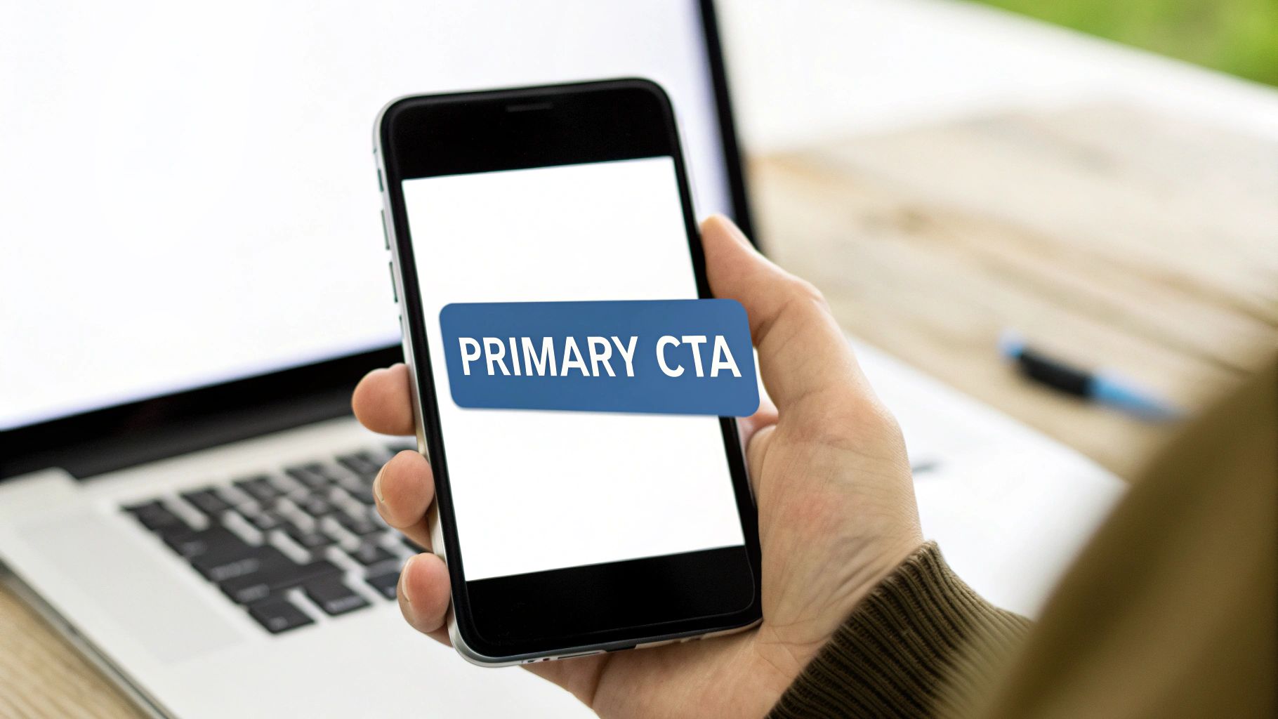
2. One Page, One Goal: The Single Call-to-Action (CTA)
Once your headline has captured attention, your next job is to tell them exactly what to do. This is where a single, clear Call-to-Action (CTA) becomes non-negotiable. Giving visitors too many choices—"Learn More," "Watch a Demo," and "Contact Us"—creates decision paralysis. A confused mind almost always says no and leaves.
One of the most effective landing page design best practices is to focus every element on guiding the user toward one specific action. This singular focus removes friction and dramatically increases your conversion rate. For a plumber offering emergency services, the CTA shouldn't be "Explore Our Services." It needs to be a bold, unmissable "Get Help Now." This clarity turns passive interest into decisive action.
How to Design a High-Converting CTA
Your CTA button is the trigger for your business goal. It must be visually prominent, use action-oriented language, and set clear expectations for what happens next.
“The button is the ultimate destination for your user. If your copy and design are the journey, the CTA is the treasure at the end of the map.” – Oli Gardner, Unbounce
Consider these powerful examples:
- For a SaaS Company: "Start Your 14-Day Free Trial" (Action: start, Benefit: free trial)
- For an E-commerce Store: "Add to Cart and Get 10% Off" (Action: add to cart, Benefit: immediate discount)
- For a Service Business: "Book Your Free Consultation" (Action: book, Benefit: free, no-risk consultation)
Actionable Tips for Implementation
- Use Contrasting Colors: Your button should pop off the page. Choose a color that stands out from your brand's palette but doesn't clash.
- Write Action-Oriented Copy: Start your CTA text with a strong verb like "Get," "Start," "Download," or "Claim." For example, "Get My Free Quote" is far more compelling than "Submit."
- Place It Above the Fold: Your primary CTA should be visible without any scrolling. On longer pages, repeat the CTA further down so it's always accessible.
- Ensure It Looks Clickable: Use visual cues like button shapes, drop shadows, or subtle hover effects to make it obvious that the element is interactive.
3. Value Proposition Clarity: Answering "Why You?" Instantly
While the headline grabs attention, the value proposition holds it. It’s the clear, concise explanation of the tangible results a customer gets from your product or service. If a visitor has to guess what you do and why it matters, you’ve already lost them. This clarity is a fundamental part of effective landing page design.
Your value proposition is your promise. It’s not about your company’s history; it’s about the specific, desirable outcome you deliver. For a financial advisor, "Comprehensive Wealth Management" is vague. "Grow Your Retirement Nest Egg and Pay Less in Taxes" speaks directly to a customer’s goals and fears, making the value immediately obvious.
How to Define a Powerful Value Proposition
A strong value proposition must be understood in seconds and should articulate why you are the best choice. It must be specific, pain-focused, and differentiate you from the competition.
"A value proposition is a believable collection of the most persuasive reasons people should notice you and take the action you’re asking for." – MarketingSherpa
Consider these powerful examples:
- For a Landscaper: "Your Dream Backyard in 30 Days, from Design to Done." (Benefit: speed, a clear timeline, turnkey service)
- For an E-commerce Store: "Handcrafted Leather Goods That Last a Lifetime, Guaranteed." (Benefit: durability, quality, risk-reversal)
- For a Niche Software: "The Only CRM Built for California Contractors. Win More Bids." (Benefit: niche-specific, outcome-focused)
Actionable Tips for Implementation
- Focus on Outcomes, Not Features: Don't sell the drill; sell the perfectly-hung picture frame. Translate your features into customer benefits.
- Write from the Customer's Viewpoint: Use "you" and "your" more than "we" and "our." Frame the entire proposition around their world, not yours.
- Test Against Competitors: Open your landing page next to your top three competitors. Is it immediately obvious why a customer should choose you? If not, refine it.
- Strengthen with Social Proof: Place a key testimonial or a "Trusted By" logo bar directly below your value proposition to add instant credibility.
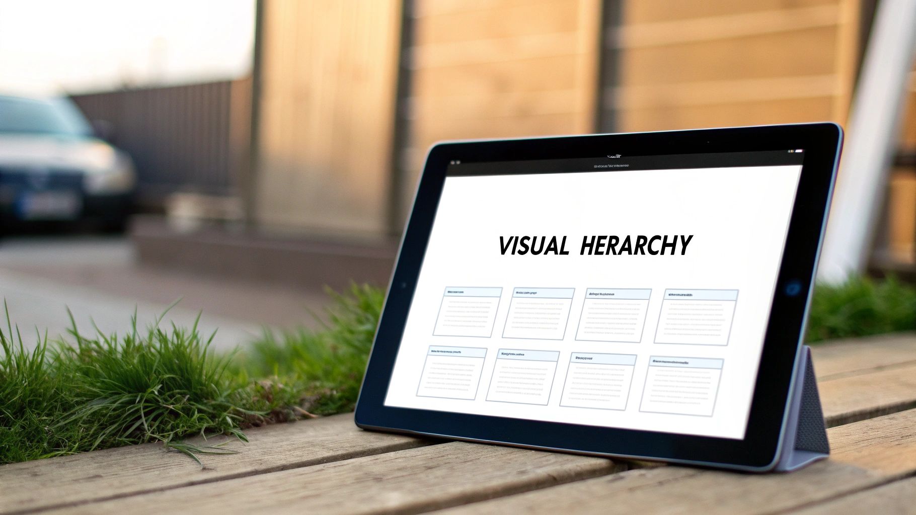
4. Visual Hierarchy and Whitespace
Your landing page isn't just a document; it's a guided conversation. Visual hierarchy is how you control that conversation, telling visitors exactly where to look first, second, and third. By strategically using size, color, and empty space (whitespace), you create a clear path that leads directly to your call to action. Without it, your page feels cluttered and overwhelming, causing visitors to abandon it out of confusion.
Proper visual hierarchy turns chaos into clarity. For a local landscaper, a huge photo of a finished project with a bold headline "Your Dream Backyard, Built in 30 Days" immediately communicates the core value. Smaller text can then provide details, but the visitor's eye is already captured by the most important message. This intentional design makes information easy to digest and act upon.

How to Guide the User's Eye
Your goal is to eliminate cognitive friction. A well-structured page feels intuitive and effortless to navigate. Whitespace isn't just empty space; it's an active element that gives your content breathing room and enhances focus.
“Good design is as little design as possible. Less, but better – because it concentrates on the essential aspects, and the products are not burdened with non-essentials.” – Dieter Rams
Consider how hierarchy directs attention:
- Apple's Product Pages: Maximum whitespace makes the product itself the hero. The headline is large, the "Buy Now" button is a contrasting color, and everything else is secondary.
- Google's Homepage: The ultimate example of minimalism. The search bar is the undeniable focal point because it's surrounded by a vast amount of whitespace.
- Medium.com Articles: Generous line spacing and margins make long-form text feel approachable and easy to read, keeping users engaged.
Actionable Tips for Implementation
- Use Size to Signal Importance: Your most critical element (headline, CTA) should be the largest. Sub-headlines and body text should scale down accordingly.
- Embrace Generous Spacing: Increase the line height of your body text for superior readability. Add consistent padding and margins around elements to avoid a cramped look.
- Limit Your Color Palette: Stick to 2-3 primary colors. Use a single, high-contrast color exclusively for your call-to-action buttons to make them pop.
- Follow the Z-Pattern: People naturally scan pages in a "Z" shape on desktop. Place your logo in the top-left, key info along the top, the core value proposition diagonally across the middle, and your CTA in the bottom-right.
5. Mobile-First Responsive Design
Your next customer is likely holding a smartphone right now. With over half of all web traffic coming from mobile devices, a landing page that isn't built for a small screen is effectively closed for business. Mobile-first design is a core principle of modern web strategy. It means designing the mobile experience first, then adapting it for larger screens—not the other way around.
This approach forces you to prioritize what truly matters. On a small screen, there's no room for clutter, slow-loading graphics, or confusing navigation. You must present your core value proposition and call to action immediately. This focus ensures a fast, intuitive experience for the majority of your visitors, directly impacting their decision to convert or leave.
How to Implement a Mobile-First Strategy
A mobile-first approach is about constraints breeding clarity. It ensures your most critical message and CTA are front and center, regardless of the device. This is non-negotiable in a world where Google prioritizes mobile-friendly sites in search rankings.
“By designing for mobile first, you create a better experience for all users. The constraints of mobile force you to focus and prioritize.” – Luke Wroblewski
Consider these scenarios:
- For a Plumbing Service: A user searching "emergency plumber near me" on their phone needs a tap-to-call button instantly, not a five-paragraph company history.
- For an E-commerce Store: A mobile shopper wants to see the product, price, and an easy-to-tap "Add to Cart" button, not pinch and zoom through a desktop layout.
- For an Event Venue: A potential client on the go needs to see venue photos and fill out a simple contact form, not navigate a complex desktop menu.
Actionable Tips for Implementation
- Prioritize a Single Goal: On mobile, every element must serve one primary conversion goal. For lead generation, that’s a simple form. For sales, it's the "Buy Now" button.
- Use Thumb-Friendly Design: Place key interactive elements like buttons and links where they are easy to tap with a thumb. Avoid placing them too close together.
- Compress and Optimize Images: Use modern formats like WebP to ensure images don’t slow down the initial page load time.
- Test on Real Devices: Browser emulators are useful, but nothing beats testing your landing page on actual iPhones and Android devices to see how it truly performs. Learn more about how to make your website mobile-friendly on uncommonwebdesign.com.
6. Build Unshakable Trust with Social Proof
Before a potential customer trusts your business, they trust other customers. Social proof is the powerful psychological principle that people conform to the actions of others. In landing page design, this means leveraging testimonials, reviews, and client logos to eliminate doubt and build instant credibility. It’s the digital equivalent of a friend’s recommendation.
When a visitor sees that real people or respected companies have achieved success with your product or service, their purchase anxiety drops. For a local software company, displaying logos from well-known businesses is far more persuasive than simply claiming to be "the best." Social proof validates your claims, making your promises believable.
How to Make Testimonials Your Best Sales Tool
Effective social proof isn't just a collection of nice quotes; it's a strategic asset designed to overcome specific objections and reinforce your core value proposition. It shows, rather than tells, how you solve problems.
“When you say it, it's marketing. When your customer says it, it's social proof.” – Andy Crestodina
Consider these powerful examples:
- For a Landscaper: "Our water bill dropped by $150 a month, and our yard has never looked better. The team was done in two days." (Benefit: specific ROI, beauty, speed)
- For a B2B Consultant: Featuring logos of recognizable clients like "City of Menifee" or "Murrieta Chamber of Commerce." (Benefit: authority, local trust)
- For an E-commerce Store: "I was hesitant about the fit, but the sizing chart was perfect. The dress arrived in 2 days, just in time for my event!" (Benefit: overcomes a common objection, highlights speed)
Actionable Tips for Implementation
- Get Specific: Vague praise like "Great service!" is weak. Guide customers to provide testimonials with concrete numbers and results. Ask, "How much time did you save?" or "What was the specific outcome?"
- Use Real Photos and Names: An authentic photo of a smiling customer next to their full name and city builds far more trust than a generic stock photo. Always get permission first.
- Place it Strategically: Position your strongest, most relevant testimonial directly beside your primary call-to-action. This provides the final nudge of confidence a visitor needs.
- Showcase Client Logos: If you serve other businesses, create a "Trusted By" logo bar. This is a fast, visual way to borrow credibility from established brands.
7. Fast Load Times and Performance Optimization
In the digital world, speed is a requirement. A visitor’s patience is thin, and a slow-loading page is a guaranteed way to lose a customer before they even see your offer. Every one-second delay in page load time can reduce conversions by up to 7%. For landing page design, performance optimization isn't an afterthought; it's a core component of a successful campaign.
A fast page directly impacts user experience, brand perception, and search engine rankings. A landing page for an HVAC company that loads in one second feels professional and reliable. The same page loading in five seconds feels frustrating and untrustworthy, sending visitors straight back to Google to find a competitor.
How to Achieve Sub-Three-Second Load Times
Your goal is to have your landing page fully interactive in under three seconds. This requires a proactive approach to how your page's assets are built and delivered.
“Speed is now a landing page feature.” – Bryan Eisenberg
Consider these performance benchmarks:
- For an E-commerce Product Page: Shopify's infrastructure aims for sub-2-second loads, knowing that even milliseconds can impact add-to-cart rates.
- For a Legal Firm: A fast-loading contact page ensures a potential client can quickly submit an inquiry without friction, capturing the lead at the moment of intent.
- For a B2B SaaS Demo Page: A snappy, responsive page reflects the quality and efficiency of the software being offered, building confidence before the demo even starts.
Actionable Tips for Implementation
- Aggressively Compress Images: Use tools like TinyPNG to reduce image file sizes without noticeable quality loss. Aim for the WebP format for broad browser compatibility.
- Optimize the Critical Rendering Path: Ensure that the content "above the fold" loads first by inlining critical CSS and deferring the loading of non-essential CSS and JavaScript files.
- Minimize HTTP Requests: Combine CSS and JavaScript files where possible. Each file is a separate request to your server, and reducing these requests significantly speeds up load times.
- Monitor Core Web Vitals: Use Google PageSpeed Insights to track your LCP, FID, and CLS scores, as these directly impact user experience and SEO. To achieve optimal performance, understanding the specific features for WordPress optimization can be crucial for developers and marketers alike.
8. Focused, Benefit-Driven Copy
Once your headline has earned a visitor's attention, the rest of your copy has one job: keep it. This is where many landing pages fail. They pivot to talking about the company or listing technical features, forgetting that the visitor is still asking, "What's in it for me?" This is why focused, benefit-driven copy is one of the most crucial landing page design best practices.
Effective copy isn't a product manual; it’s a conversation focused entirely on the visitor’s desired outcome. It translates what your service does into what their life looks like after they buy. For an accounting firm, "We use advanced cloud software" is a feature. "Get your taxes done in 15 minutes without leaving your home" is a benefit that resonates and converts.
How to Write Copy That Sells
Your copy should be concise, scannable, and relentlessly centered on the customer. It guides them from their problem to your solution, making them feel understood and confident.
"People don't want to buy a quarter-inch drill. They want a quarter-inch hole!" – Theodore Levitt
Consider these benefit-first examples:
- For a Landscaper: "Enjoy a perfect, weed-free lawn all summer—without lifting a finger." (Benefit: effortless beauty, more free time)
- For a Financial Advisor: "Stop worrying about retirement and start planning the life you want." (Benefit: peace of mind, future security)
- For an E-commerce Brand: "Finally, a protein powder that tastes like a milkshake and builds muscle." (Benefit: great taste without compromise, effective results)
Actionable Tips for Implementation
- Use the "You / Your" Framework: Scan your copy and replace sentences about "we" or "our" with ones that start with "you" or "your." This instantly shifts the focus back to the customer.
- Create "Because" Statements: List your top features. For each one, add "which means you can…" to translate it into a tangible benefit. Feature: "24/7 customer support." Benefit: "…which means you can get help instantly, even at 2 AM."
- Address Objections Directly: Think of the top 2-3 reasons a visitor might hesitate. Address them head-on in your copy to build trust and eliminate friction.
- Keep it Scannable: Use short sentences (under 20 words), bullet points, and bold text. Visitors rarely read word-for-word; they scan for value. For more detailed guidance, learn more about how to write website content on uncommonwebdesign.com.
9. Trust Elements and Security Indicators
Before a visitor gives you their email address, let alone their credit card number, they need to answer a critical question: "Can I trust this business?" Every element on your landing page either builds or erodes that trust. Trust elements are visual and textual cues that reassure visitors your business is legitimate, their data is safe, and your promises are credible.
For a potential customer, seeing a secure checkout badge or a clear money-back guarantee is the digital equivalent of a firm handshake. It removes hesitation and anxiety. This is a non-negotiable component of modern landing page design, as it directly addresses the friction that stops a visitor from becoming a customer.
How to Build Instant Credibility
The goal is to make visitors feel safe and confident in their decision to convert. This is achieved by strategically placing universally recognized symbols of security and making clear, customer-first promises.
"Trust is the ultimate shortcut to a conversion. Without it, even the most persuasive copy and brilliant design will fail." – Peep Laja, CXL
Consider these powerful examples:
- Amazon's A-to-Z Guarantee: A powerful promise that protects buyers, making the decision to purchase from a third-party seller feel risk-free.
- Shopify Trust Badges: Displaying logos of trusted payment providers like Visa, PayPal, and Apple Pay near the checkout button reassures customers their financial data is secure.
- Basecamp's Security Page: They dedicate an entire section of their site to transparently explaining their security, privacy, and data protection measures, building immense trust with B2B clients.
Actionable Tips for Implementation
- Place Trust Seals Strategically: Position security badges (like SSL certificates) and payment logos directly below your CTA button or near form fields where sensitive information is entered.
- Be Specific with Guarantees: Don't just say "Satisfaction Guaranteed." Be explicit: "30-Day Money-Back Guarantee. No Questions Asked." This removes ambiguity and builds confidence.
- Make Policies Accessible: Link to your Privacy Policy and Terms of Service in the footer. This transparency shows you have nothing to hide.
- Show You're Real: Prominently display a phone number and a physical address. This proves there are real people behind the website, which is crucial for service businesses. For an in-depth guide, you can learn more about website security best practices on uncommonwebdesign.com.
10. Strategic Forms and Friction Reduction
Your form is the final handshake, the moment a visitor becomes a lead. Yet, it's also the single biggest point of friction on most landing pages. Each unnecessary field you add is another reason for a potential customer to abandon the process. Strategic form design is a crucial practice because it systematically removes these barriers, making conversion feel easy.
Think of it this way: asking for a phone number and company size on the first interaction is like asking for too much, too soon. The goal is to ask for only the information you absolutely need to take the next step. Slack, for instance, gets you started with just an email address, reducing the initial commitment to almost zero and dramatically increasing sign-ups.
How to Design a Frictionless Form
A high-converting form feels less like an interrogation and more like a simple, logical conversation. It respects the user's time and builds trust by not being greedy for data.
"The more fields you require, the more you ask for from your visitor, the less likely they are to convert. It's a simple, direct correlation." – Oli Gardner, Unbounce
Consider these streamlined approaches:
- For a Home Service Quote: Ask for "Name," "Email," and "Service Needed" (dropdown). You can get the address and phone number on the follow-up call.
- For an Event RSVP: Request "First Name" and "Email." Everything else is non-essential for simply saving a spot.
- For a B2B Demo Request: Start with "Work Email." Use progressive profiling to ask for more details like company name and size later in the relationship.
Actionable Tips for Implementation
- Embrace the "Rule of Three": For a top-of-funnel offer like a newsletter or checklist, try to stick to three fields maximum (e.g., Name, Email, Topic of Interest).
- Use Smart Fields and Real-Time Validation: Let users know immediately if there’s an error (like a typo in an email) instead of making them wait until they hit submit.
- Test Field Labels: A/B test placing labels above the input field versus inside it as placeholder text. Above-the-field labels often perform better as they don't disappear when the user starts typing.
- Match Form Length to Offer Value: A free webinar signup warrants fewer fields than a detailed, personalized business audit. The more value you offer, the more information a user is willing to provide.
Landing Page Design: 10-Point Comparison
| Item | 🔄 Implementation Complexity | ⚡ Resource Requirements | 📊 Expected Outcomes | ⭐ Ideal Use Cases | 💡 Key Advantages / Tips |
|---|---|---|---|---|---|
| Clear and Compelling Headline | Low — copy edits & A/B tests | Low — copywriter, testing tool | Increased engagement, lower bounce | Hero areas, ad landing pages | Front-load benefit, <10 words, A/B test |
| Single, Clear Call-to-Action (CTA) | Low–Medium — design + placement testing | Low — designer, CRO tool, analytics | Higher conversion rates, clearer funnel | Single-offer pages, trial signups | Use action verbs, contrast, repeat CTA |
| Value Proposition Clarity | Medium — research + iteration | Medium — user research, copy, testing | Better qualification, higher relevance | New product launch, homepage hero | Focus on outcomes, quantify benefits |
| Visual Hierarchy and Whitespace | Medium — design system & QA | Medium — designer, front-end dev | Improved scannability, longer time on page | Product pages, content-heavy layouts | Use typographic scale, consistent spacing |
| Mobile-First Responsive Design | High — design + dev + testing | High — responsive dev, device testing | Improved mobile conversions, SEO boost | Mobile-heavy audiences, e‑commerce | Test on real devices; prioritize above-fold |
| Social Proof and Testimonials | Low–Medium — collection & placement | Medium — customer outreach, media assets | Increased trust, higher conversions (25–50%) | High-consideration purchases, SaaS | Use real names, metrics, place near CTA |
| Fast Load Times & Performance Optimization | High — technical implementation | High — devs, CDNs, monitoring tools | Better SEO, lower bounce, higher conversions | High-traffic sites, e‑commerce | Optimize images, defer JS, monitor Core Web Vitals |
| Focused, Benefit-Driven Copy | Medium — skilled copywriting & testing | Medium — copywriter, UX input, tests | Faster comprehension, stronger persuasion | Landing pages, product descriptions | Use "you", short sentences, problem/solution |
| Trust Elements & Security Indicators | Low–Medium — legal + design updates | Medium — certs, policy copy, badges | Reduced purchase anxiety, lower abandonment | Checkout pages, signup/payment flows | Place near CTA/payment, use real badges |
| Strategic Forms & Friction Reduction | Medium — UX + backend integration | Medium — frontend dev, CRM integration | Higher form completion, better lead quality | Lead capture, signup flows, gated content | Limit fields (3–5), use progressive profiling |
Putting It All Together: From a 'Website' to a 'Growth Engine'
We've covered the essential components that separate a high-performing landing page from a digital dead end. From crafting a headline that grabs attention to optimizing your forms for a frictionless experience, each of these landing page design best practices serves one purpose: to drive action.
But implementing these strategies is more than just tweaking colors or rewriting copy. It represents a fundamental shift in how you view your website. It should no longer be a passive online brochure. It must become an active, automated growth engine—a 24/7 salesperson that works tirelessly to generate qualified leads, even while you sleep.
The Real Takeaway: It’s All About Clarity and Trust
If you remember only two things from this guide, let them be clarity and trust. Every element we've discussed is a tool to build one or both.
- Clarity is about instantly answering your visitor's questions: “Am I in the right place?” “What’s in it for me?” “What do I do next?” A compelling headline, a clear value proposition, benefit-driven copy, and a single, obvious CTA all work together to eliminate confusion. If a visitor has to think too hard, you’ve already lost.
- Trust is the foundation of any business transaction. It’s what convinces a hesitant prospect to share their contact information. Social proof, security badges, professional design, and fast load times all signal that your business is credible and legitimate. Without trust, even the most persuasive offer will fall flat.
A local contractor doesn't win a big job just by having a flashy truck. They win it by showing up on time, providing a clear estimate, and having a portfolio of happy clients who vouch for their work. Your landing page must do the same thing in the digital world.
Your Actionable Next Steps: From Theory to ROI
Reading about landing page design best practices is one thing; putting them into action is what generates a return on your investment. Start now.
- Conduct a 5-Minute Audit: Pull up your most important landing page. Using this article as a checklist, ask yourself: Is my headline clear? Is my CTA singular and compelling? Is my value proposition obvious within three seconds? Be ruthless.
- Identify the Low-Hanging Fruit: You don't need to rebuild everything overnight. What's the one change that could make the biggest impact? Maybe it’s adding a few powerful customer testimonials or simplifying a clunky contact form. Make that one change this week.
- Commit to Measurement: You can't improve what you don't measure. Ensure you have analytics set up to track your conversion rates. Test one major change at a time, like a new headline or a different CTA button color, and see how it affects your results.
By systematically applying these principles, you transform your website from a cost center into a predictable source of revenue. This is the path from simply having an online presence to owning a powerful digital asset that actively grows your business.
Tired of a website that doesn't pull its weight? If you’re ready to turn your online presence into a true growth engine with landing pages designed for conversion, we can help. At Uncommon Web Design, we build strategic websites that don't just look good; they deliver measurable results.


