
If your website is a pain to use on a phone, you’re not just creating a hassle—you’re actively turning away paying customers. Making your website mobile-friendly isn't a tech upgrade; it's a business decision. The best way to do it is with responsive design, an approach that lets your site automatically adapt to any screen size, from a desktop monitor to a smartphone.
This means every visitor gets a seamless experience—no frustrating pinching and zooming required. It's the standard for a good user experience and a non-negotiable for ranking well on Google.
Why a Mobile-Friendly Website Is a Business Imperative

Let's be direct: if a potential customer can't easily navigate your website on their phone, they're gone. A mobile-friendly website isn't a bonus feature anymore; it’s a core requirement for any business that wants to grow.
The data is undeniable. Mobile traffic has exploded, climbing from just 0.72% in 2009 to making up over 64% of all global website traffic today. That's a massive shift, and it shows exactly how people find businesses and decide where to spend their money. You can find more stats on this shift in consumer behavior over at EmailVendorSelection.
The Mindset of a Mobile User
You have to get inside the head of a mobile visitor. They’re in a completely different frame of mind than someone sitting at a desk.
- They're impatient. People on their phones expect your site to load in under three seconds. If it doesn’t, they're bouncing—and heading straight to a competitor.
- They're on a mission. They need something now. Whether it's your business hours, a phone number, or directions, they want that information instantly.
- They get frustrated fast. Having to fight with a clunky menu, squint at tiny text, or try to fill out a form with their thumb is a recipe for abandonment.
Why This Matters for Your Bottom Line
This goes way beyond just keeping Google happy, though that’s a huge piece of the puzzle. Google now uses mobile-first indexing, meaning it primarily looks at the mobile version of your content to decide how to rank your site. A bad mobile experience directly hurts your chances of showing up in search results and attracting new customers.
Think of it this way: a non-mobile-friendly site is like having a storefront with a jammed door. It doesn't matter how great your products are inside if most people give up before they can even get in.
Ultimately, a mobile-friendly website meets your customers where they are—on their phones. It's about removing friction and making it incredibly easy for them to become your next lead or sale. Your website should be your hardest-working salesperson, operating 24/7.
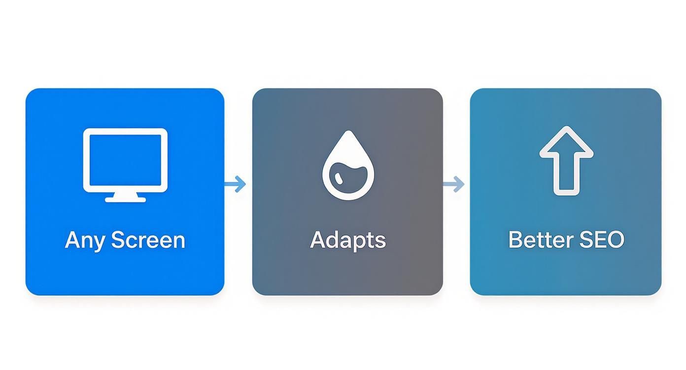
Responsive Design: The Cornerstone of a Mobile-Friendly Site
If you want your website to work on mobile, the conversation starts and ends with one thing: responsive design. We're not talking about creating a separate "m.yourwebsite.com" version. That's an old, clunky, and expensive way of doing things that creates more problems than it solves. Today, a single, unified responsive site is the only professional approach.
Think of it like water: a responsive site flows and adapts to fill whatever container it's in, whether that's a massive desktop monitor or a smartphone. This isn't just a coding trick; it's a fundamental shift in how your site is built to meet users wherever they are.
For a contractor, this means a gallery of project photos that looks great on a desktop gracefully stacks into a single, scrollable column on a phone. For a local restaurant, it means the menu is actually readable and the "Order Now" button is impossible to miss.
Ditching Pixels for Fluid Grids
So how does this work? The secret is moving away from rigid, fixed-pixel layouts. Instead of telling a content block to be "800 pixels wide," you build with a fluid grid. This means using relative units like percentages.
You might design a column to take up 50% of the available screen space. On a big desktop, it’s nice and wide. On a phone, it automatically shrinks to half of that much smaller screen, no extra work required. This simple shift ensures your content intelligently reflows and prevents that awful horizontal scrollbar that kills the user experience.
A responsive website isn't just a shrunken-down version of your desktop site. It’s about creating the best possible experience for the specific device someone is using at that moment.
The Massive SEO Payoff
This is about more than just looking good. Your search ranking depends on it. Google has been on a mobile-first indexing approach for years, which means it predominantly uses the mobile version of your website to determine how you rank in search results.
If your site is a mess on a phone, Google notices, and your rankings will take a hit. It's that simple.
With over 64% of Google searches now happening on mobile as we head into 2025, a non-responsive site is like putting a "Closed" sign on your door for the majority of potential customers. You can dig deeper into how much mobile browsing dominates the web in this comprehensive report.
Optimizing Your Site for Speed and Touch
A layout that simply fits on a small screen is only half the battle. If that site is painfully slow or a nightmare to use with your thumbs, visitors will leave just as quickly. True mobile-friendliness is about speed and usability.
For someone on their phone, speed isn't a "nice to have"—it's everything. Mobile devices now drive a staggering 62.66% of all global web traffic, and Google’s own data shows that 53% of those users will leave if a page takes more than three seconds to load. Every second counts. You can dig deeper into these mobile user stats in this DesignRush report.
Making Your Website Faster on Mobile
So, what’s slowing things down? It’s usually the same few culprits. The number one offender is almost always large, unoptimized images. A high-resolution photo straight from a camera can be several megabytes—a disaster for anyone on a mobile network.
Here’s where to focus your efforts for the biggest speed wins:
- Compress Your Images: Before you upload an image, run it through a tool like TinyPNG. You can easily slash file sizes by over 70% without any visible loss in quality. If you're on WordPress, there are plugins that can automate this.
- Leverage Browser Caching: Caching instructs a visitor’s browser to save static parts of your site—like your logo and CSS files. When they come back, their browser doesn't have to re-download everything, making subsequent visits feel almost instant.
- Choose the Right Hosting: Your server is the engine your website runs on. Cheap, shared hosting often means slow performance. Investing in quality managed WordPress hosting is one of the single best things you can do for site speed.
A responsive design doesn’t just adapt its layout; it delivers a better experience on any device, which is something search engines reward.
When you connect the dots, you see that a great user experience is directly tied to your site's visibility and, ultimately, its success.
Designing for Thumbs, Not Cursors
Once your site is fast, you have to think about how people actually use it. They aren't navigating with a precise mouse cursor; they're using their thumbs. This calls for a completely different mindset.
If a potential customer has to pinch-and-zoom just to tap your phone number, you’ve already failed. The goal is to make every interaction effortless.
Think about the physical reality of using a phone. Buttons need to be big enough to tap confidently. Links need enough space between them to prevent "fat-finger" mistakes. These details are mission-critical, especially for local businesses.
Your phone number should be a click-to-call link. Your address should open directly in Google Maps. Every little thing you do to remove friction makes it that much easier for a visitor to become a customer.
Mobile vs Desktop User Experience Priorities
| Consideration | Mobile Priority (What Matters Most) | Desktop Priority (More Forgiving) |
|---|---|---|
| Speed | Instant loading is critical. Every kilobyte counts. | Users are often on faster, more stable connections. |
| Navigation | Simple menus (like a hamburger icon) and clear CTAs. | Complex mega-menus and multi-level navigation are fine. |
| Layout | Single-column, scannable content. Vertical flow is key. | Multi-column layouts with sidebars and complex grids work well. |
| Tap Targets | Large, well-spaced buttons and links are a must. | Small links are acceptable with a precise mouse cursor. |
| Forms | Short forms with minimal fields and mobile-friendly inputs. | Longer, more detailed forms are less of a barrier. |
| Content | Concise text and headlines that get straight to the point. | More room for in-depth content and longer paragraphs. |
Ultimately, a good mobile experience is about empathy. By putting yourself in your customer's shoes—on their device, in their context—you can anticipate their needs and design a site that not only works but feels great to use.
Simplifying Navigation and Content for Smaller Screens

What looks perfectly organized on a sprawling 24-inch monitor often becomes a confusing jumble on a 6-inch phone. To make your site genuinely mobile-friendly, you have to get ruthless about simplifying.
Put yourself in your customer’s shoes—they're on their phone, probably on the go. Does an HVAC company’s homepage really need to display all twelve of its service options at once? Probably not. A clean "hamburger" menu (the icon with three horizontal lines) can neatly organize those choices without overwhelming the visitor.
The goal here is to slash decision fatigue. A mobile user is on a mission; a cluttered screen is just a roadblock.
Prioritize Your Most Valuable Actions
On a desktop, you have space for multiple calls-to-action (CTAs). On mobile, that luxury is gone. You need to identify the one or two actions that are most crucial for your business and make them glaringly obvious.
For most local service businesses, these are the actions that directly lead to revenue:
- "Request a Quote" for a roofer.
- "Book an Appointment" for a dental office.
- "Call Us Now" for an emergency plumber.
These primary CTAs need to be "above the fold"—visible the instant the page loads, no scrolling required. Think big, high-contrast buttons with plenty of clickable space. A thumb shouldn't have to perform surgery to tap the right link.
A potential customer on their phone should never have to hunt for the button that puts money in your pocket. Make it the most prominent element on the screen. This single adjustment can dramatically boost your leads.
Make Your Text Effortlessly Readable
Another classic mobile fail is typography. If someone has to pinch-and-zoom just to read about what you do, you've already lost them. Readability isn't a bonus feature; it's a fundamental requirement.
For body text, a font size of at least 16 pixels is the accepted standard for comfortable reading on a small screen.
Beyond just the size, pay attention to line spacing. Ample spacing prevents that dreaded "wall of text" effect. Short paragraphs and bold, clear headlines are your best tools for this. Breaking up content makes it easily scannable and much less intimidating on a compact display. This is a core component of a great user experience, and it's worth diving deeper into user experience design best practices to get it right.
How to Properly Test Your Website's Mobile Performance
https://www.youtube.com/embed/UWFoxol1yV0
You’ve put in the work to build a responsive site. Don't just assume it's perfect. You need to test it to find the frustrating glitches that send potential customers right to a competitor.
The good news is that you don't need a high-tech lab to do this. A few simple tools can give you a crystal-clear picture of what your mobile visitors are actually experiencing.
Start with Google's Litmus Test
Your very first stop should be the free Mobile-Friendly Test from Google. This is non-negotiable because it shows you exactly what Google's own crawler sees when it scans your site for its mobile-first index. If Google flags something here, it's hurting your SEO.
Just pop in your website’s URL, and you'll get a straightforward pass-or-fail result.
Getting that green "Page is mobile friendly" message means you've met Google's basic technical standards. If it fails, the tool gives you specific feedback like "text too small to read" or "clickable elements too close together," which creates an instant to-do list for your developer.
Use Your Browser's Built-In Tools
Every modern web browser has a powerful secret weapon: its developer tools. With a simple keyboard shortcut (usually Ctrl+Shift+I on Windows or Cmd+Option+I on Mac), you can instantly see how your website looks on dozens of different phone and tablet screen sizes.
This "device mode" is priceless for catching layout bugs without needing a drawer full of physical gadgets. You can check if your photo gallery stacks correctly on an old iPhone or see if your contact form gets cut off on a new Android.
The Most Important Test: The Human Element
Tools are fantastic for spotting technical issues, but they can't tell you if your site is genuinely easy to use. For that, you need the most critical test of all: acting like a real customer.
Grab your own phone and try to accomplish your number one business goal.
- Can you actually fill out your contact form with your thumbs?
- Is your phone number a single, obvious tap-to-call link?
- Can you read the text on your services page while walking outside in bright sunlight?
But don't stop there. Hand your phone to a friend or family member who doesn't know your site. Ask them to find a specific service or request a quote. Then, watch them. Where do they get stuck? What makes them pause? This kind of real-world feedback is pure gold.
This process is a key part of any professional website audit. In fact, we've put together a comprehensive guide that includes all of these human-centric checks. You can see how your site measures up by going through our full web audit checklist. It's often these small, real-world usability problems that make the biggest difference.
A Few Common Questions We Hear
When business owners start digging into making their website mobile-friendly, a few questions always pop up. They usually revolve around cost, how much work is involved, and what it really means for the bottom line. Let's tackle the ones we get asked most often.
Is a Responsive Site the Same Thing as a Mobile Site?
Not at all, and it's a crucial difference. You might have seen sites with an "m.yourwebsite.com" address—that's a separate mobile site. It’s an old-school method that forces you to manage two different websites. It's twice the work and can be a mess for your SEO.
A responsive design is one single, smart website that automatically adjusts its layout to look great on any device. This is the modern standard for a reason. It's much better for your Google rankings, easier to maintain, and ensures every visitor gets the same professional experience. It's the only way we build websites.
What's the Real Cost to Make an Existing Website Mobile-Friendly?
The honest answer: it depends entirely on your site's foundation. If you're on a modern platform like WordPress, the solution might be as simple as making targeted tweaks to your theme's code.
However, if your site is running on old, inflexible code, a full rebuild is often the smarter and more cost-effective choice in the long run. Trying to patch an outdated system is like putting a fresh coat of paint on a crumbling foundation. A rebuild gives you a solid, future-proof platform for growth, not just a quick fix.
Think of it as an investment, not an expense. A professional, mobile-friendly website isn't just about looking good. It’s about creating a powerful sales tool that works around the clock to turn visitors into leads.
How Can I Tell if My Website Is Frustrating Mobile Visitors?
Your own website data will tell you the story. Log into your Google Analytics account and navigate to your audience reports. From there, you can compare your traffic by device type: Mobile vs. Desktop.
Pay close attention to these metrics when you compare the two:
- Bounce Rate: Is the bounce rate for mobile users way higher? That's a huge red flag. It means people are showing up, taking one look, and leaving immediately.
- Average Session Duration: If mobile visitors are spending significantly less time on your site, it's a clear sign they can't find what they're looking for.
- Pages Per Session: A low number here for mobile users suggests they aren't exploring your services. They're hitting a dead end and giving up.
The numbers don't lie. This data will show you exactly where the user experience is breaking down and costing you customers.
Your website should be your best salesperson, not a barrier between you and your customers. At Uncommon Web Design, we build websites designed to convert traffic into real business growth. If you're ready to see what a truly mobile-friendly site can do for your company, book a no-obligation consultation with our team.


